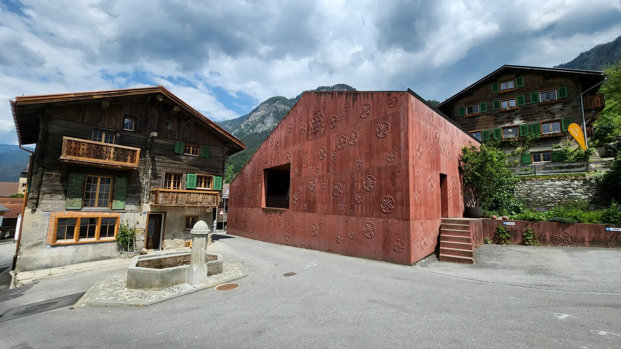
Dulux Study Tour 2023
Switzerland: city and country
Tour participants are exploring the architecture, projects and practices of Helsinki, Lisbon, Zurich and Venice during their European adventure.
Zurich: a full cup
Day 8
Sarah Lebner shares her thoughts on the group's Swiss experience.
It’s midnight in Vals – a quintessential Swiss mountain village – and you’re floating in a warm pool, looking up at the night sky, in a silent night-time bathing experience. The architect, Peter Zumthor, is renowned for designing sensorial experiences and I think this could be what heaven feels like and even if Bradley Kerr finished yesterday’s post with this same moment, it deserves covering again. We return to the baths at 7am for one last chance to grasp this ultimate moment.
The running group joke, #itsalldownhillfromhere feels more apt than ever as we leave Vals and drive back to Zurich.
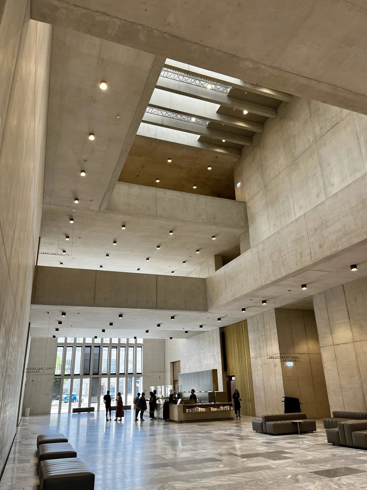
Kunsthaus Zurich Extension
The Kunsthaus Zurich Extension by David Chipperfield is easy to appreciate. Unlike a few public buildings we’ve seen, it’s not a gimmick or a landmark, but instead a highly resolved civic place. The refined concrete, copper and marble forms are chosen for their relationship to the older museum building, local availability and partially recycled material (concrete).
Technically refined approaches to acoustics and natural light alongside geothermal heating and cooling in the heavy mass walls (no air conditioning) make the galleries effortlessly pleasant and offer more sustainable preservation and viewing methods.
The entry foyer is designed as a public space and stays open longer than the museum as a passageway, which is a nice idea – even if the building still screams “formal institution” would possibly seem alienating to some parts of the community. You get the sense that this building could comfortably sit in its place in the city for hundreds of years, which I think is an important criterion for such an expensive and material-heavy investment.
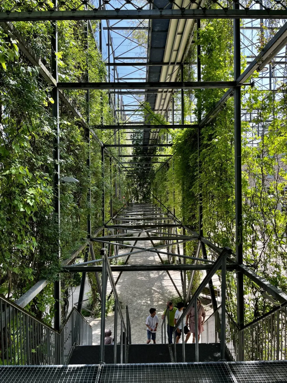
MFO Park
We pause for lunch at MFO Park; imagine a post-apocalyptic industrial steel building frame remnant that’s been taken over by greenery. We have lunch here and it’s fantastic; four storeys of garden and platforms that make you feel like a child in a treehouse again.
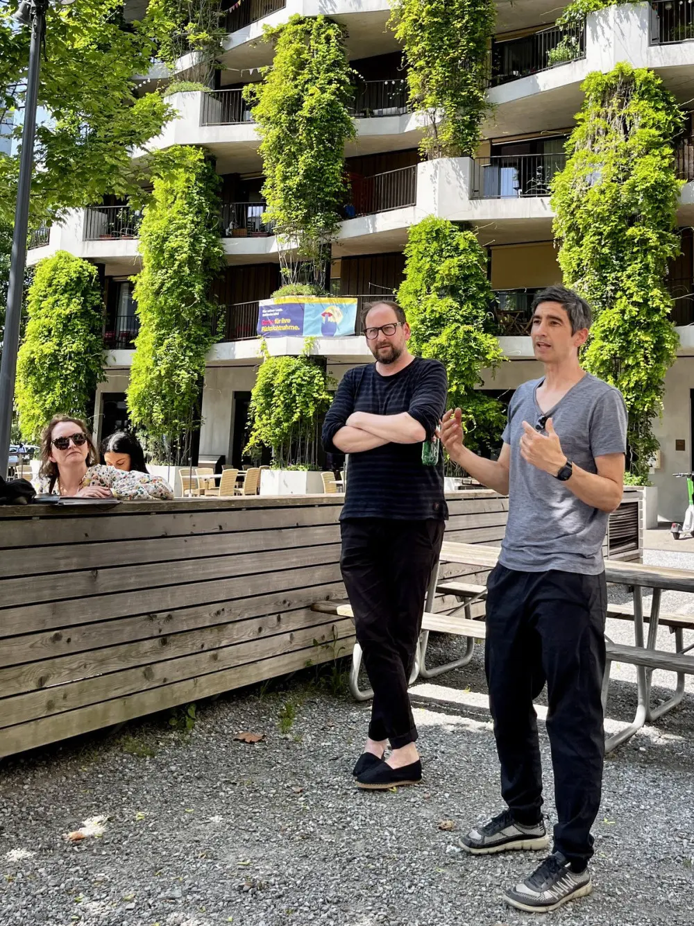
Hunziker Areal housing cooperative
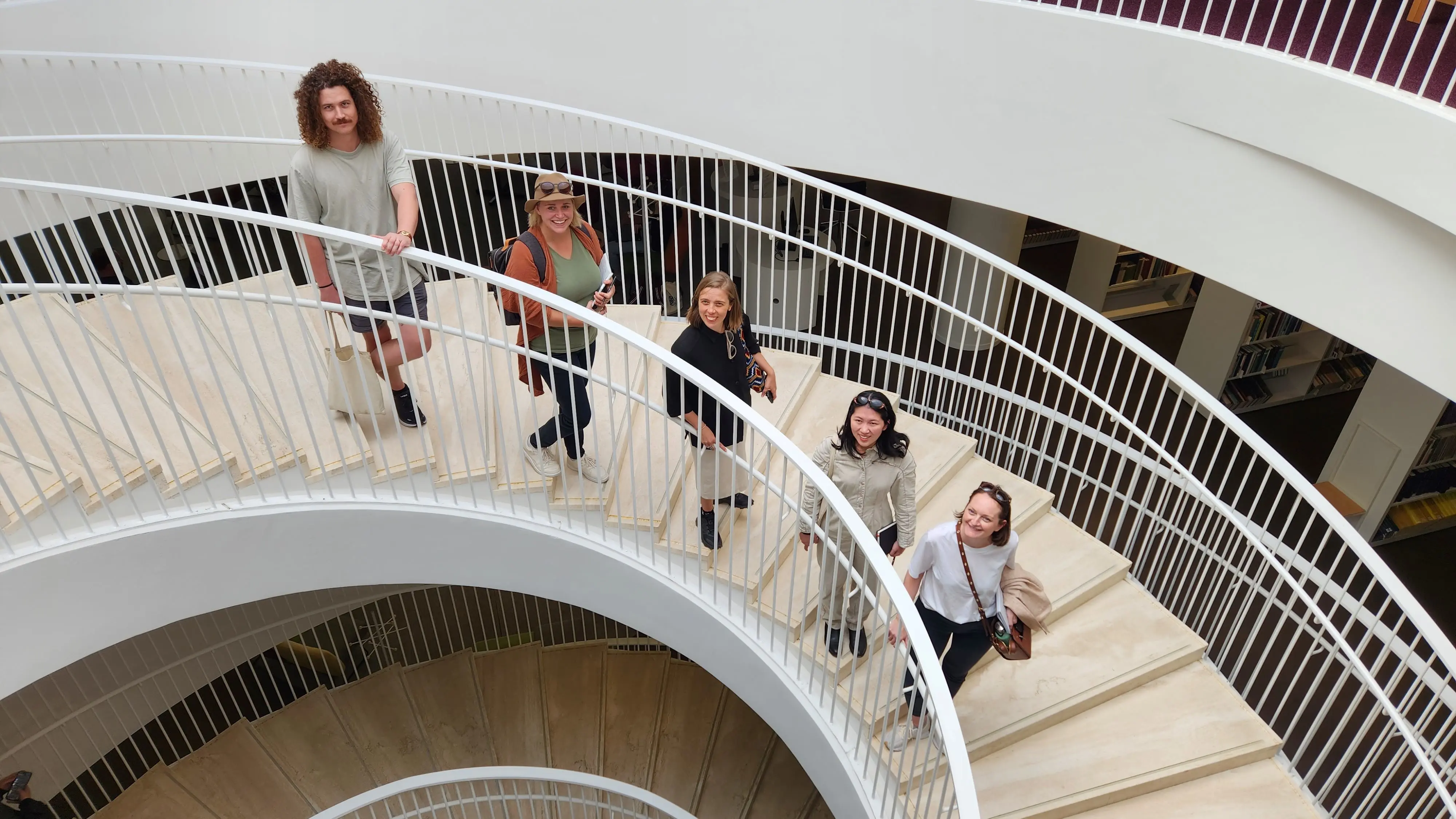
Next, we visit the Hunziker Areal housing cooperative which consists of 13 apartment blocks, totalling 400 units. Designed by five different architecture firms and built by one contractor. We’re lucky to have a tour with Thomas Friberg and Martin Gutenkast from Pool Architekten (pictured) even though it’s a public holiday. The whole thing is an experiment in affordable housing, allowing the project team to challenge local planning rules. There are only 100 car spaces, given to visitors and special concessions.
One apartment pattern stacks light voids to efficiently get natural light into the deep spaces. The apartments don’t have balconies and one that we visit has a communal roof space while another carves out a communal terrace garden and winter garden (like a sunroom). Another apartment experiments with single mass integrated-insulation concrete (a product I don’t think we have in Australia) while another tests the economics of mass timber.
A rule book for the area creates consistent elements among the experimentation such as defining the ground area for commercial tenancies in a different visual format. People pay a fee to join the cooperatives and if they ever leave they get that money back. The system is so successful that Thomas Friberg estimates 25% of housing in Switzerland is under the cooperative model and even a lot of the social housing is simply subsidised cooperative housing.
Our group is deeply fascinated by this system. It’s the first place we’ve seen where kids are really active in the architecture. A splash pool is heartily used in the ground commons, and a resident who excitedly and generously invited us to see her apartment explains that the thing she loves most of that her kids have so many friends living in the same area.
Le Corbusier Pavillion
Vals: Venerating Peter Zumthor
Day 7
Bradley Kerr shares his insights.
I remember feeling vividly – "I won a place on this tour". I don’t know that I’ve earned this, but I’m going to embrace it. The Australian Institute of Architecture invited us to nominate places and projects that we would like to visit and now I need to figure out where I would most want to go. Norway’s not on the travel shortlist, so Steilneset Memorial is off-menu. Well, there’s still the Shelter for Roman Ruins, and that leaf-looking church and of course Therme Vals, which are all in Switzerland, but we’re supposed to be nominating projects in Zurich. Stuff it, just nominate it. Worst case scenario, I’ll go in my own time. Peter Zumthor’s architecture is what I’d like to show my students when we talk about genus loci, and architecture of place. His material use considers multiple contexts and conditions and the detail resolution executed in construction is beautiful.
But, you know when you hear so much about something and then the time comes and the thing just doesn’t live up to the expectation? I have a friend who firmly believes that the week leading up to the holiday is better than the holiday itself. Our first stop on the way to Vals is the Shelter for Roman Ruins. It provided some reassurance that my expect The project was as delicate as the photos and videos suggest, but allowed to age.
The greyed exterior was also starting to grow moss. The wildflowers behind the project smelled almost like honey. The bumblebees were so large they were comical. Edwina Brisbane observed that the interior was preserved, the timber wasn’t grey. The purpose of the structure is also evidenced by the structure. Most surprisingly, there were no animals living in the ruins roof structure. I think this disappointed me, but maybe I just miss Australia.
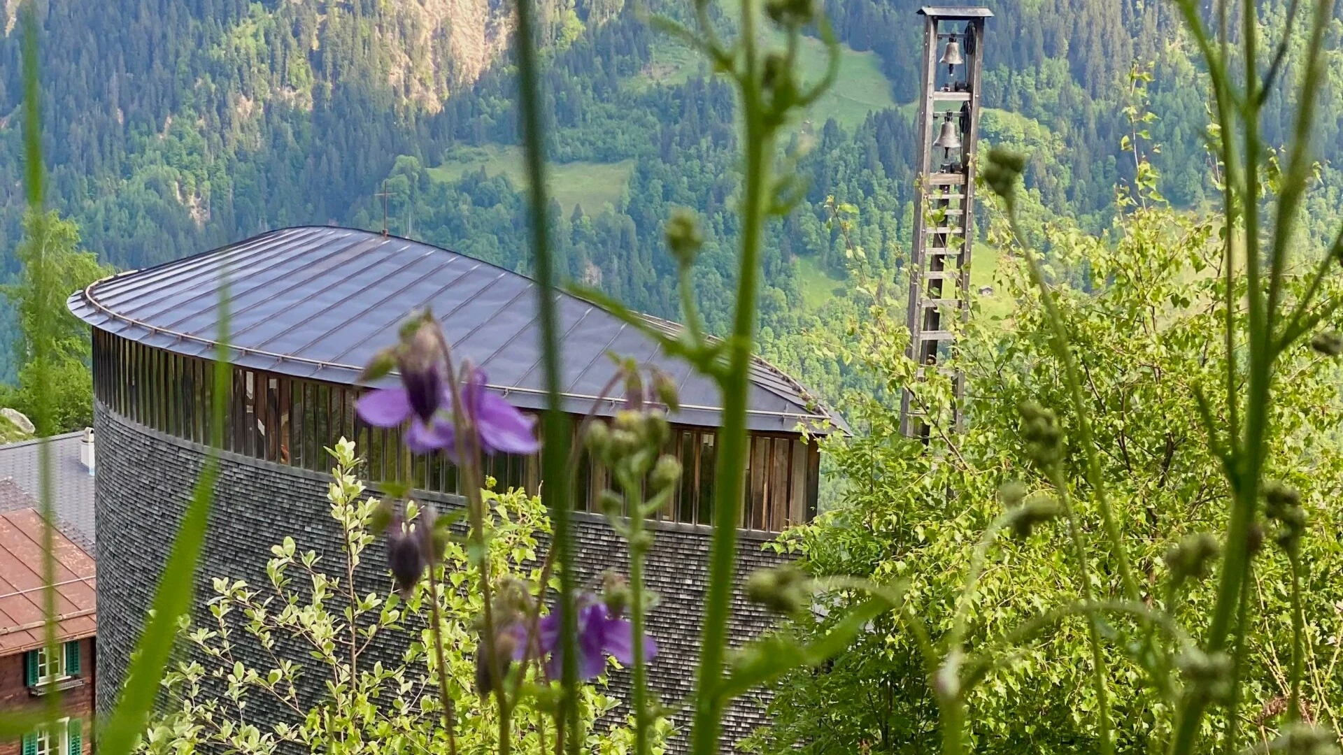
Next stop: the Saint Benedict Chapel. There’s a short walk before you get to the chapel. I wanted to talk about the subtle resolution of the structure, about the ageing timber cladding or that the interior walls are painted ply. I wanted to talk about architectural gesture of the entry. In reality, I just really wanted to go for a hike around the mountains or sit and stare at the snow-capped peaks. I think about how different this is to our landscapes, but the gentle wildflowers littering the streetscape feel a little like home. We’ve seen a lot of objects in the landscape on this tour, and something apparent with the first two projects is that they’re of the landscape. Time for the drive to Vals now.
We arrive at Therme Vals. I sprint to the room, and down to the baths to find the cave-like room that you swim through a tunnel to get to. On the way, memories of exploring caves along the South Coast of New South Wales come back to me. Being led by the light, the architecture subtly directs you where you need to go. Wildflowers peak over the skylights. It’s kind of imperfect, not everything aligns.
Alright, found the hot pool, the ice pool, the flower pool, and finally, the cave pool, again.
The water is more buoyant here, like it has a higher viscosity. You don’t feel that in pictures. Unexpectedly, there’s also a bit of resistance – almost like a light tide. I’m alone, and the room echoes like I had thought it would. Like a sea cave. And in the isolation, the exhaustion of the previous few days and among the discussions we’ve been having as a group, I can’t help but chuckle…
Lisbon is a study in aged appreciation for our tour participants.
Our participants explore everything Helsinki has to offer from churches to universities to retail as well as project and practice visits.
Check out the itinerary of the architectural sights and project visits of the 2023 tour of Finland, Portugal, Switzerland and Italy.
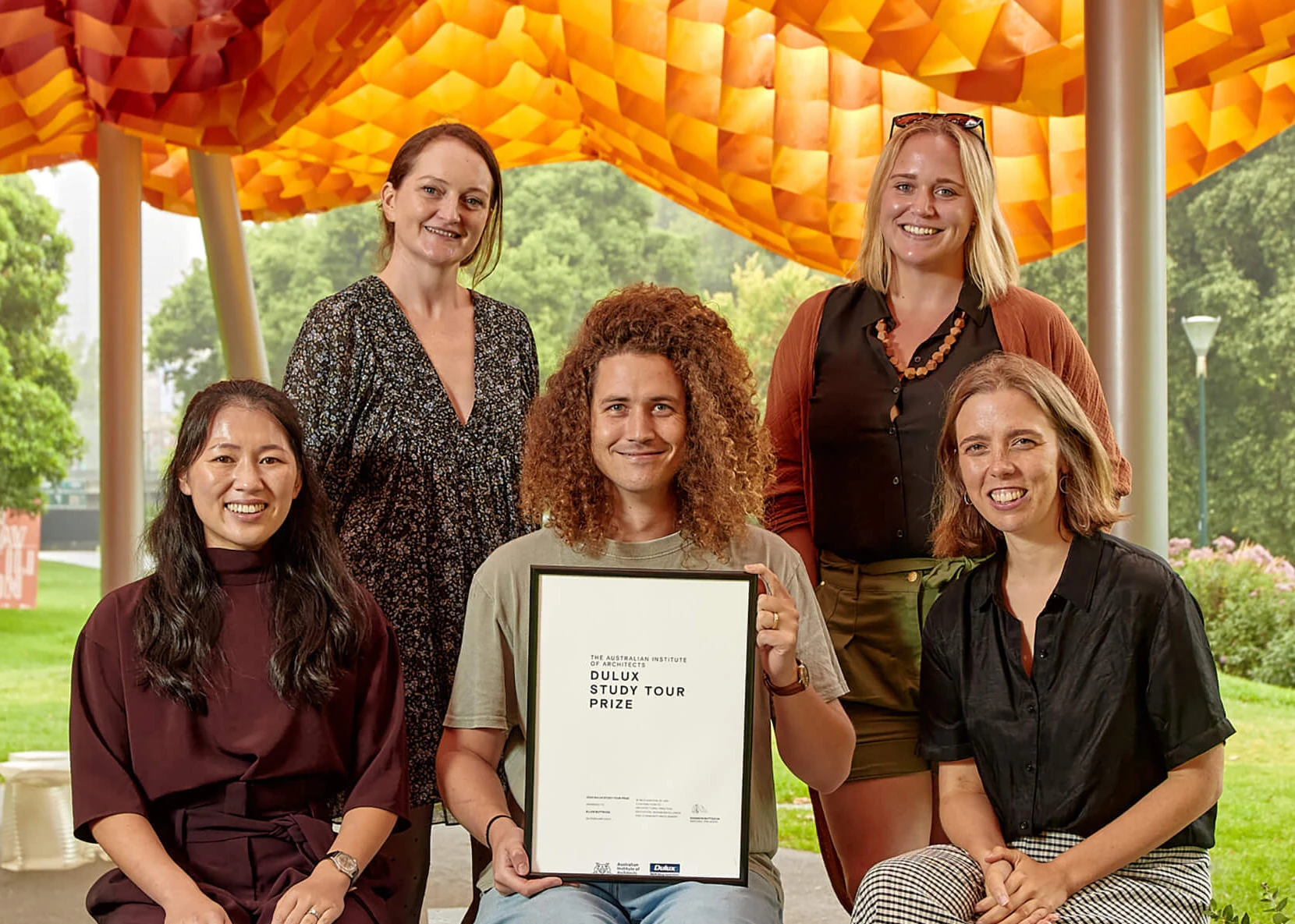
Congratulations to our 2023 participants who are on a European tour exploring the best of international architecture.
