Dulux Study Tour 2023
First stop: Helsinki
Tour participants are exploring the architecture, projects and practices of Helsinki, Lisbon, Zurich and Venice during their European adventure.
Dulux Study Tour Day 3
Between humanism and materialism
Sarah Lebner shares her impressions of Helsinki.
I’ve always thought that people who cried at architecture took their job way too seriously…but I must confess I had a little moment standing in the Aalto House today. I’d like to say that it was just sleep deprivation and jet lag, but the privilege of the moment had me heavily swallowing some bubbling emotion. Let me explain why.
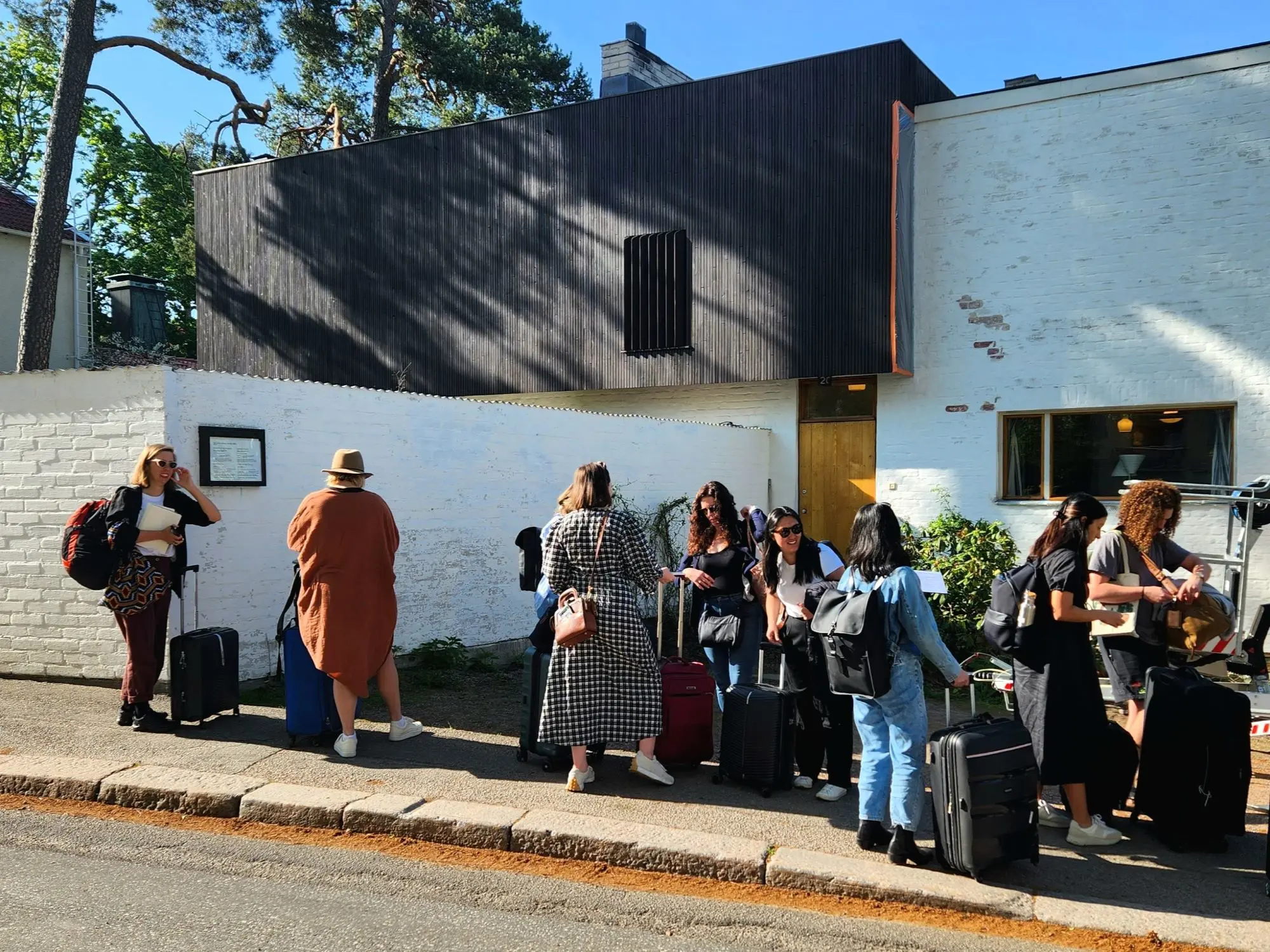
Aalto House and Aalto Studio
On this last day in Helsinki, we visited the Aalto House and Aalto Studio. We’ve already seen many Aalto projects and they’ve transformed from buildings I vaguely remember from a history class at university to works I now have an intimate admiration for. Please note, I’ve only used the surname Aalto in this writing. This is intentional. While these works are predominantly from the skill of Alvar Aalto, there’s no doubt that credit is also due to Aino and Elissa and no doubt other integral team members at Studio Aalto.

Inside Aalto House
Architecture tours usually focus on public buildings and multi-residential projects because it’s hard to visit privately owned houses, so as an architect whose work and heart lies in firmly in single homes, I was extremely excited to see the Aalto House.
Beauty in texture
I’ve seen Aalto’s work described as “between humanism and materialism” and before this trip these words felt academic and alienating to me. But having experienced these projects in three dimensions, with context and all the senses, these ‘isms’ now seem like practical and apt descriptions.
Let’s start with materialism. Helsinki is full of it. It seems to me that economic austerity during not-so-distant tough times for the country has forced Finnish designers to create texture, warmth, rational beauty and visual interest (things that humans crave) by using ordinary materials extraordinarily well. For example, brick is everywhere but it’s often laid in a unique bond; in-situ concrete is also popular but I’ve seen more timber formwork imprints than anywhere else in my life; standing seam copper and timber battening add texture and detail like threadwork on a tapestry.
And humans like this. We like detail, texture, warmth, visual interest, and a scale appropriate to our size and senses. We like the natural world and anything that reminds us of it, such as raw materials, or patterns and order that are delightfully contrasted with the ‘perfect imperfect’.
This is why Aalto’s works are particularly humanist. Aalto’s handrails and doorknobs are beautiful and ergonomic. Simple curtain dividers, woven wall panels and tensioned fabric light diffusers offer simple and delightfully textural solutions. The application of material patterns and contrasting textures offers tangible materiality, human scale, and warmth to playful volumes and modest spaces. The interest in furniture and lighting design demonstrates a near obsession with human experience and comfort. The effort to bring light into spaces in a country that suffers long dark depressing winters it generous to the inhabitants.
Inside Aalto Studio
Climate considerations
Am I gushing? Let me garnish with some critical thought. At both of today’s Aalto buildings I was very disappointed with the lack of physical connection to nature. The visual was there – far ahead of its time – but while Alvar Aalto had his own access to the garden, the rest of the studio had to circulate right back through a front door and walk around the building to access the primary garden spaces. And in his home, the connection to the outdoors was a little clunky. This shocked me. And while the Aaltos didn’t have climate change on their horizon, I’m concerned for how these (and other Finnish buildings) will perform in increasingly warm summers and prolonged series of warm days.
Many of their buildings have unshaded east and west windows to understandably capture as much light as possible during a typically cold climate and during short winter days. And these are buildings typically made of huge insulated thermal mass elements.
This combination works well in cooler times but it can flip to a thermal nightmare when heatwaves are experienced and all that sun they’re trying to capture starts to heat and be stored in well insulated high-thermal-mass spaces. Add to this the lack of openable windows typical in cooler climate regions and I become very nervous for the future of these spaces. Maybe some of that prevalent battening needs to be repurposed into operable, optimised or removable shade screens.
Emotional farewell
And so our Helsinki whirlwind comes to an emotional end and why exactly did I feel so moved at this final site visit? Because I think I realised I was standing in pioneering proof that it was entirely possible to prioritise practicality, durability, sustainability, and modesty while achieving beauty, joy and spaces that nurtured and enriched people’s lives.
Dulux Study Tour Day 2
Sing like a choir
Edwina Brisbane shares her reflections on Helsinki.
Various shades of grape is an unconscious obsession of the city, all the textures imaginable and 100 different and wonderful door handle types. Day 2 gives us the opportunity to meet architects from ALA, Playa, Collaboratorio and OOPEA. Through discussions with these architects, about their work, the city and the value of design on a young nation, our understanding of the driving forces behind the beautifully rich textures we experienced on day 1 began falling into place.
With that, I offer reflections from the day. Discussions have swirled around Dulux Study Tour group and our super generous new Finnish friends.
Has the poetry in architecture been lost to austerity and the realities of business?
This question was raised off the back of a comment by Juhani Pallasmaa (from day 1), when seeking advice for young architects.
There appears to have been a shift in values sometime between Alvar Aalto’s heyday and now. The value of the architectural proposition is no longer the symbolism of the gesture and how it fits into a continuous body of work. The proposition is the creation of space for the users, the city and its creatures. That is, what it does, rather than what it says. The users rather than the architect. The poetry is in connection, experience and generosity, in handing over a building to a community and measuring the success of the outcome by their feedback rather than architectural theorists’ reflections.

Collaboratorio
Be a good neighbour. Sing in the choir.
Both ALA and Playa (my personal favourite for the day), talked about their work in a personified way, asking themselves what is a good neighbour in this context.
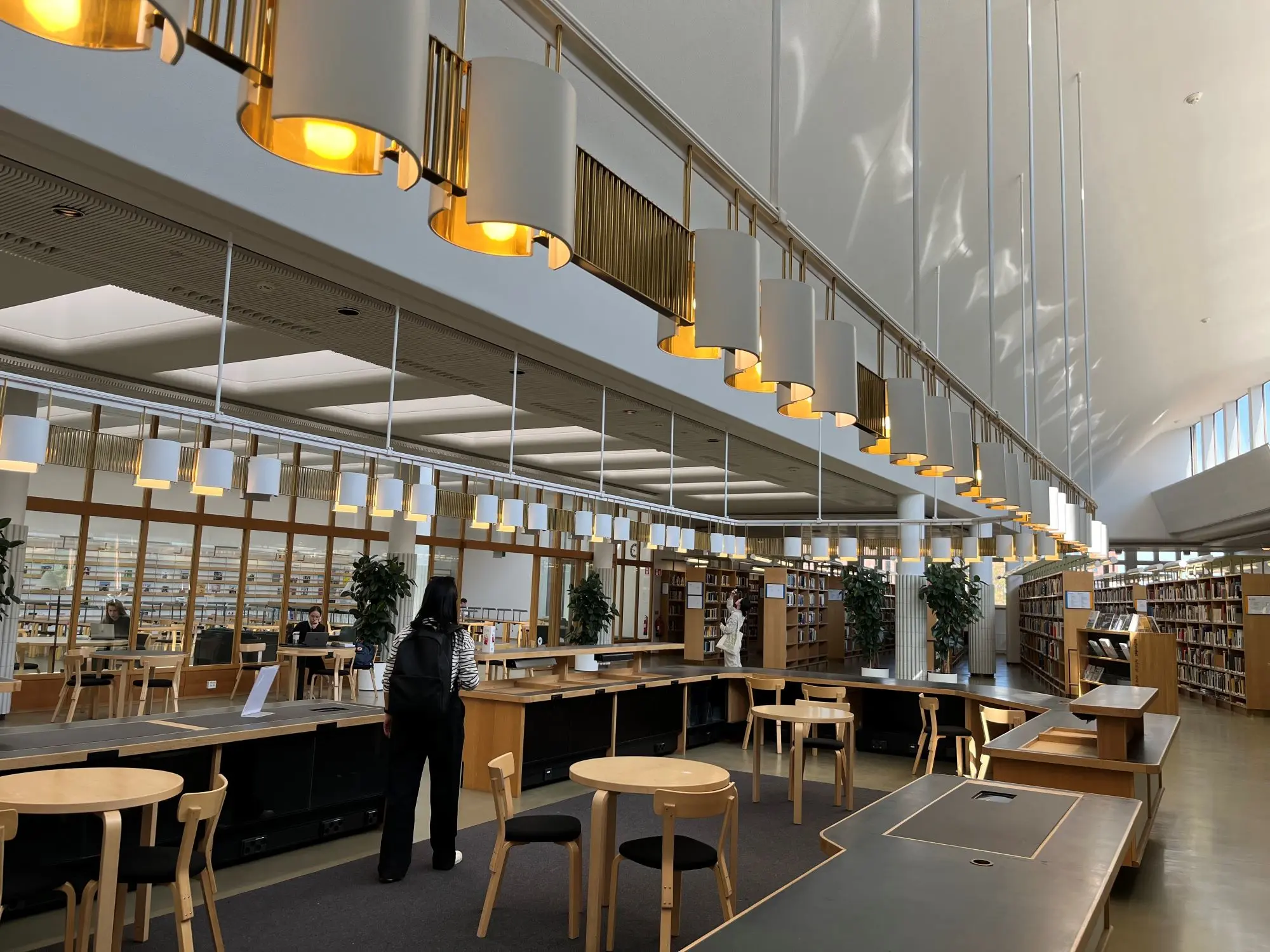
For the Oodi Central Helsinki Library by ALA Architects, it is the position of the entry, the gesture of the sheltered public space, the openness to the media building and Steven Holl’s art gallery, and how the building creates a sense of place to the urban field. (The urban field, as ALA put it, is Soviet-scale public square, large enough for probably the entire city to gather).
Playa Architects, who work in residential neighbourhoods, noted that “every building seems to be shouting, a residential area should be more like a choir, the buildings should sing together”. Leading to softness and subtly in the materiality, form that responds to the typography of the site and small moments of delight for the residents. I’d much rather be sung to than yelled at.
Looseness in the detail
OOPEA, together with their client, has created an airy, welcoming church. The intent is that everyone must feel welcome. I’ve always thought creating a welcoming place is about the urban gesture, the detail and the open work or some level of incompleteness that is left to the user. OOPEA has schooled me in openness and looseness.
Openness doesn’t need to be a marginally incomplete gesture or an allowance for flexibility and weathering. An incredibly considered and refined project can have looseness in the execution of thoughtful details. Small imperfections or a history of the builder gives some kind of warmth and humility to our experience of a place.
Like your favourite colleague, who is always thoughtful and professional but with a dry sense of humour that gets you every now and then, you create a connection and sense of familiarity in these moments.
It must be said that OOPEA’s Tikkurila Church and Housing project is truly beautiful.
Dulux Study Tour Day 1
Architecture in Helsinki: Contact High
Bradley Kerr shares his insights into Helsinki from day one of the study tour.
The soft poplars scattering the landscape on the drive into town contrast with the heavy masonry, brick, stone and render. There’s a lot of red, there’s a lot of copper.
Red granite is absolutely everywhere in Helsinki, as a honed tile, polished, rough cut, as road gravel, pavements, sidewalks, as a shading device, and it’s in the aggregate mix in the in-situ concrete.
The city has a beautiful slight-pink tint that, despite the heavy material, creates a soft and welcoming streetscape complemented by trees that look like they only exist in a fourth-year student render. Today we’re seeing 19 projects, a practice visit and an interview.
Embracing environment through design at Aalto University
Our walking tour guide takes us to the train station to take us to Aalto University is littered with red granite in the architecture, pavements, roads and sidewalks. The Aalto University campus embraces something that may appear evident to the Australian ethos, which is the significance of designing with the landscape in mind. Green stuff is pretty nice, and we’d rather look at a tree canopy while studying than into a brick wall. There are some incredible details.
Kampii Chapel and Amos Rex Art Museum
We head to the Kampii Chapel and then Amos Rex Art Museum, which has to be one the most arrogantly absurd interventions to a public space, and it was brilliant. It introduced a fun, playful, childish interaction with architecture that completely breaks down the intellectual anticipation of architectural critique. It was fun. The skylights were really big and you can climb them and then you can slide down them.
Temppeliaukio Church
We arrive at Temppeliaukio Church. The detail, the light, the atmosphere, the warmth in the room of nothing, but concrete, rock and copper. Quality architecture doesn’t have to be in the built quality – it’s in the qualities, the ephemeral nature of a space that doesn’t matter that it’s a bit echoey because you expect it to have an echo and its walls are bedrock. How can such densely packed concrete beams feel so effortlessly light?
The material culture of a city that has historically relied on its local industry reveals an honest narrative of place-based architecture. Architectural movements, or periods, have happened and will continue – but what’s apparent is the rich material history and the textures it leaves behind.
Red, black and white granite make up the bedrock of a city of iron-rich soils. These materials are paired with stunning copper roofs, cladding, flashings and all the boring details that architects try deeply to convince their friends and family are actually very interesting and very, very important.
Practice visit – Juhani Pallasmaa
Juhani Pallasmaa is very welcoming. An incredible catalogue of written work, and in categories or areas that are particularly interesting to my understanding of architecture. Until I saw an image of “Australian Aborigines” standing on an emu nest in a book pertaining to the significance of Animal Architecture.
Juhani mentions living with the Sámi for eight years prior to the design of the Sámi Museum. Juhani also talks of – from my interpretation or understanding of his words – the importance of Connecting with Country. Juhani then talks of the irrelevance of intellectual property, when true intellectual property can only be understood by the individual, and that any attempt to imitate will be poor.
Project visit – Löyly
Anu Puustinen of Avanto Architects led the study group through Löyly – a sauna, bar, restaurant and outdoor terrace complex with stunning views.
Helsinki – Day 1
Our tour participants swapped the seaside city of Lisbon for the lofty, green mountains of Switzerland on their next stop of the Dulux Study Tour.
Our participants explore everything Helsinki has to offer from churches to universities to retail as well as project and practice visits.
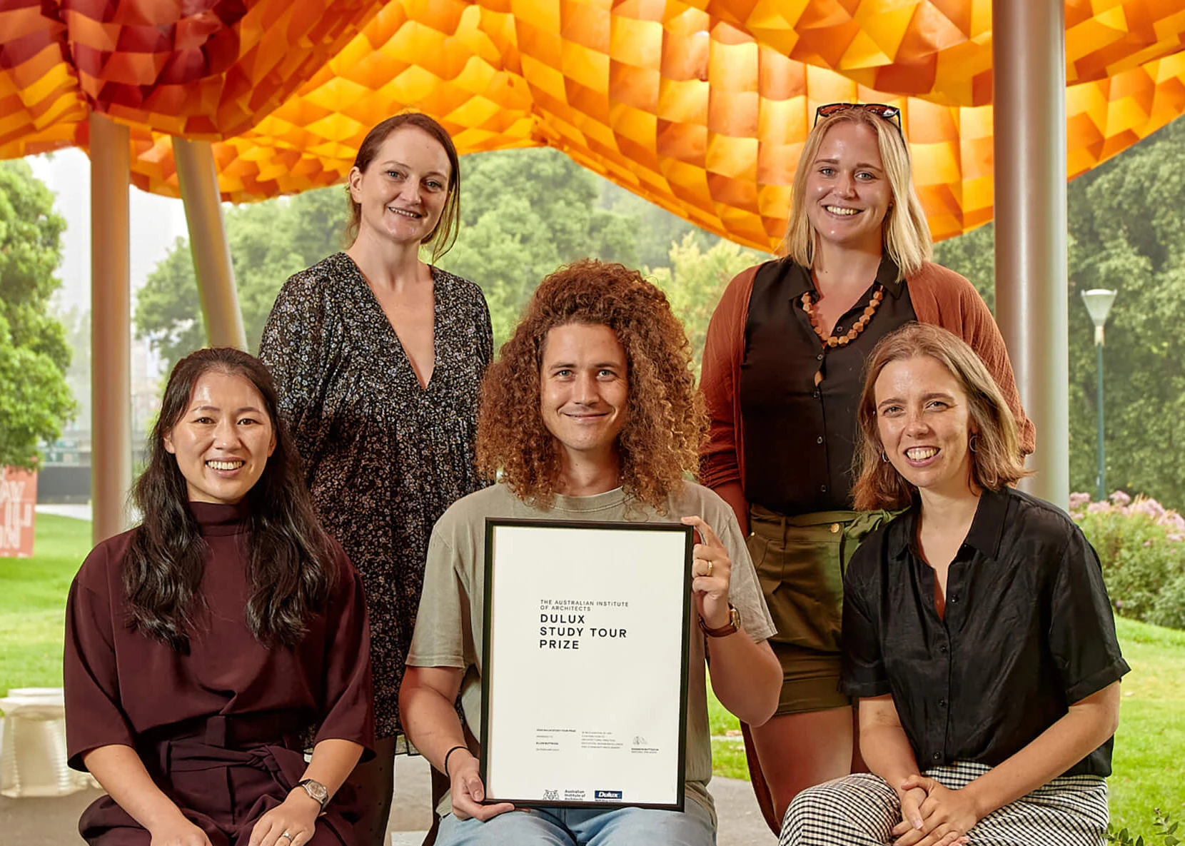
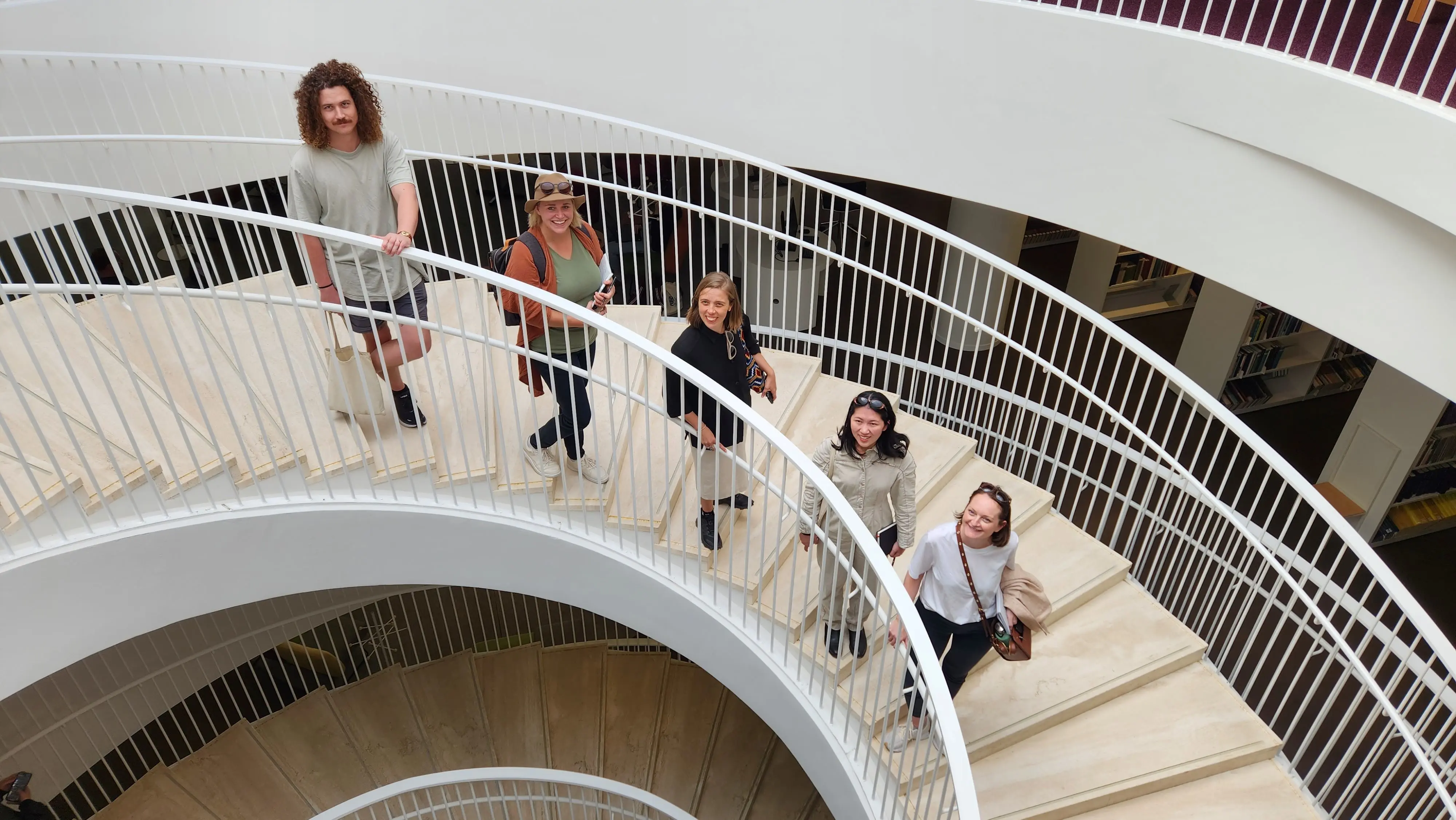
Congratulations to our 2023 participants who are on a European tour exploring the best of international architecture.
Check out the itinerary of the architectural sights and project visits of the 2023 tour of Finland, Portugal, Switzerland and Italy.
