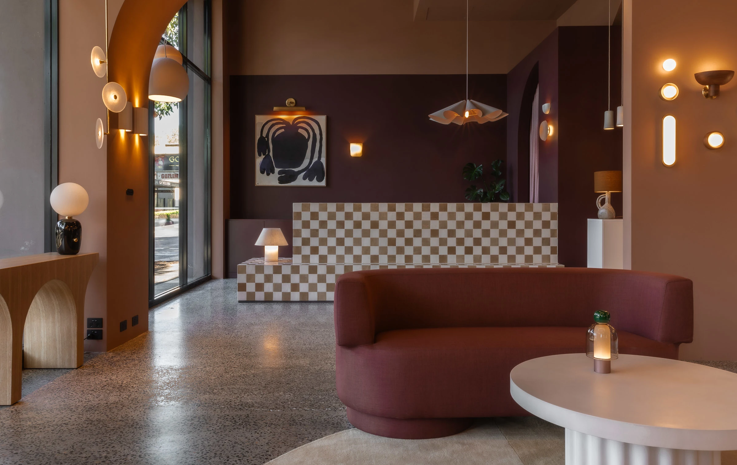
Dulux Colour Awards 2024
Commercial Interior – Workplace and Retail
This category recognises excellence in the interior paint finishes of any commercial or industrial building such as offices, studios, factories, retail stores and shopping centres.
Commercial Interior – Workplace and Retail Winner
Bagnoli Architects
Kariton (Chinatown)
About the project
Kariton (Chinatown) is a business inspired by Filipino gelato street carts (karitons) and quickly becoming famous for its wildly experimental flavours. This merging of culture and experimentation was the starting point for the design of the stores.
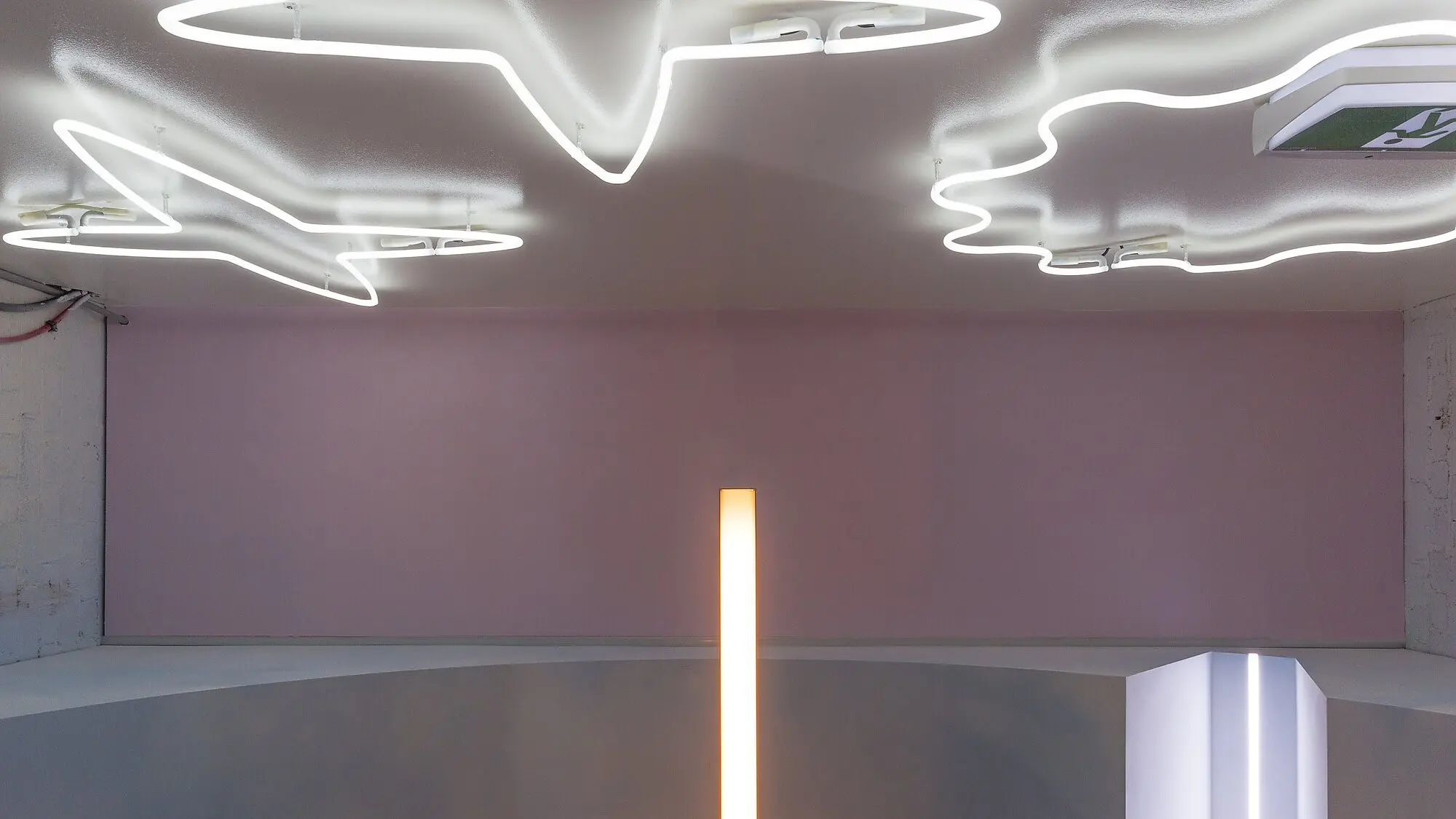
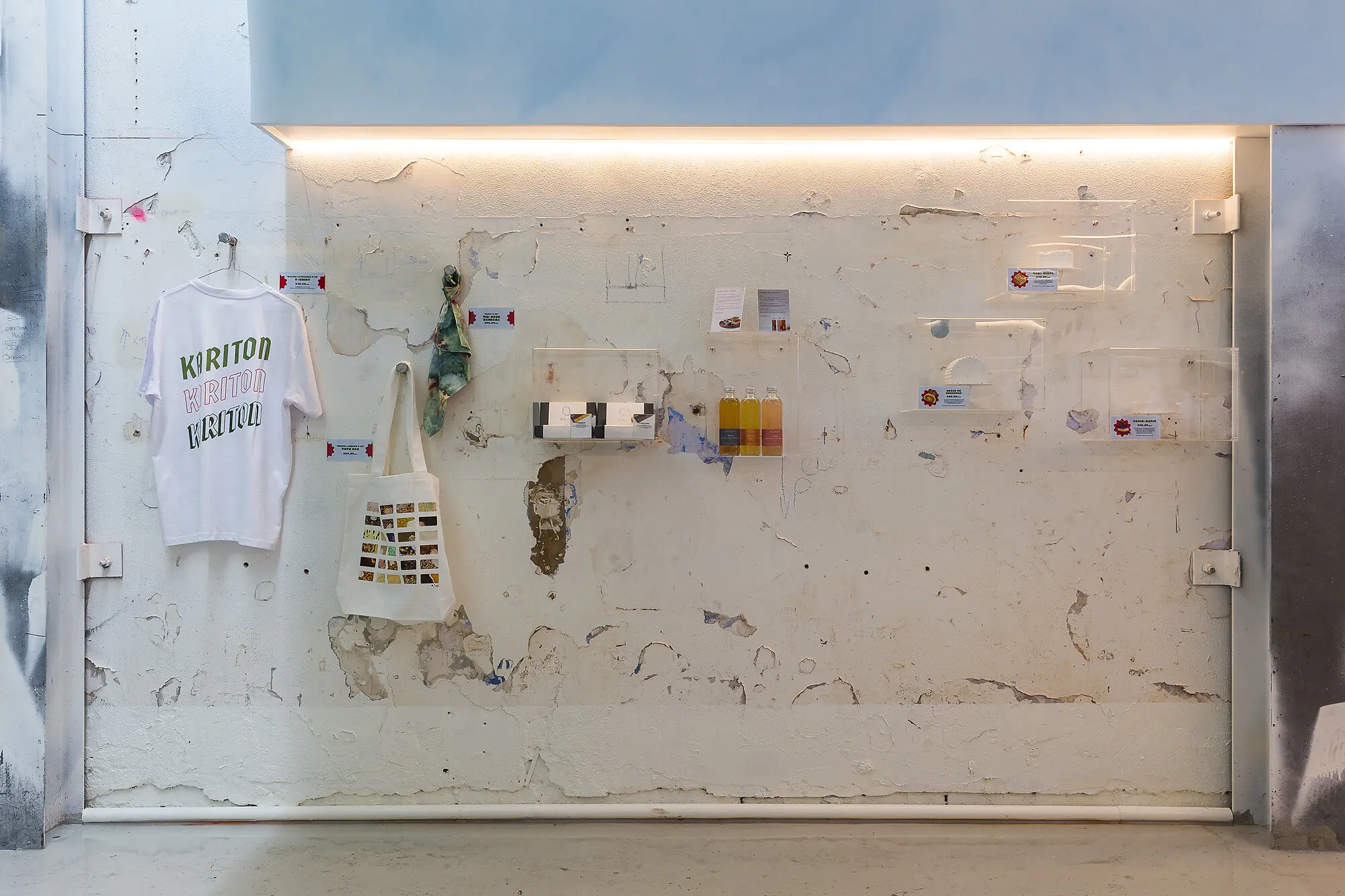
Each store in Australia is assigned a cultural identity based on a Filipino location. At Kariton (Chinatown), the decrepit shell of the original building was exposed and overlaid with futuristic elements designed to reference the complex city of Manila.
What the judges said
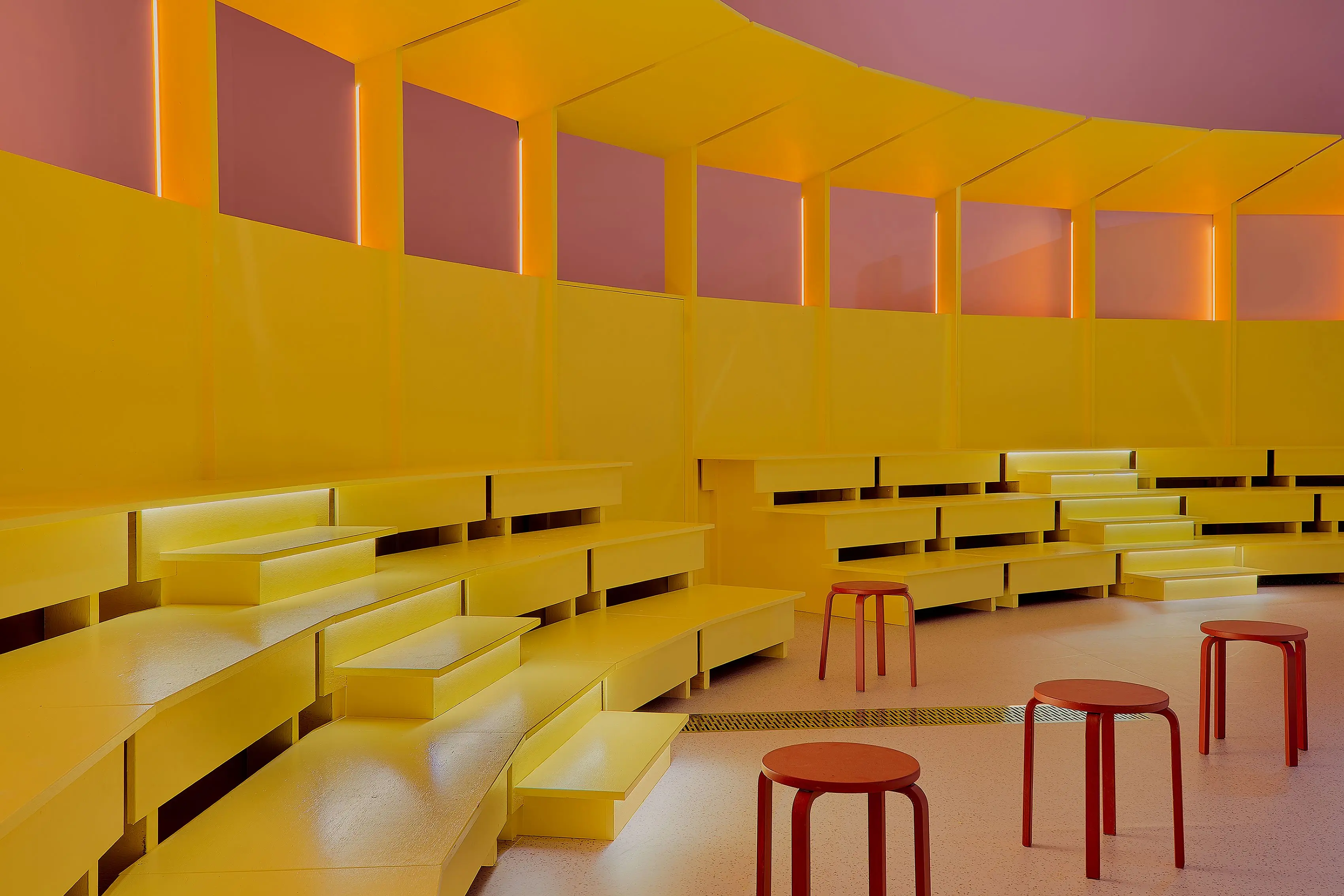
"A clear category standout, Kariton (Melbourne) pulled us in with its unpredictable take on a gelati bar, smack in the heart of Melbourne’s Chinatown. The space references the ramshackle, modern metropolis of Manila, with peeling painted walls, suspended merch and haphazardly scattered coloured stools.
"Beyond these elements, however, are layers of sophistication and surprise: statement double doors open to a chamber-like space with a high curved ceiling and glossy floor.
"In a departure from what we’ve come to expect of this genre, the colours of the products – in this case, the gelato – are apparent in subtle hints as opposed to dominant swathes.
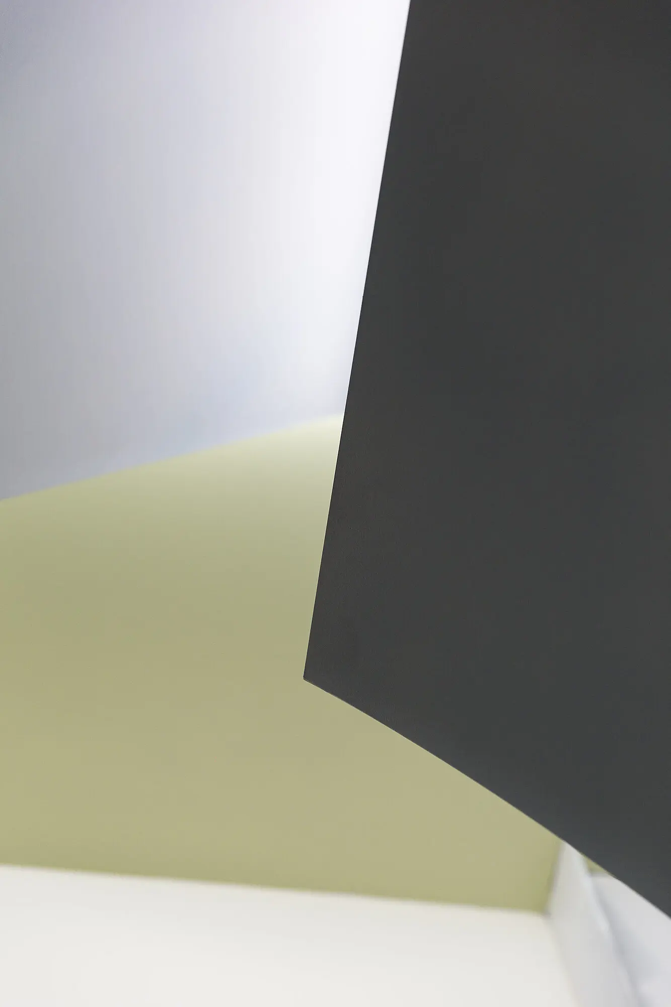
"Instead, the focus has been on creating a dialogue between finishes that either absorb or reflect light. Hence, the counter is black, the ceiling a mauvish-grey and the floor a reflective, glossy Avista® Chris White.
"The design strategy to merge culture and experimentation in this way has produced something wholly intriguing, unique and innovative."
Shaun Carter, judge.
Inside Kariton



The winning palette
Commendation
Agero Group
Level 16, 350 Queen Street, Melbourne

About the project
The design solution was to avoid a typical office environment when merging two offices into one in Melbourne's CBD.
The refreshed design started in the lobby with walls in green Misty Moss, an arched entrance in brown Cuddlepot and a feature wall in Black Caviar. The rich colours were balanced against the raw exposed concrete floor and columns.
The office's Social Hub, bathed in natural light, is finished in Palace Stone to offset the rich and textured tones of the furniture and joinery. Palace Stone is also used as the backdrop to the main work space with Cuddlepot and Misty Moss used as feature patterns on walls to contrast the monochromatic office furniture.
What the judges said
"A speculative office fitout that feels like a bespoke retail boutique is an unlikely design ambition but in this Melbourne office tower it has been neatly executed, nonetheless. Imbuing the interior with a strong colour strategy was key to avoiding a typical corporate aesthetic and we credit the unusual pairings that have been specified.
"A client-free brief undoubtedly allows greater creative freedom than the norm, but restraint has been used here and we commend the clever instances in which colour has been used to create depth and distinction. It demonstrates what’s possible when the shackles of expectation are shaken off, opening up new possibilities."
Inside Level 16, 350 Queen Street


Commendation
Kennedy Nolan
Up There Store
About
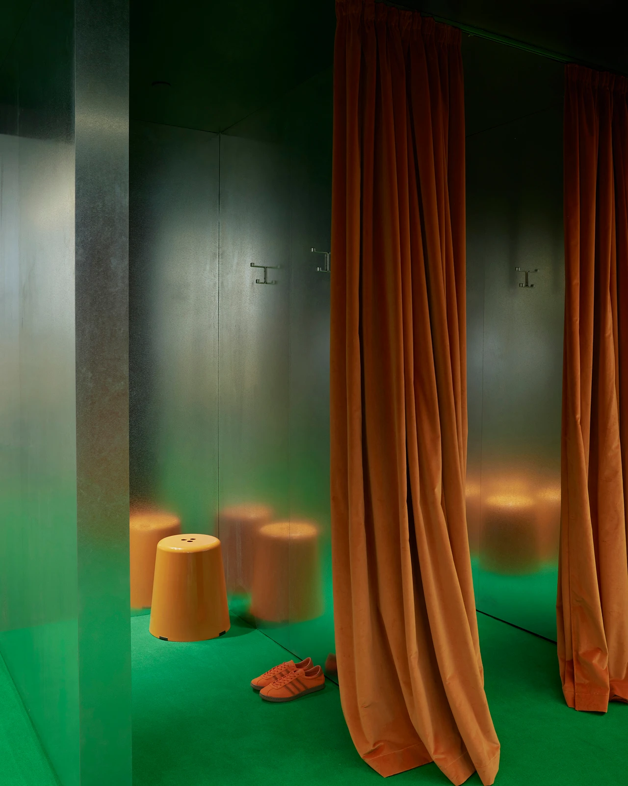
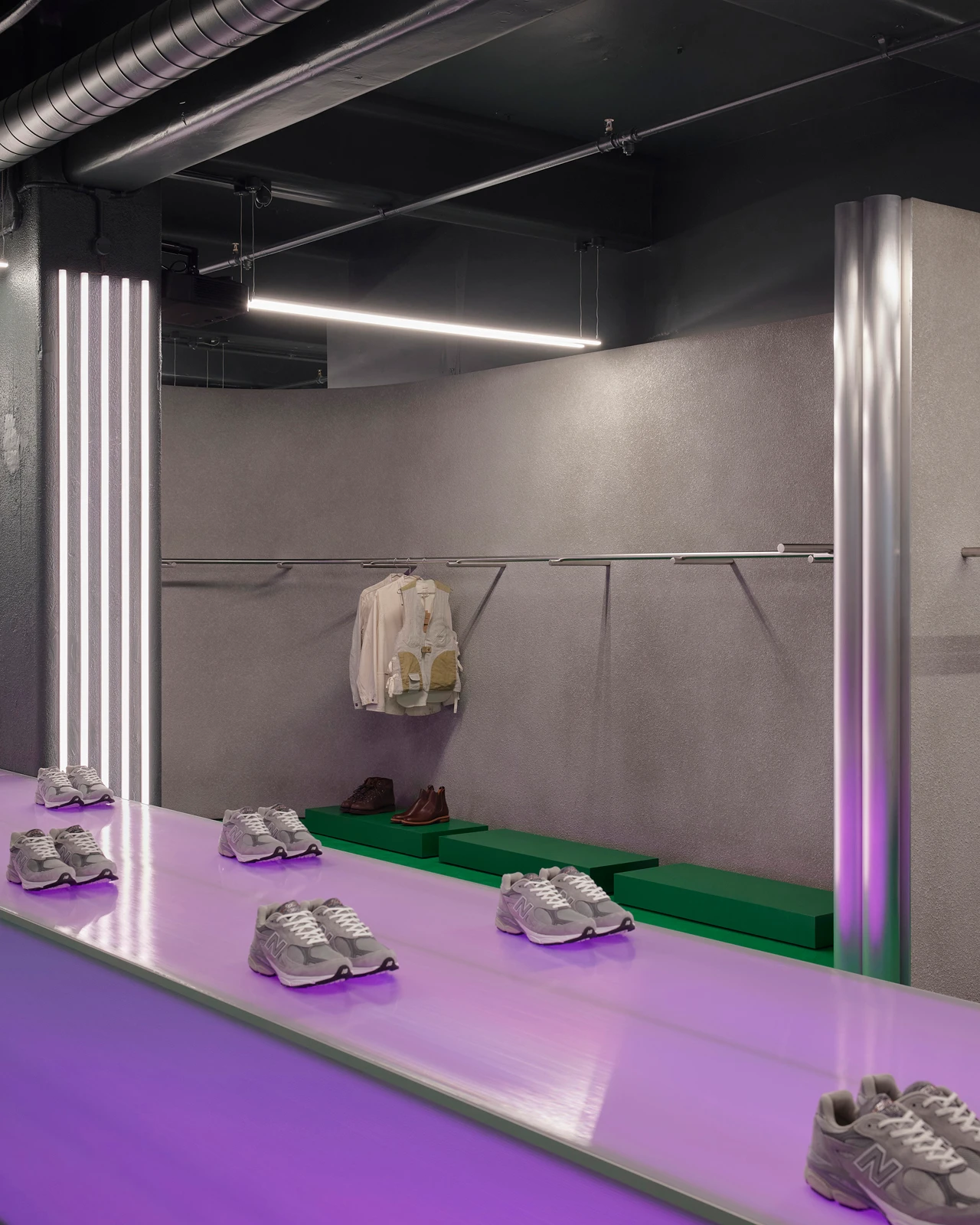
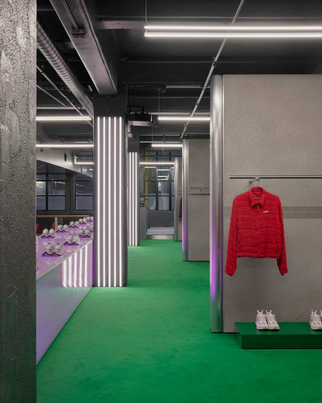
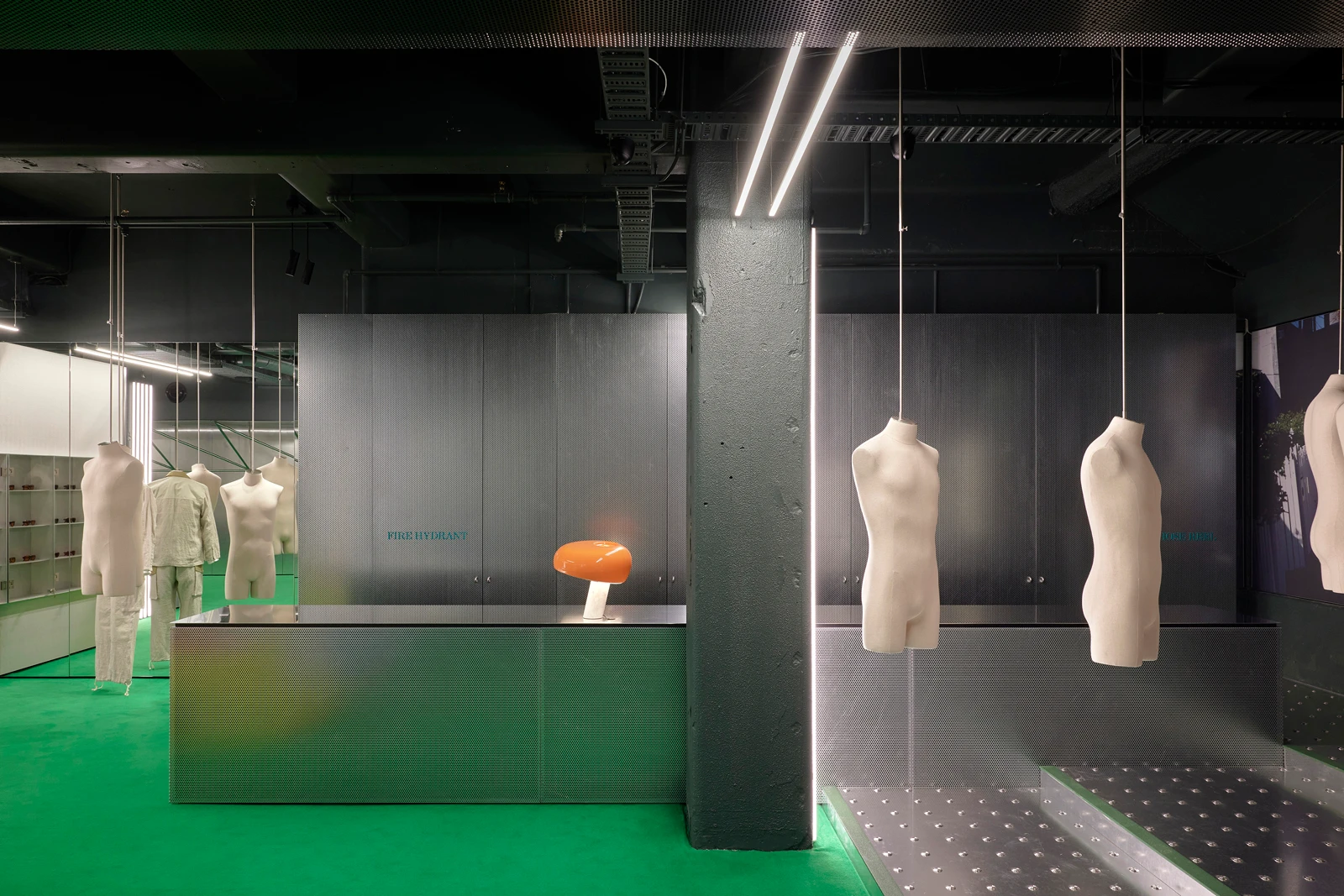
The new Up There flagship store in Melbourne's Flinders Lane was created as part of a major brand refresh. This change inspired a palette of saturated colour including the intense green floor – a key colour for Up There – that was used as a grounding colour and resonant of a grassy field.
What the judges said...
“This vibrant retail space is pure eye candy, sharp, snazzy and exceptionally well considered. It is easy to see how the architects were inspired from the outset by the brand’s saturated colour palette as well as the distinctive subterranean, inner-city space, and they’ve run with the brief to make this a flagship store for its dedicated followers.
"Kennedy Nolan are at ease with a directive calling for a ‘theatrical, cinematic, abstract, curated, expansive and memorable’ design and the practice is well versed in using colour to elicit emotion.
"An intense green floor sets the foundation, followed by a series of coloured lighting effects in bright singular shades specific to distinct areas of the outlet. At its centre is a long table with programmable coloured back-lighting adjusted to change up the mood.
"To allow these standalone gestures to truly pop, the architects have accurately chosen lowlight paint shades in grey and off white for the ceiling, walls and columns, a strategy that is as pivotal as specifying highlight colours, and we applaud them for striking the balance so finely."
Inside Up There Store
The palette
Dulux Colour Awards 2024 category winners
Explore how the winners brought to life the innovative use of colour in residential, commercial and public spaces.
Dulux Colour Awards 2024
Our finalists
View the 83 projects from designers and architects selected as this year's finalists from a record 527 entries across eight categories.
Image credits
Ari Hatzis Kariton | Simon Shiff Level 16, 350 Queen Street | Sean Fennessy Up There Store.


