Commercial Interior – Public and Hospitality
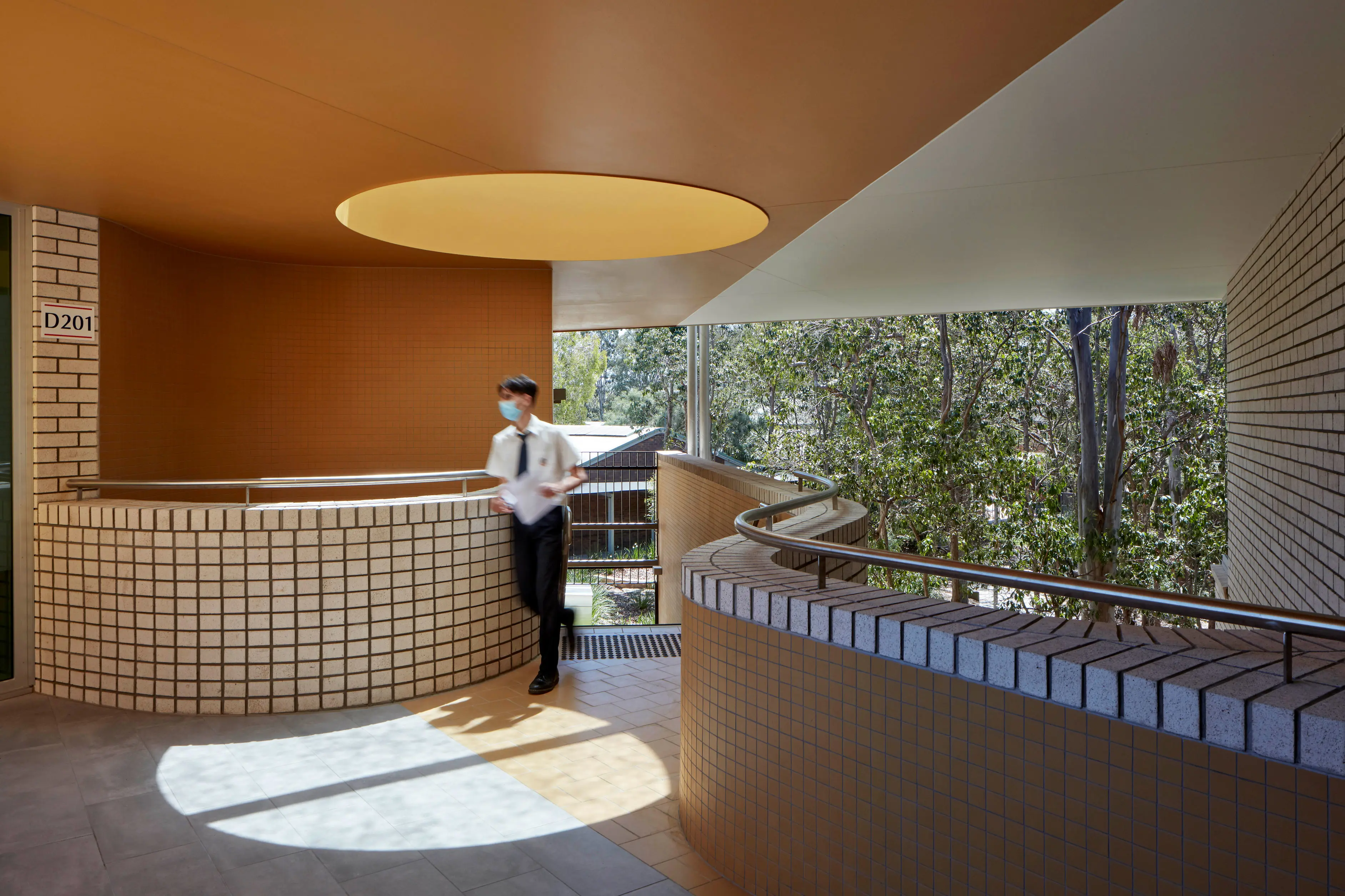
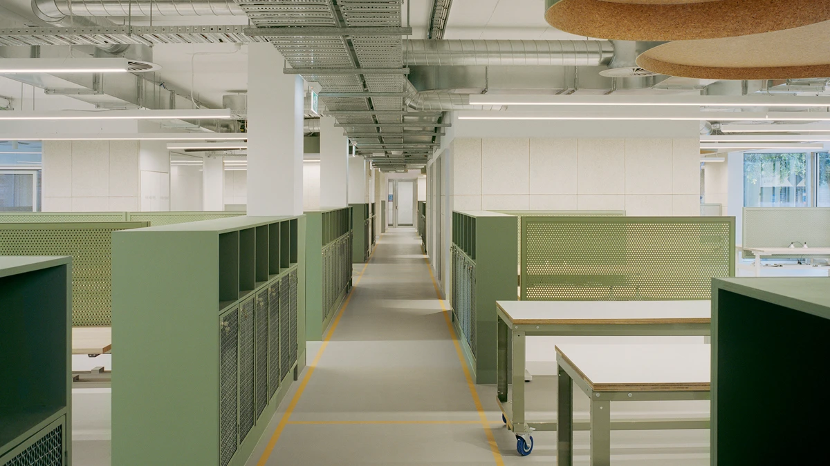
The Dulux Colour Awards 2022 Commercial Interior – Public and Hospitality category recognises the best interior paint finishes of any commercial or industrial building such as education facilities, community centres, healthcare facilities, museums, theatres, places of worship, cafes, restaurants, fitness centres, one-off installations, events, hotels and accommodation. Category and Australian Grand Prix winner: Studio Bright for Monash Robotics. Photograph: Rory Gardiner Colours featured: Burdoch
Winner


Studio Bright for Monash Robotics Lab, Melbourne.
About
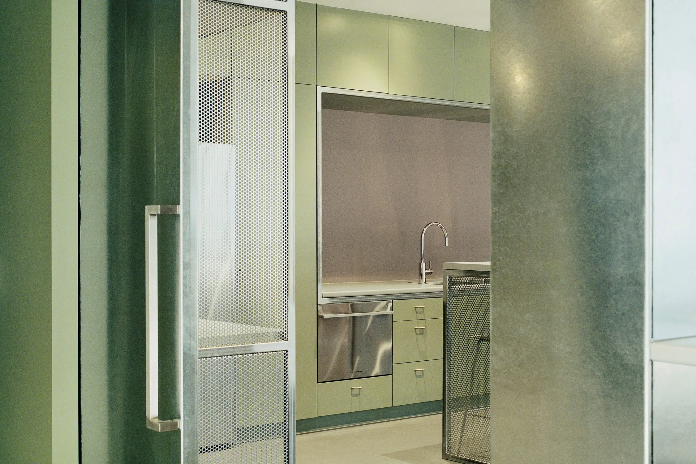
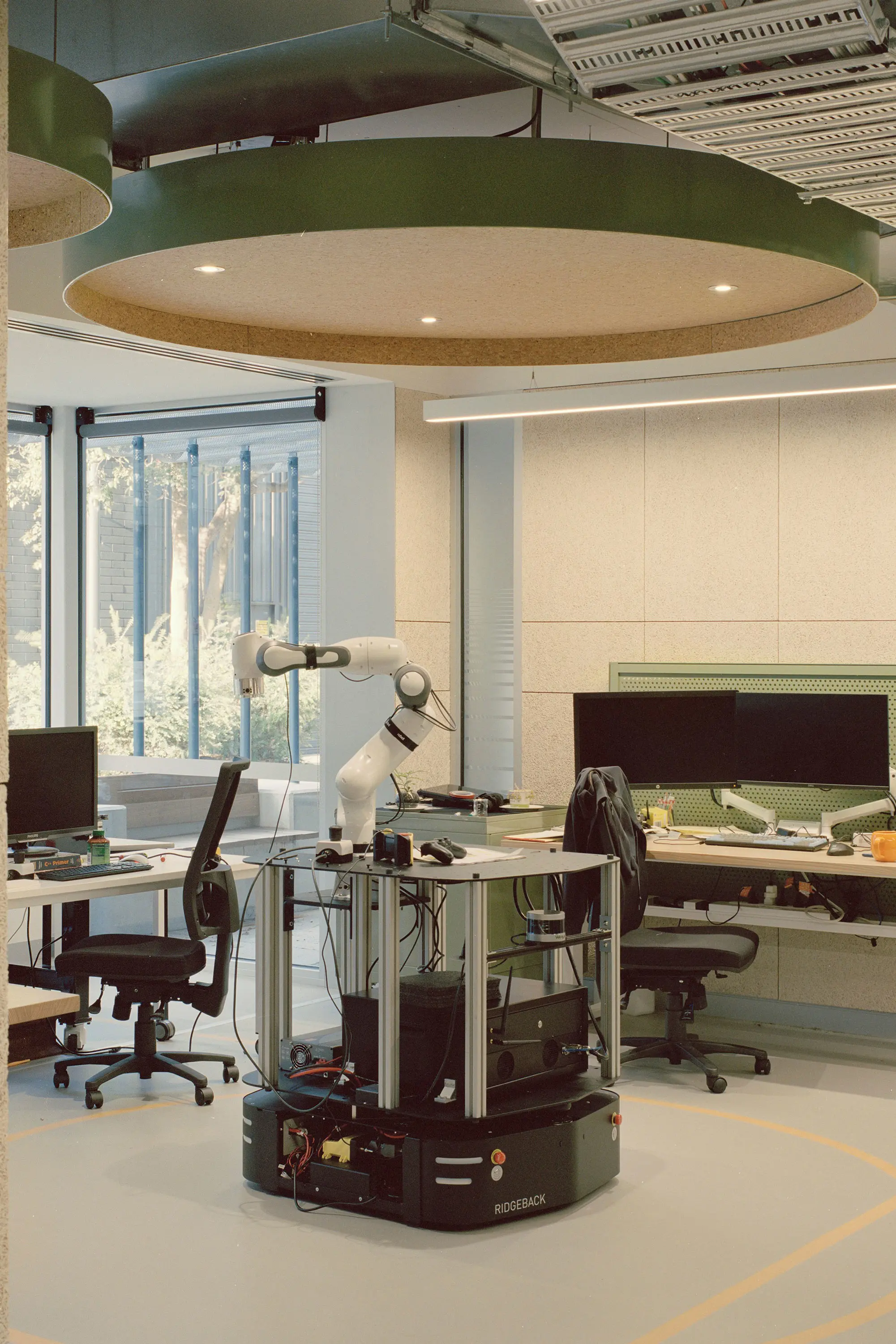
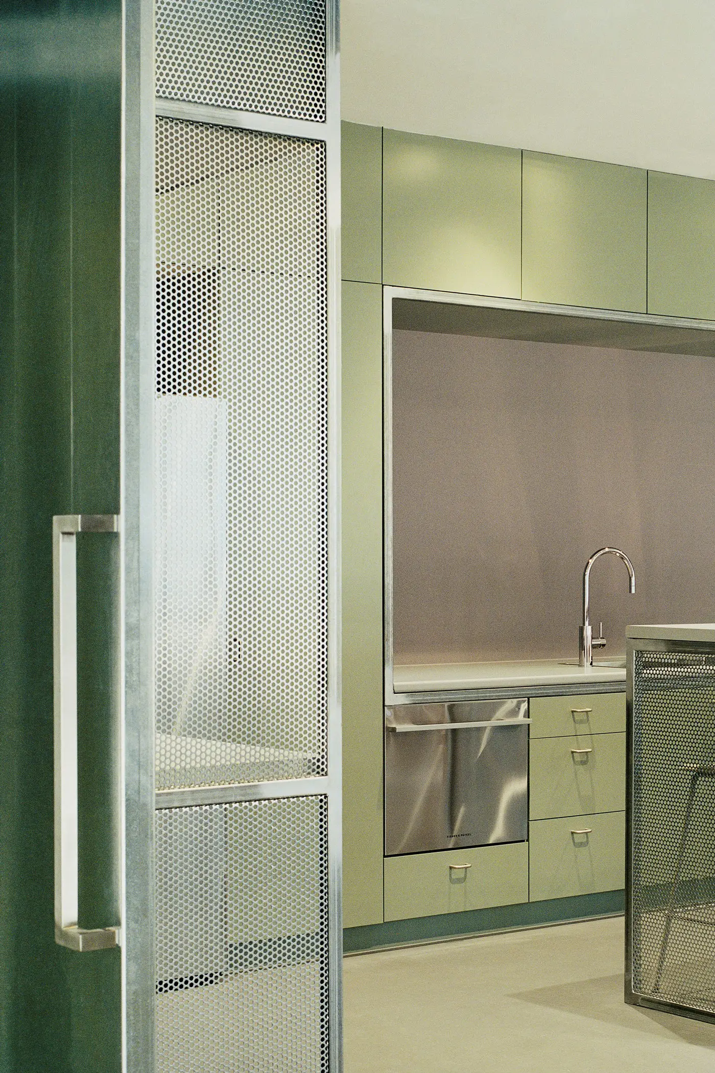
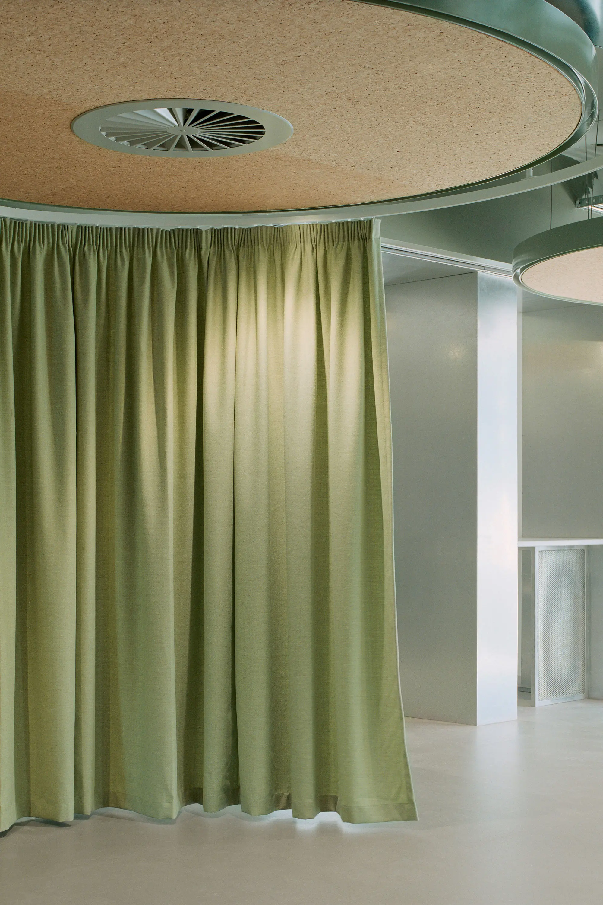
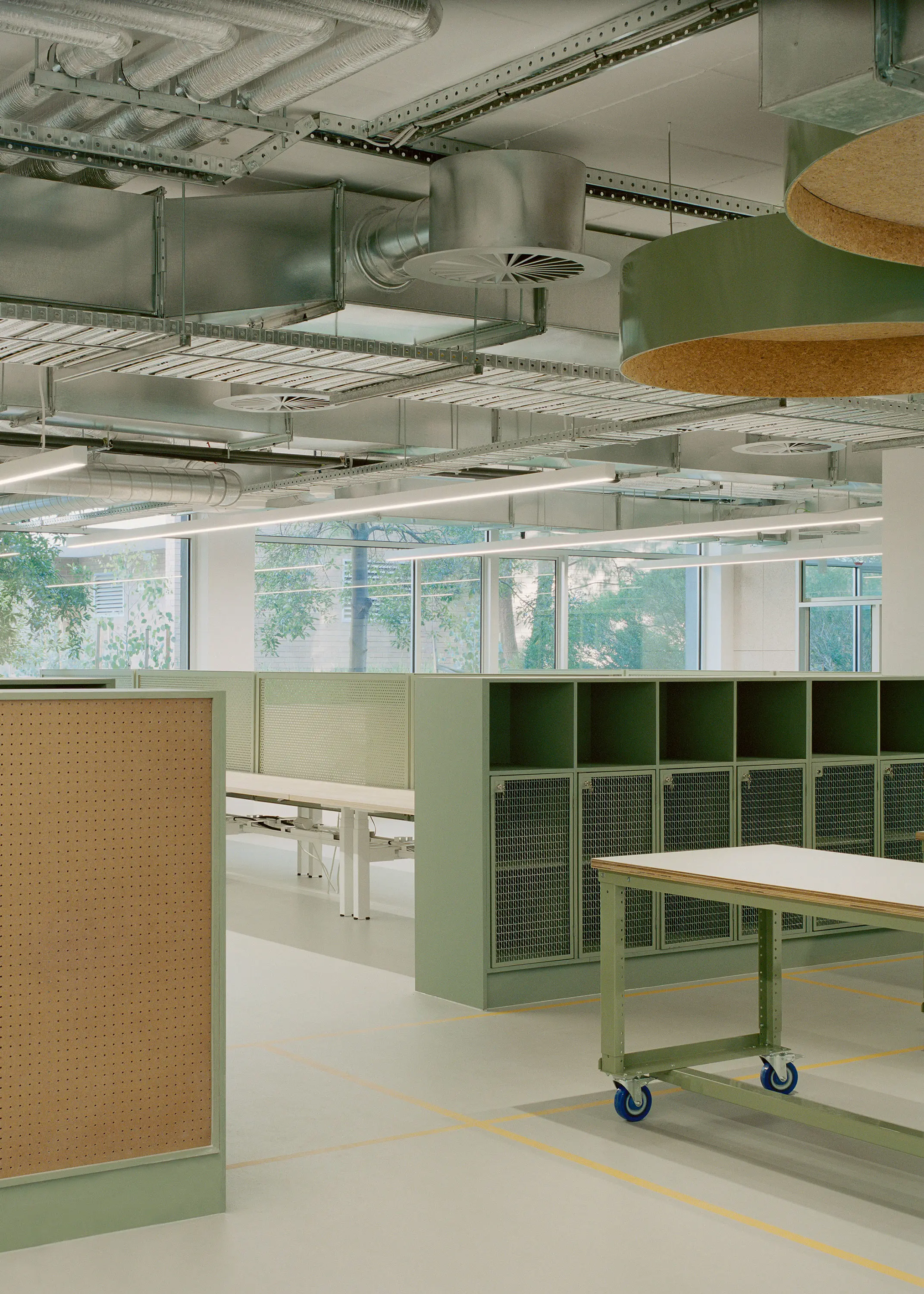
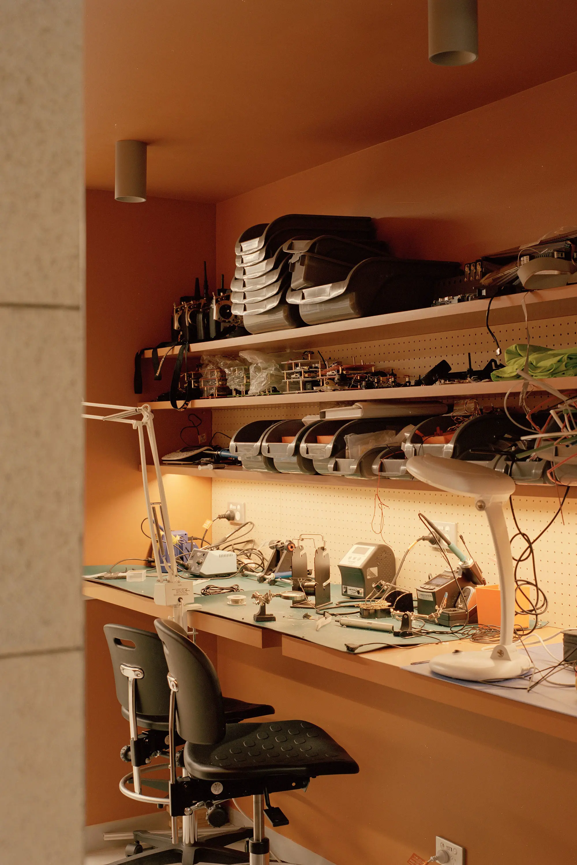
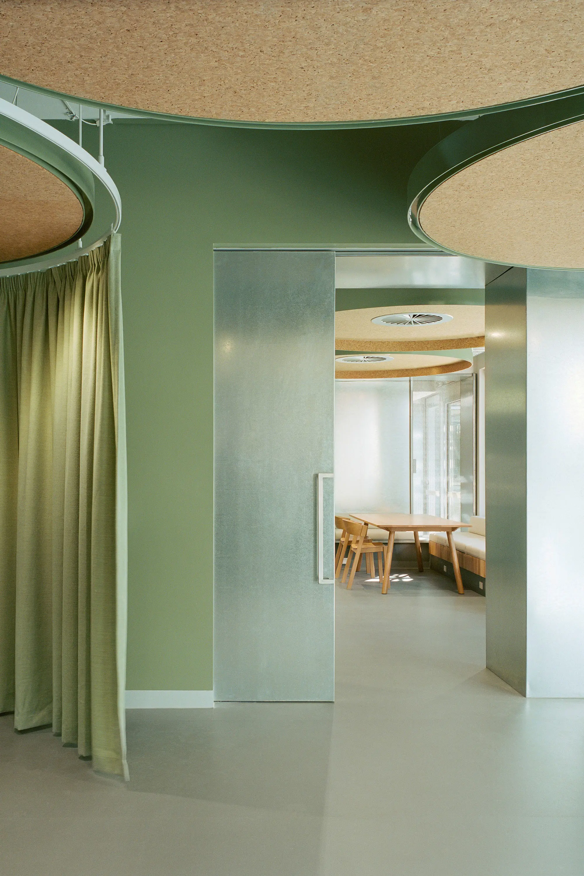
The Monash Robotics Lab is a research centre designed for utility and comfort at Monash University in Clayton, Melbourne. Burdock was used as the main interior colour for its calm tone, large hanging discs in Colorbond® Pale Eucalypt® indicate informal meeting spaces and Hot Ginger was used across the building for pops of colour. Wash&Wear Matt and Wash&Wear +Plus Kitchen&Bathroom Low Sheen were used throughout.
What the judges said...
"On a purely aesthetic level, the specified palette is refined and elegant, particularly the captivating play of vibrant shades with more subtle hues against natural materials. When considered within the context of a science laboratory on an educational campus, however, it becomes utterly striking for its unexpectedness. At this level, the architects’ intent is to be applauded, for it stares stereotypes in the face and demonstrates the value of originality."
The winning palette
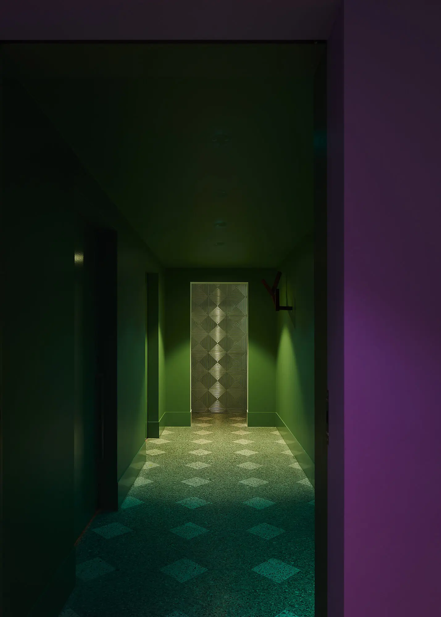
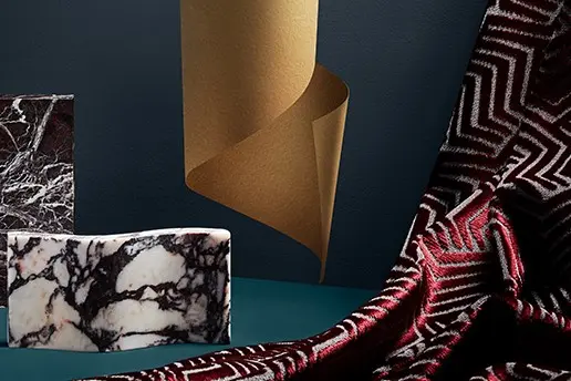
Studio Bright focused on a combination of calming greens, natural materials and geometry to create pleasant spaces and spark innovation at Monash Robotics Lab.
Gallery
Commendations
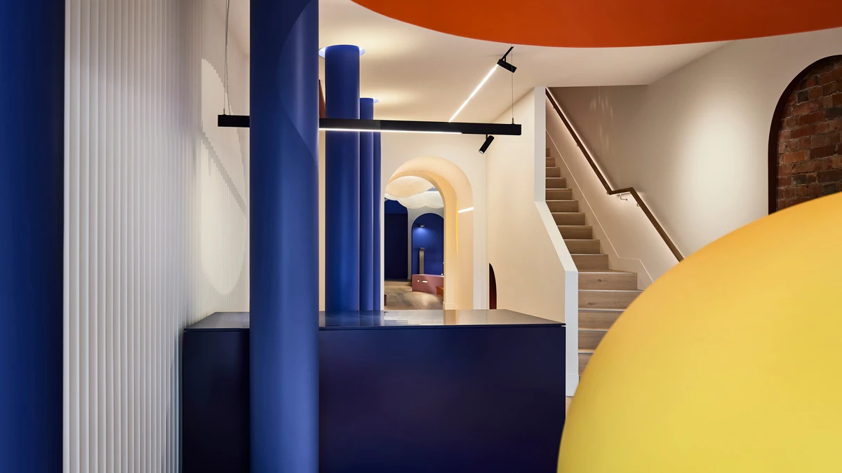
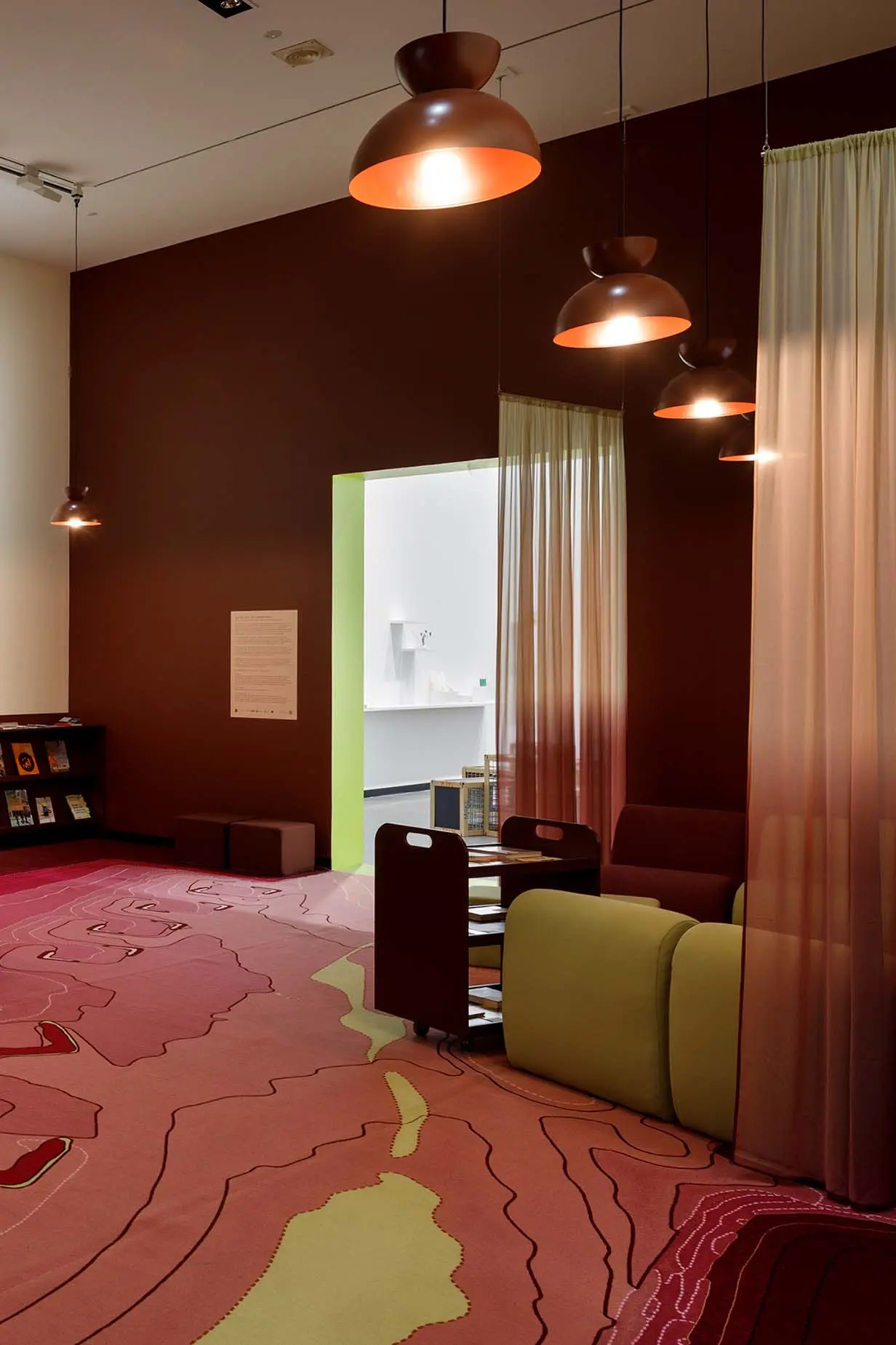
Nicola Cortese, Stephanie Pahnis and Lauren Crockett for Reading Space – The Common Room, Melbourne
What the judges said...
“An immersive exhibition, investigating public art, life and space, the Reading Space aims to soften the traditional idea of an institution and, ultimately, to encourage the act of reading. Colour and texture combine to convey a warm, comfortable atmosphere conducive to quiet contemplation and discussion. To this end, the palette is convincing; without it, the premise is lost. It demonstrates the extent to which colour can enhance the spatial experience, to orchestrate a sense of calm and encourage users to slow down.”

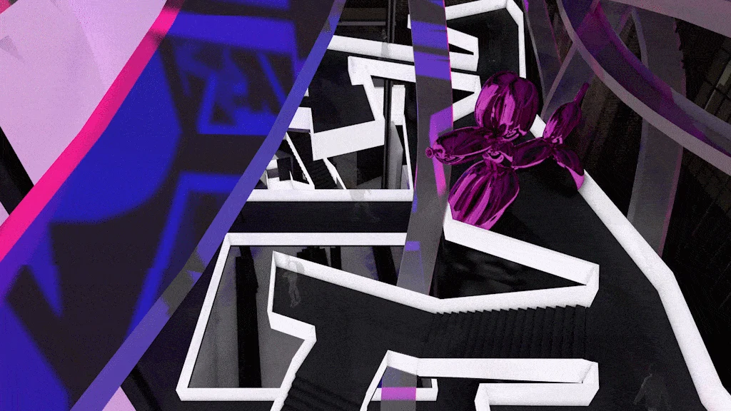
Hassell for Di Stasio Carlton, Melbourne
What the judges said...
“Di Stasio’s new Carlton establishment is one that will be indelibly printed on the memory, such is its level of originality and theatricality. Unlike any other restaurant design, this feels quite futuristic in its bold integration of art and colour, especially the brave, innovative use of green and purple. The design is refreshingly unconventional, with exaggerated proportions and clashing textures of concrete, sandstone and steel, coalescing in three distinct spatial identities. Far from whimsical, this interior ranges from cool and stark, to moody and immersive.”
