Forecasting a world of colour
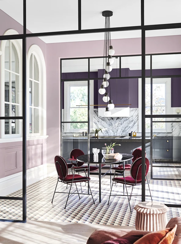
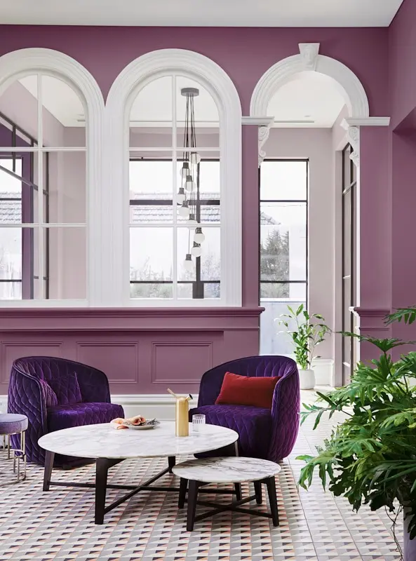
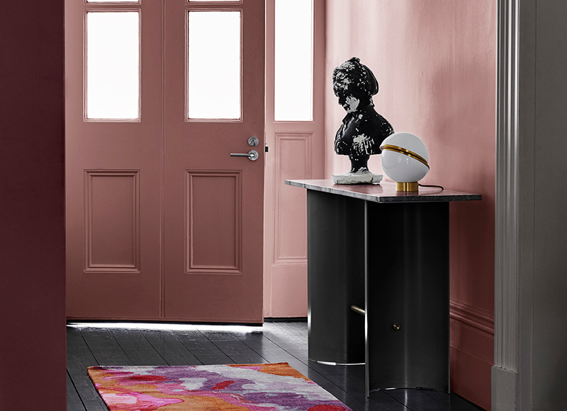
Since its inception in 1999, the Dulux Colour Forecast has evolved dramatically. Consumer trends and colour preferences are, of course, ever-changing, and this constant evolution is clearly articulated in each year’s forecast. By Lucy Feagins, Founder, The Design Files. Colours featured: Dulux Cuticle Pink, Splendid Coral, Friends, Carmen (feature wall) and Vivid White™ (trims and ceiling) from the Dulux Colour Forecast 2018 – Escapade Palette. Styled by Bree Leech. Photographer: Lisa Cohen.
Trendsetting experts
It's easy to dismiss colour trends as fleeting or fickle, but when it comes to colour, there are some things that are steadfast and constant. Now in its 24th year, the annual Dulux Colour Forecast is renowned for distilling and defining global colour trends, for the local market. Based on rigorous research, the Forecast is a guiding beacon when it comes to colour and trends forecasting for Australia's design and architecture industries.
Andrea Lucena Orr is Dulux's long-standing Colour & Communications Manager and has been involved in producing the Colour Forecast. She explains 'There’s quite a process involved for reviewing key influences and researching, looking at new product designs, designers, fashion, technology, global news, economy, political news'.
Andrea and her team attend many key industry seminars and events such as Milan Design Week to source inspiration for the Colour Forecasts.
"Once our team has all of the research and information we need to look at where there is great repetition of colour, texture, etc," Andrea explains. "Crucially, this info is then considered through an 'Australian/New Zealand filter', to ensure the colours will work in the Australian market, taking into consideration the distinctive light in the Southern Hemisphere, alongside lifestyle and cultural differences."
Hot pink days
In the 2013 Colour Forecast, the Blur palette included a bright, almost neon pink, that was sure to spark an instant sense of nostalgia amongst design afficionados. Remember when every cushion, tablecloth and home accessory seemed to feature a piercing fluorescent edge or detail?
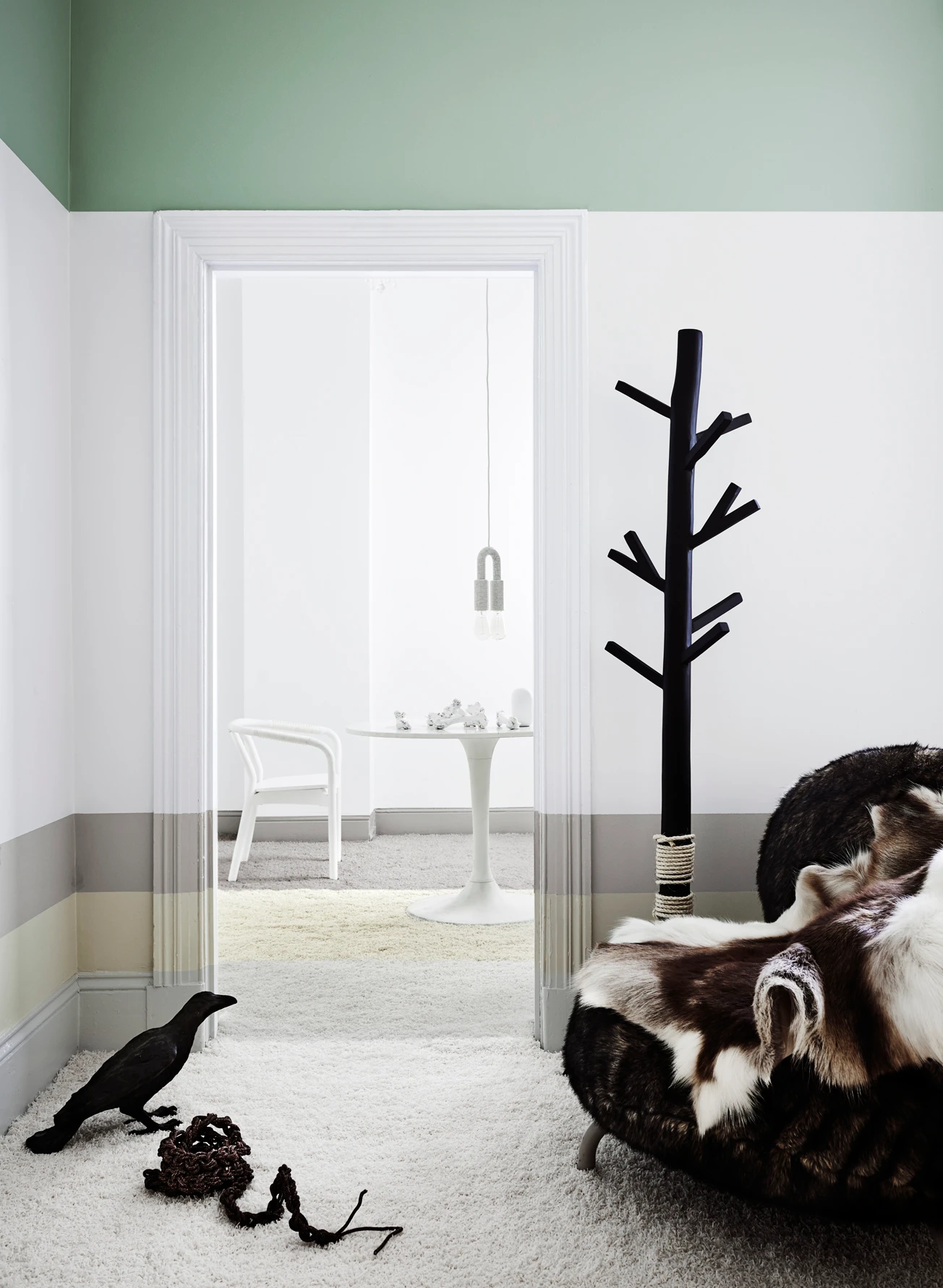
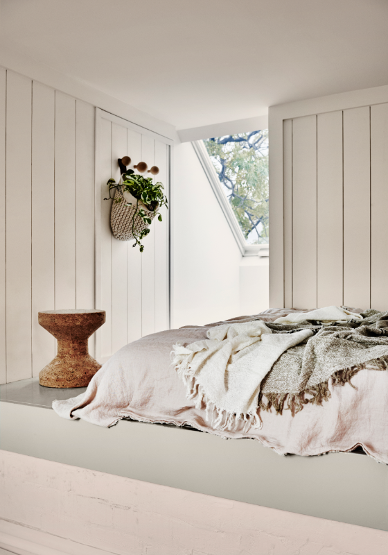
Wall
Snow Green Quarter
Greens range from yellow citrus greens through to blue greens such as teals. Lighter muted greens can add a peaceful and relaxed feel to a room whilst citrus and brighter lime greens can liven up a space. Greens are versatile and easy to live with and can be used on the inside and outside of your home.
Lush greenery
Minimalist moment
In 2017, we entered a restrained, more pared-back era. Scandinavian minimalism was having its moment in the spotlight, as captured in the Sentience palette, where chalky neutrals, greys and greiges brought a sense of calm to contemporary Australian interiors. Whitewashed timbers, white and grey stone benchtops and tan leather accents defined interiors.
Shades of grey
The grey theme continued through to 2018, where palettes including Kinship and Essential (pictured) cemented Australia’s long-standing love affair with grey interiors from soft icy pastels to deeper mid-greys.
Ceiling
Terrace White
With a hint of a grey-beige undertone, Terrace White is ideal for pairing with cooler whites and muted shades. It is perfect for interior or exterior walls and trims. Terrace White schemes beautifully with Lexicon® Half or Tranquil Retreat.
Comforts of home
Fast forward to today, where trends have clearly shifted into much warmer territory – as seen in 2021’s comforting forecast consisting of browns, deep reds, terracottas and much warmer neutrals in the Retreat, Nourish (pictured) and Reset palettes.
Warm days ahead
So, what does Andrea see for the year ahead when it comes to colour?
"We will continue to see some earth-based colours lingering on, as they seem to be the security blanket we need at the moment during uncertain times," Andrea muses.
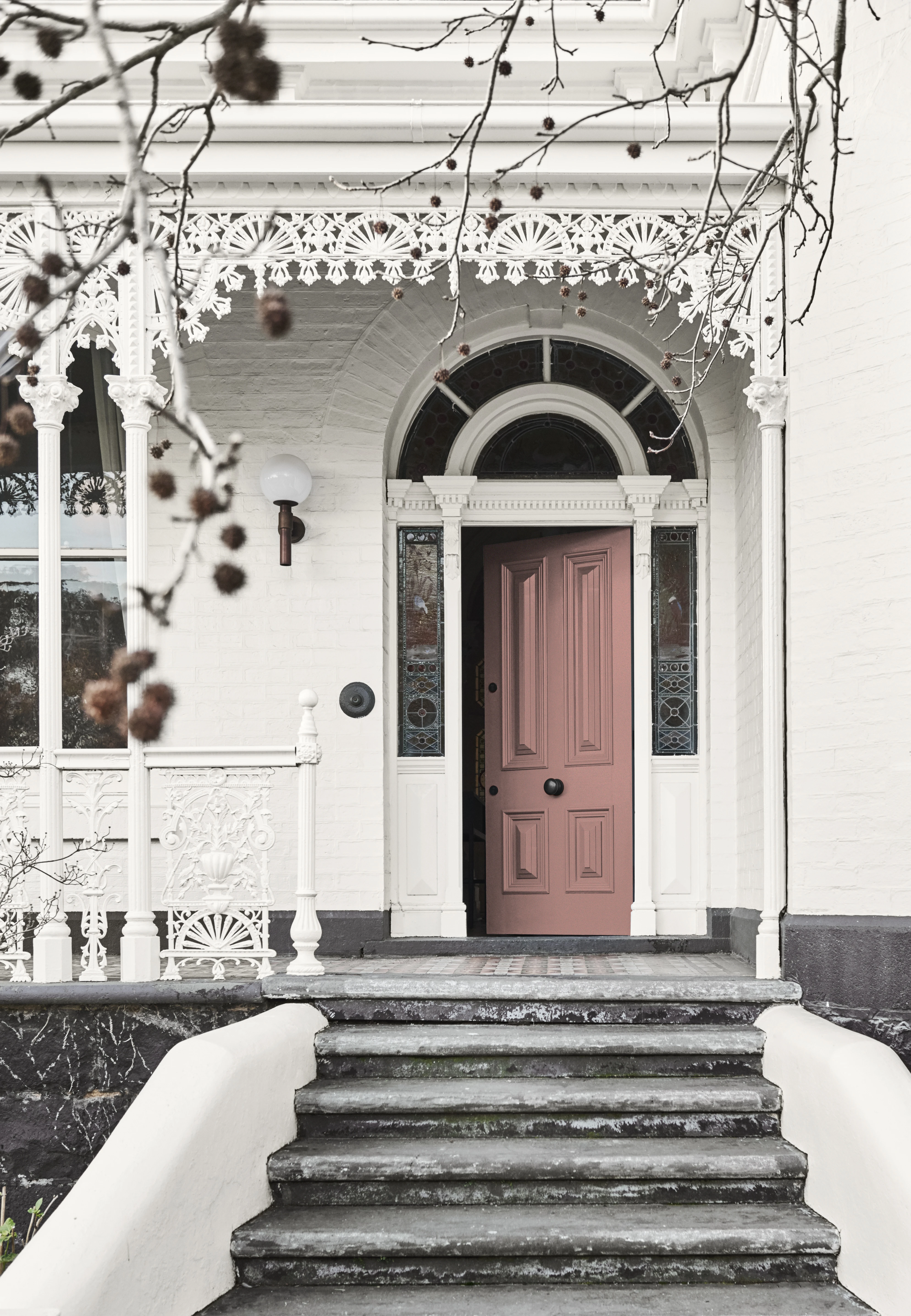
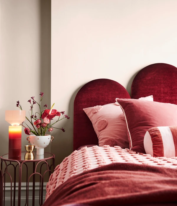
So, the next 12 months will herald a consolidation and continuation of the warmer, earthy hues we've been seeing so much of over the past few years with a few unexpected surprises that Andrea can't divulge until the release of the 2023 Dulux Colour Forecast very soon!
Trends over the years
Wall
Snow Green Quarter
Greens range from yellow citrus greens through to blue greens such as teals. Lighter muted greens can add a peaceful and relaxed feel to a room whilst citrus and brighter lime greens can liven up a space. Greens are versatile and easy to live with and can be used on the inside and outside of your home.
Wall
Snow Season Quarter
Snow Season Quarter is a popular soft and neutral grey white. It is perfect as the main colour throughout the house or as a trim colour inside or outside.
Wall
Lexicon®
Bring a smart, modern look to your home with this crisp white. Lexicon® is a ‘space opener’ and its fresh feel lets you bring textures and cooler coloured furnishings into play.
Wall
Solution
Solution is ideal for creating a holiday feel at home, all year round. This oceanic green colour pairs well with Purple Balance, minty Soft Fresco and the solid blue of Bondi to make feature walls, cupboards and shelving really pop.
Wall
Deep Sapphire
Blues can create a tranquil and calming atmosphere in your home. Dark blues can add a sophistication and moodiness to the space whilst lighter blues can add a sense of calm. Blue is a versatile colour and can be easily schemed with many other colours for the interior or exterior.
Ceiling
Lexicon® Half
For a crisp, modern look Lexicon® Half is a perfect clean white suitable for trims or main walls for both inside and out. It is a great white for highlighting exterior features or if you're looking for a bright white for walls. Lexicon® Half pairs well with neutrals, cool greys and charcoals such as Candle Bark, Colorbond® Woodland Grey®, Dieskau, Highgate, Miller Mood, Milton Moon, Oolong, Silkwort, Stepney and Terrace White.
Cabinetry
Sea Creature
The beautiful fresh teal green of Sea Creature is the perfect colour for accents and front doors. It pairs well with warm neutrals such as Complex Beige and crisp white Lexicon® Quarter.
Wall
Blind Date
Blind Date is a soft warm neutral with a red undertone that can be used as a main colour or feature colour both inside and out. Pair it with crisp whites to create an aura of elegance.
Wall & Ceiling
Vivid White™
Vivid White™ is a pure clean white that is perfect for creating a clean, contemporary look. It is the ultimate choice for modern interior walls and trims and is also ideal for exterior features such as fretwork and window frames. The crisp freshness of Vivid White™ will brighten any space and give it a luxe modern vibe.
Trim
Lexicon® Half
For a crisp, modern look Lexicon® Half is a perfect clean white suitable for trims or main walls for both inside and out. It is a great white for highlighting exterior features or if you're looking for a bright white for walls. Lexicon® Half pairs well with neutrals, cool greys and charcoals such as Candle Bark, Colorbond® Woodland Grey®, Dieskau, Highgate, Miller Mood, Milton Moon, Oolong, Silkwort, Stepney and Terrace White.
Door
Lexicon® Half
For a crisp, modern look Lexicon® Half is a perfect clean white suitable for trims or main walls for both inside and out. It is a great white for highlighting exterior features or if you're looking for a bright white for walls. Lexicon® Half pairs well with neutrals, cool greys and charcoals such as Candle Bark, Colorbond® Woodland Grey®, Dieskau, Highgate, Miller Mood, Milton Moon, Oolong, Silkwort, Stepney and Terrace White.
Ceiling and trims
Lexicon® Half
For a crisp, modern look Lexicon® Half is a perfect clean white suitable for trims or main walls for both inside and out. It is a great white for highlighting exterior features or if you're looking for a bright white for walls. Lexicon® Half pairs well with neutrals, cool greys and charcoals such as Candle Bark, Colorbond® Woodland Grey®, Dieskau, Highgate, Miller Mood, Milton Moon, Oolong, Silkwort, Stepney and Terrace White.
Wall
White Dune Quarter
White Dune Quarter is a creamy white with a subtle green undertone. It is perfect for pairing with greys, browns and charcoals.
Ceiling
Natural White™
Natural White™ is the lightest of warm whites and also one of our most popular. Loved by home renovators and interior designers alike, this versatile white will brighten any space. It is perfect for main walls inside and out and ideal for exterior features. It never fails to impress.
Wall
New Neutral
The lovely subtle green of New Neutral is beautiful for your projects inside and out. It pairs well with Army Greens, dark charcoals like Hardened Steel and crisp whites like White on White™.
Door
Evening Blush
Evening Blush is beautiful, warm clay-coloured pink that pairs well with soft neutrals such as Beige Artefacts. It can be used as an accent colour such as on a feature wall or used as an all-over wall colour to add a sense of warmth and drama to any space.
Wall
Smoky Quartz
The subtle neutral pink of Smoky Quartz can contribute to a stunning scheme perfect for your master bedroom and formal spaces. Smoky Quartz balances beautifully with the timeless Bruised Burgundy and cool, fresh white of Lexicon® Quarter.
Wall, Door & Surrounds
Terra Rose
The deep rose hue with a pinking undertone of Terra Rose can brighten up a space and add some life. It can add to an opulent and tastefully elegant colour palette in your favourite room. It pairs well with the moody Biro Blue and classic warm White Exchange Half.
Wall
Whisper White
Whisper White lets you create a welcoming atmosphere in your home. As the most perfect ivory, it is a lush, warm white that works beautifully with most colour schemes inside and out in any style of home.
Wall
Vintage Beige
A warm midtone neutral with ochre undertone, Vintage Beige is great as main wall or trim colour inside and outside.
Ceiling
Natural White™
Natural White™ is the lightest of warm whites and also one of our most popular. Loved by home renovators and interior designers alike, this versatile white will brighten any space. It is perfect for main walls inside and out and ideal for exterior features. It never fails to impress.
Explore our Colour Forecasts
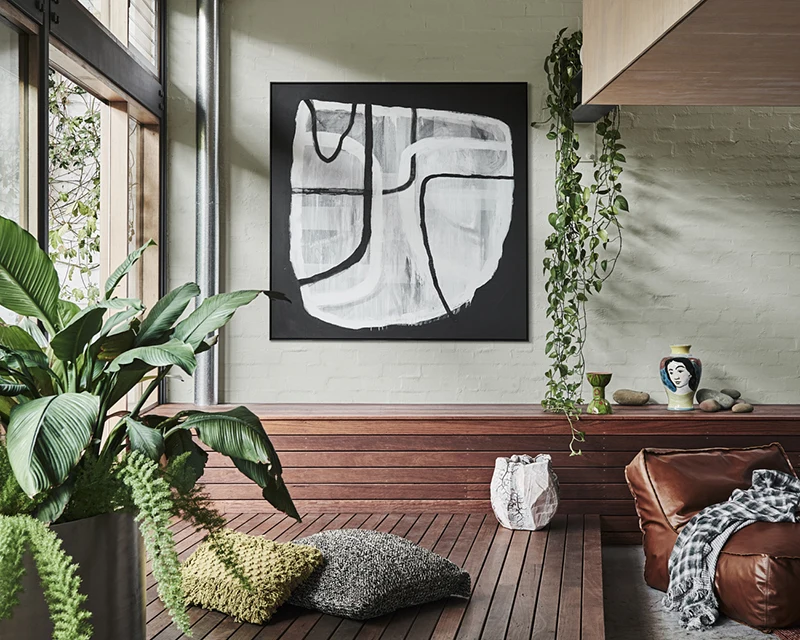
Comprising soft comforting neutrals which have rich, invigorating accent hues that allow moments of personal expression.
Redefining your home spaces was the goal of the Nourish, Reset and Retreat palettes in 2021.
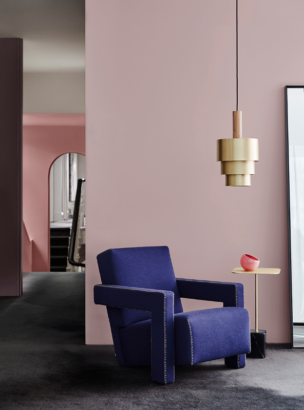
Reconnecting was at the centre of the Grounded, Comeback, Cultivate and Indulge palettes of 2020.
Creating your happy place was the focus of the Repair, Wholeself, Legacy and Identity palettes in 2019.
As life moved into the fast lane, the desire to shift gears and slow down took over. The Balance theme harnessed the power of colour to take on life's complex challenges.
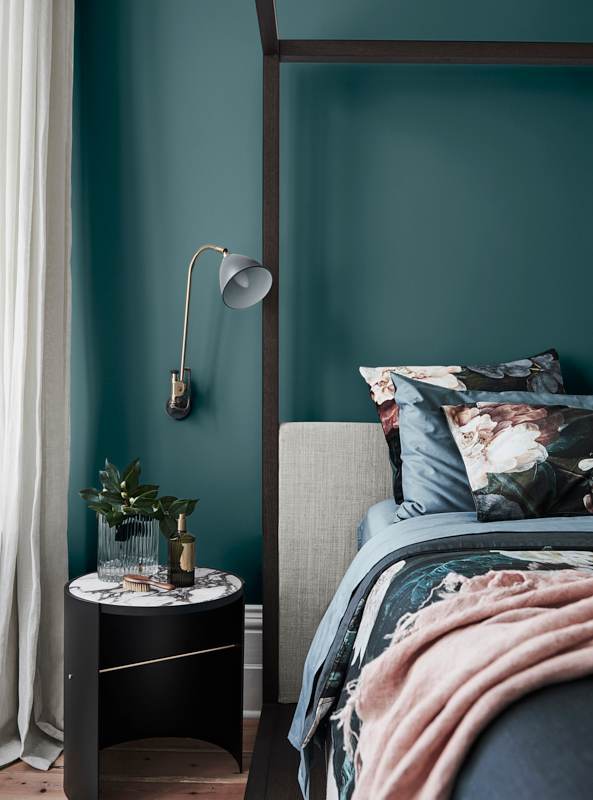
An antidote to many challenges we faced was provided in the distilled colour palettes of Sentience, Chroma, Entwine and Construct.
Disclaimer
Colours displayed should be used as a guide for your colour selection. To ensure best accuracy, test your colour choice at home by ordering Dulux sample pots, stickers and A4 colour swatches.