Dulux Colour Forecast: inception
Colour trends for the new millennium
We were in a period of transition in 1999-2000. As we moved into the new millennium, trends became more fickle and varied. Colour design was more free of fashion restraints and trends than ever before.
The '90s were a decade of individualised style and eclecticism. Meanwhile, the early 2000s saw the public grow more adventurous in using and understanding colour at a surprisingly fast rate. Colour was no longer timid and certainly not taking a back seat to design and textures as in the past.
Updating with colour
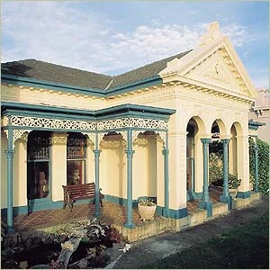
This heritage home in Dulux Clotted Cream took on an innovative stylish look when coupled with the vibrant blue on the posts, windows, guttering and columns.
A bold change with a combination of soft custard yellow walls and a calm green ceiling against the eye-catching mineral blue island bench and green cabinetry.
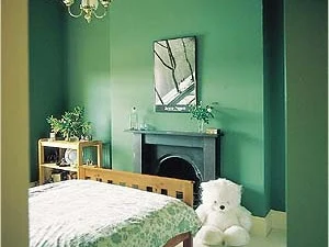
Leafy plants in this heritage bedroom complemented the natural green walls that were reminiscent of cocos palms and ideal for pairing with warm whites.
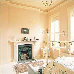
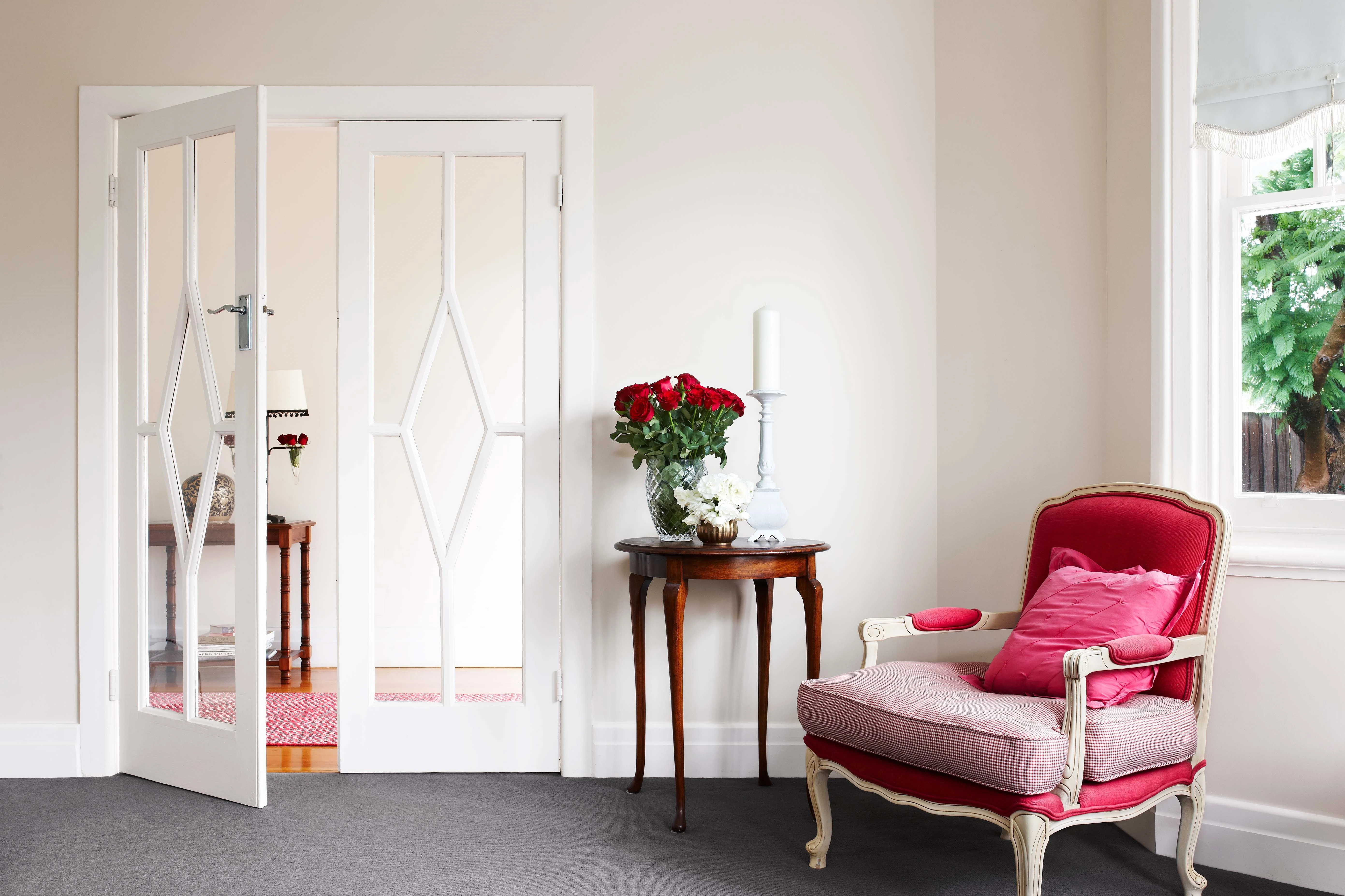
This classic combination of warm neutrals on the ceiling, cornice, skirting and windows with soft apricot on the walls created an atmosphere of traditional elegance.
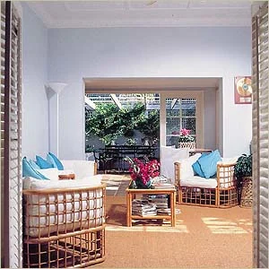
The lightest of purples added a modern feel to the walls while Dulux Vivid White™ framed the outdoor aspect.
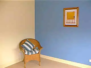
Feature walls were quickly becoming the must-have home trend. Deeper colours were adding interest to many rooms throughout the home.
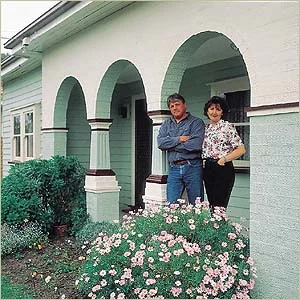
A soft combination of varying shades of mint green exterior walls and windows perfectly matched Dulux Lime White on the columns and crimson gutters and trim.
Back to basics
There was a hunger for homeowners to create their own individual palette of colours and create a distinct look. As a result, many opted to stay with the same basics in their homes instead of starting with a trend from scratch, and were instead making updates through new colour selections.
Among the significant trends were earth-based colours and country pastels.
Earthly Basics palette
Overpowering social and economic forces were assaulting us all with pressures of work, traffic, child raising and instant communications that demanded instant results, leaving us feeling battered and seeking shelter from the storm of modern life. The home became the sanctuary. This was reflected in the continuation of the environmental natural colours, with khaki-based greens and tans leading the way. In times of change, we fell back on the familiar and secure. We looked to nature and the home environment to create a safe and secure palette. Such colours as aqua, green-blue and turquoise emerged along with plenty of red earth-toned browns. Colour set the sheltering tone as it merged all the materials into a whole statement of the home as a sanctuary.
Country Linens palette
The soft, pastel tones of crisp country linens were creating a palette of relaxing, yet sophisticated colours similar to that found in the homes of European royalty. Washed denim, gingham check, crocheted lace, floral prints and whitewashed furniture brought the charm of a French farmhouse into the home. Delicate pink indicated a return to femininity. White was replaced with neutral backgrounds, even the traditional white window trim was turned to tan to give a softer look, eliminating strong contrasts.
Dulux Colour Forecast: now and then
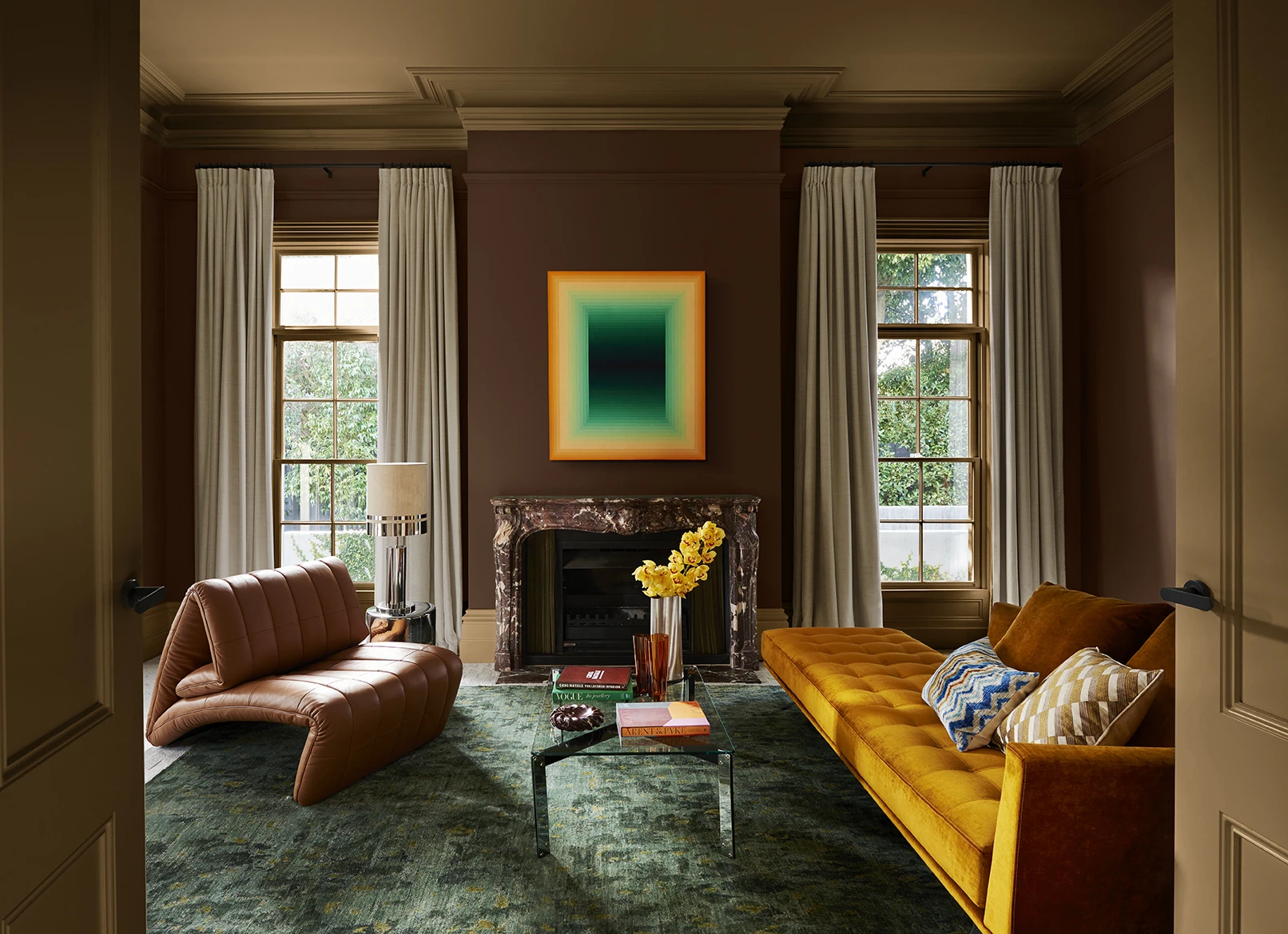
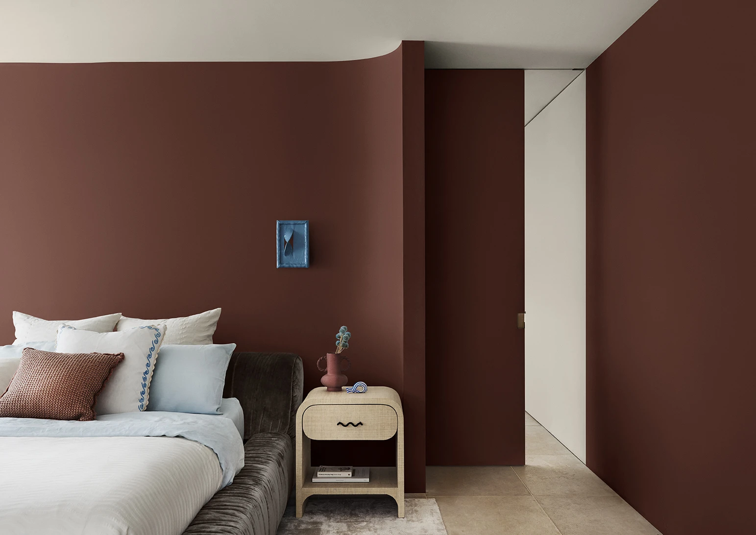
Dulux Colour Forecast 2024 reflects an inner desire for positivity and spaces that nurture within our homes with warm colours such as rich golds, olive greens and reddy browns.
We're proud to be at the forefront of colour trends in interior design as we celebrate the 25th anniversary of the Dulux Colour Forecast!
Download the Dulux Colour Forecast 2024 brochure to explore the three beautiful palettes and be inspired to transform your home with the latest trends.
Love your colour
Dulux Authentic Colour®
Only Dulux colour mixed with Dulux Wash&Wear® paint gives you exact colour accuracy to create Dulux Authentic Colour® palettes that look fresh in your home for years.
Disclaimer
Colours displayed should be used as a guide for your colour selection. To ensure best accuracy, test your colour choice at home by ordering Dulux sample pots, stickers and A4 colour swatches.
