![interior grey lounge room with grey couch and chair.
Ceiling Terrace White
Walls Spanish Olive](http://images.ctfassets.net/j001bqnk84dk/4JJjbW4Nu2GMGgjCub4kRi/56de9ac81d3e0a5555345cd40347ca87/cq5dam.web.1280.1280__13_.jpeg?fm=webp&fm=webp)
Colour Forecast 2018
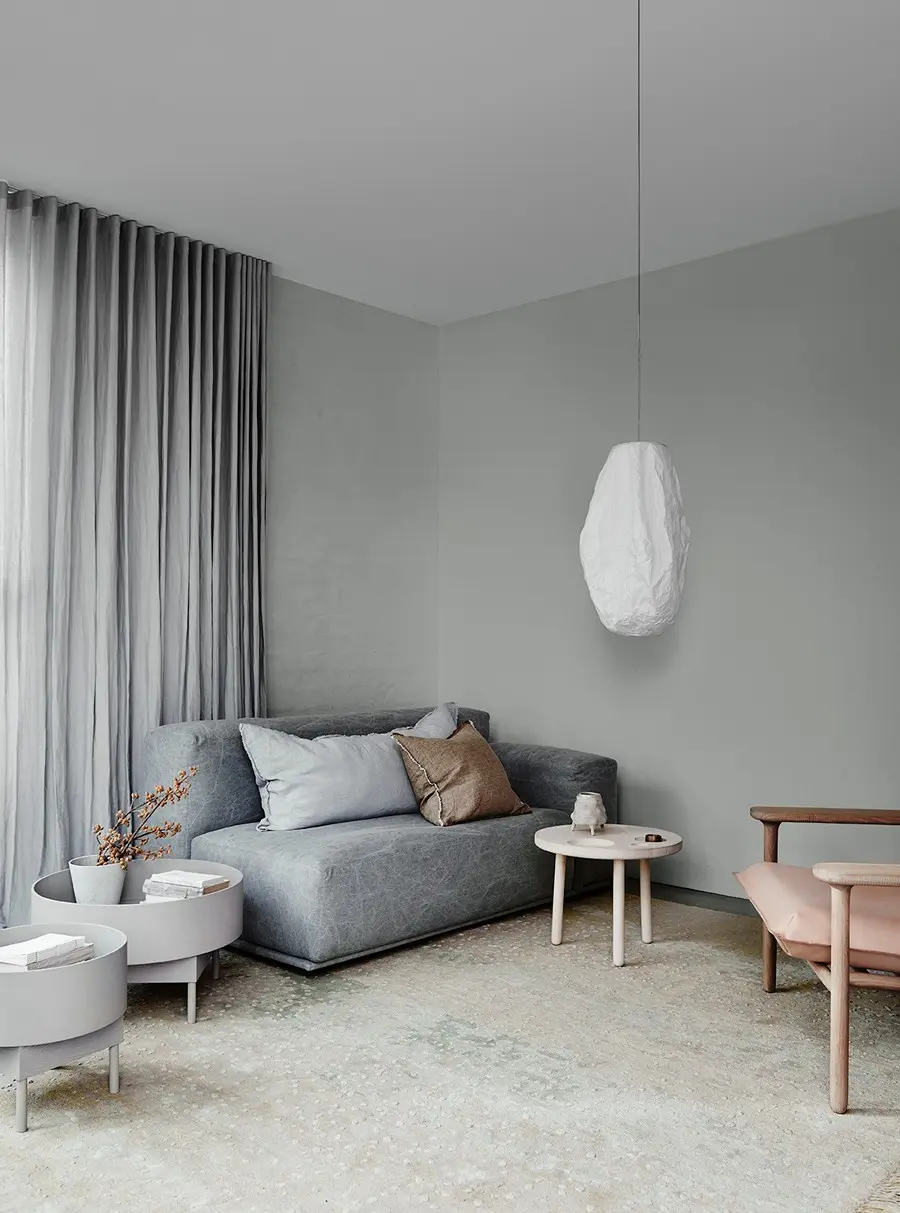
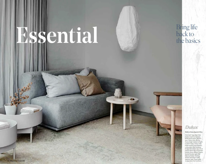
Essential
It’s the simple pleasures that remind us that life need not be so complicated. The familiar comfort of a cup of tea, the warm kiss of the sun on your face – beauty can exist in the most humble and quietest of moments. Showy status symbols begin to lose their shine, replaced by the Nordic tradition of Hygge.
Bring life back to basics
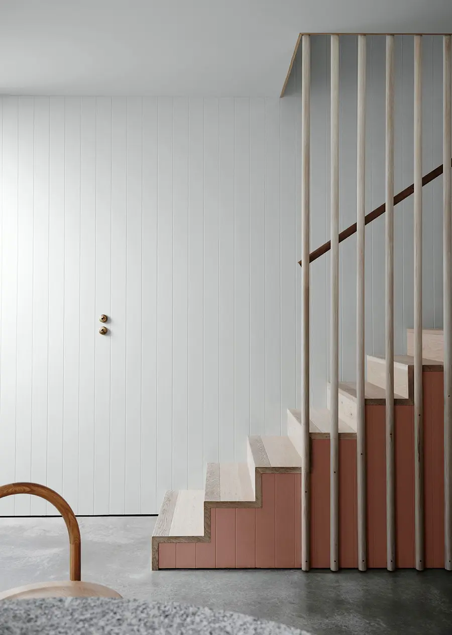
Time is no longer an elusive and fleeting luxury, rather a series of moments to be savoured and shared. Our search for a more authentic existence inspires a new-found appreciation for natural and recycled materials. As we embrace the old as new, we move towards a more genuine and conscious way of living.
![interior decor. Grey table with books and plant.](http://images.ctfassets.net/j001bqnk84dk/2WXuSJxtwfyBUKyglMwJkm/c2e5c6ef0da9a35410a749d15042adbb/cq5dam.web.1280.1280.jpeg?fm=webp)
![](http://images.ctfassets.net/j001bqnk84dk/2WXuSJxtwfyBUKyglMwJkm/c2e5c6ef0da9a35410a749d15042adbb/cq5dam.web.1280.1280.jpeg?fm=webp)
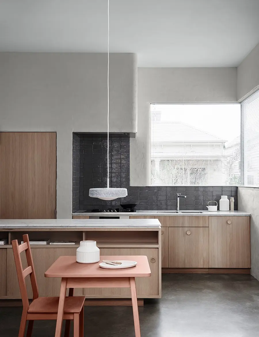
Combine naturals such as soft brown, sand and grey green for a relaxing scheme conducive to taking time out.
Charm of imperfections
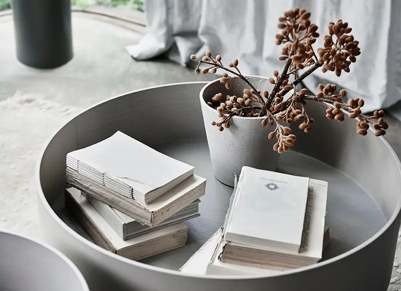
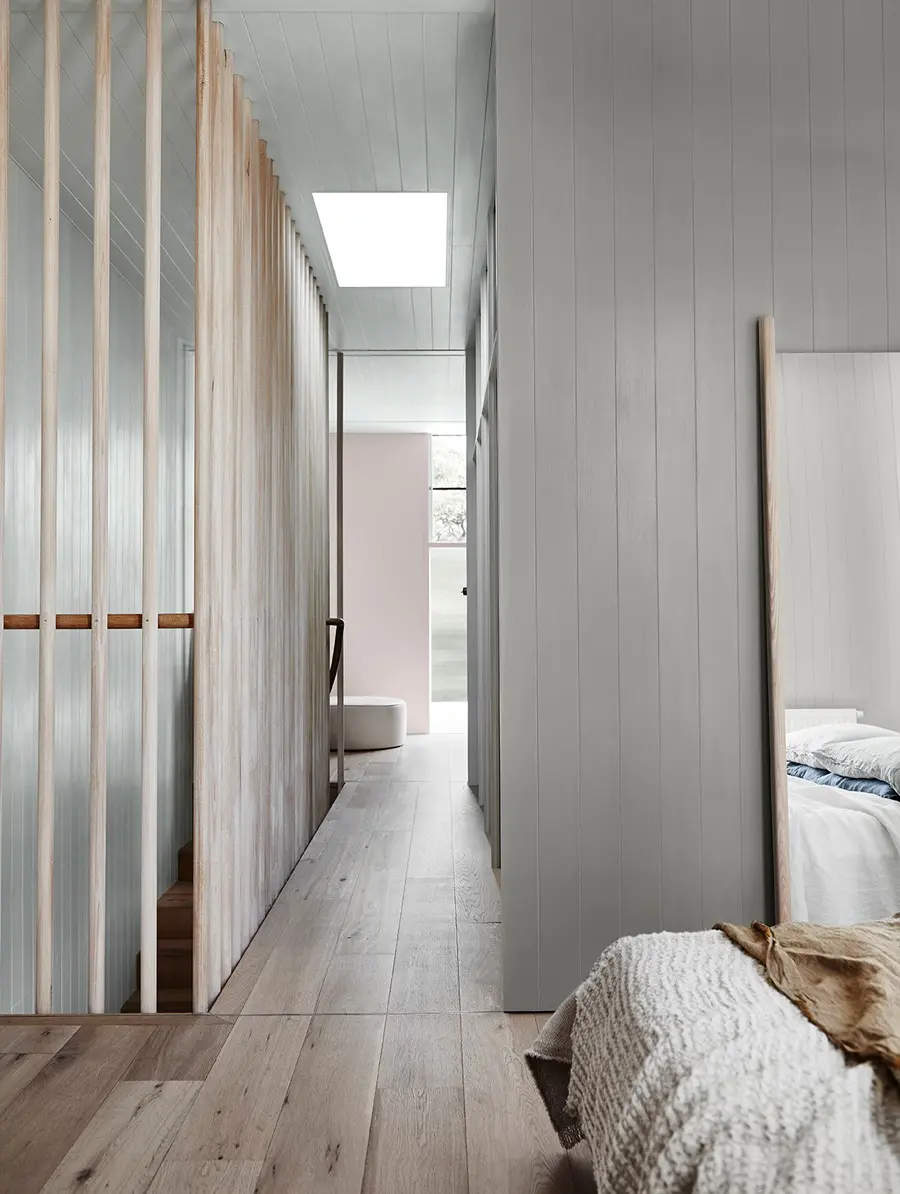
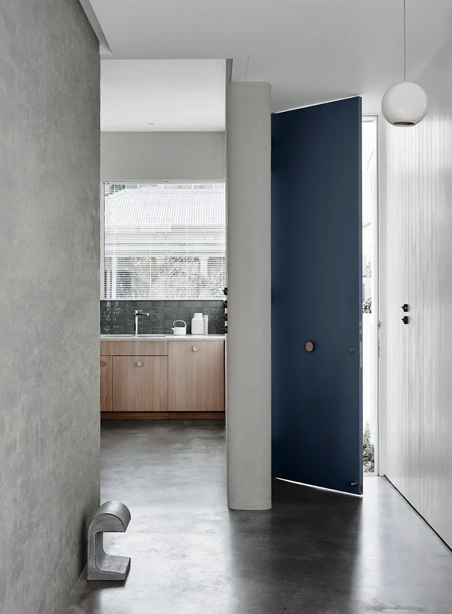
Liven up a neutral look with different textures. Imperfect edges on textiles, handmade details and a mix of materials will give your space character and ensure your neutral colour scheme is never dull.
Paler colours create a calming and nurturing palette. The simple charm and raw honesty of imperfect finishes help to make your room feel comfortable and inviting. Start with hand-crafted ornaments and natural linens.
![Spanish Olive is a silvery-grey with beautiful green undertones is a perfect colour for living spaces and bedrooms. It is ideal for creating a lovely neutral scheme and pairs well with warm whites such as White Exchange Half and reddish-brown Clay Court.](http://images.ctfassets.net/j001bqnk84dk/2YmTsIDkajfISqvAFuNala/f0a08e826436d0e9107a6e6ef8a9c881/cq5dam.web.1280.1280__1_.jpeg?fm=webp)
Sophisticated colour twists
Adding a rich, warm colour such as Clay Court to your grey scheme can create a focal point within a space or highlight architectural detail. It can be the colour twist that elevates your colour scheme from simple to sophisticated.
![Dieskau is a welcoming greige with a warm, slightly mauve undertone. Soft and subtle, Dieskau is perfect for any space inside the home and ideal if you're wanting to achieve the Hamptons look with trim in crisp white such as Lexicon® Half or Vivid White™. For exteriors, Dieskau can be used for walls or trims when using darker greige/greys. This tranquil colour also schemes beautifully with the warm dark grey of Klavier and warm mid-based greiges of Teahouse and Stepney.](http://images.ctfassets.net/j001bqnk84dk/62HfzFpvqQBdD8GuX6UJWd/594b2fc766058fdbfb7d4c45cd765f83/cq5dam.web.1280.1280__3_.jpeg?fm=webp)
Sleeping sanctuary
Dulux Flooded Gum is the perfect mid-grey to pair with light timber tones such as oak and ash. Contrast the subtle warmth in Flooded Gum with soft denim-style blues.
![Flooded Gum is a beautiful warm greige that is perfect inside on main walls, accent walls and trim as well as a stunning option for exterior weatherboard and render surfaces. The softness of Flooded Gum pairs well with cool and neutral whites and charcoals.](http://images.ctfassets.net/j001bqnk84dk/3VRSh5ZgSOzLCainXaqK8O/730f261a5105c1aa41903dd07f2f1d2f/cq5dam.web.1280.1280__5_.jpeg?fm=webp)
For more details on the products and colours featured in our 2018 colour trends, read our digital magazine.
Don't risk tinting your favourite colours with other paint brands. Only Dulux pigments mixed into Dulux Wash&Wear® and Dulux Weathershield® are designed to create our iconic colours shown here every time. Colours featured: Dulux Teahouse (exterior) and Dulux Domino (trim and verandah).
Essential Palette
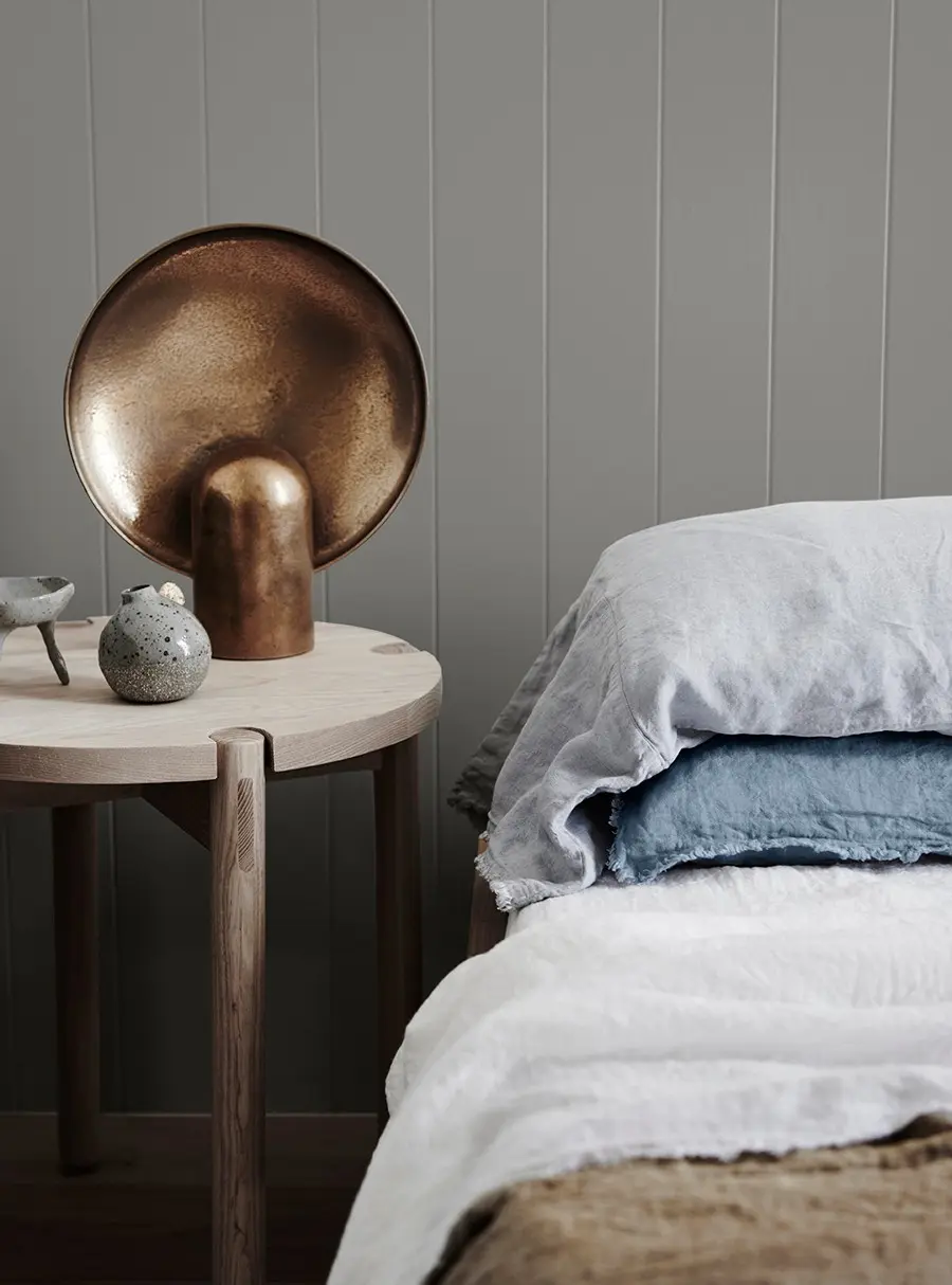
The Essential trend is a calm and nurturing palette draws on the soft warmth of leathers, a pop of bold blue, and the beautiful imperfections of aging materials in rusted tones.
Essential gallery
![interior hallway and stairs with wooden railings.](http://images.ctfassets.net/j001bqnk84dk/7974ibeGiQMfi9hUMGQwPK/c31d1be2119b2bf9e2c693dce0aee2df/cq5dam.web.1280.1280__12_.jpeg?fm=webp)
Door
Mornington Half
The gentle pink of Mornington Half with a slight grey undertone enhances many warm and cool colours. It teams beautifully with whites like White on White™ and soft neutral whites like Casper White Quarter.
![interior grey dining room with table and chairs.](http://images.ctfassets.net/j001bqnk84dk/2GUZhLDE8E3aAhWZxZP72y/1bc592e72a66fb80e045d5d15b400544/cq5dam.web.1280.1280__4_.jpeg?fm=webp)
![interior grey stairway.](http://images.ctfassets.net/j001bqnk84dk/63HFJsTCUeQ1zsALzdR1ID/6922b8eee8a8e94b63c2a3a43e0030ee/cq5dam.web.1280.1280__17_.jpeg?fm=webp)
Wall & Ceiling
Terrace White
With a hint of a grey-beige undertone, Terrace White is ideal for pairing with cooler whites and muted shades. It is perfect for interior or exterior walls and trims. Terrace White schemes beautifully with Lexicon® Half or Tranquil Retreat.
Wall
Terrace White
With a hint of a grey-beige undertone, Terrace White is ideal for pairing with cooler whites and muted shades. It is perfect for interior or exterior walls and trims. Terrace White schemes beautifully with Lexicon® Half or Tranquil Retreat.
Ceiling
Terrace White
With a hint of a grey-beige undertone, Terrace White is ideal for pairing with cooler whites and muted shades. It is perfect for interior or exterior walls and trims. Terrace White schemes beautifully with Lexicon® Half or Tranquil Retreat.
Ceiling
Terrace White
With a hint of a grey-beige undertone, Terrace White is ideal for pairing with cooler whites and muted shades. It is perfect for interior or exterior walls and trims. Terrace White schemes beautifully with Lexicon® Half or Tranquil Retreat.
Most Loved Whites + Essential
Dulux has been crafting some of Australia’s most iconic paint colours for nearly a century. Here’s how our Most Loved Whites and Neutrals can work in harmony with the Essential palette.
Dulux Casper White Quarter
Dulux Casper White Quarter is a soft white that teams beautifully with the soft grey-green of Dulux Spanish Olive and Mornington Half of the Essential palette. Subtle in warmth with grey undertones, it’s the secret ingredient to a harmonious colour scheme.
Dulux Snowy Mountains Half
The warmth of Dulux Snowy Mountains Half creates a perfect counterbalance to the cool hue of Dulux Noble Knight. For a contemporary scheme team with Dulux Dieskau – this natural tone brings together the striking contrast between white and deeper blue.
![interior entrance with kitchen view closeup.](http://images.ctfassets.net/j001bqnk84dk/3qky6SY1bOim3H2lgYD0MF/81ba9826a8bbffaed4f183a434133ca3/cq5dam.web.1280.1280__6_.jpeg?fm=webp)
Wall
Snowy Mountains Half
Snowy Mountains Half is a slightly neutral white that can be used with warmer and cooler colours. It can easily be used for the main colour both inside and out.
![Snowy Mountains Half is a slightly neutral white that can be used with warmer and cooler colours. It can easily be used for the main colour both inside and out.](http://images.ctfassets.net/j001bqnk84dk/3qky6SY1bOim3H2lgYD0MF/81ba9826a8bbffaed4f183a434133ca3/cq5dam.web.1280.1280__6_.jpeg?fm=webp)
![interior labelled closeup of table and books.](http://images.ctfassets.net/j001bqnk84dk/315hrTlgsOgYa4DzxSqPvH/51f991fdccba292d52f8e8e0c4a6a600/cq5dam.web.1280.1280__9_.jpeg?fm=webp)
![](http://images.ctfassets.net/j001bqnk84dk/315hrTlgsOgYa4DzxSqPvH/51f991fdccba292d52f8e8e0c4a6a600/cq5dam.web.1280.1280__9_.jpeg?fm=webp)
Suppliers
![interior labelled closeup of table with pot and plate.](http://images.ctfassets.net/j001bqnk84dk/4YUJzFlR5H5sPYzJ3XpbfR/1c155f4d373ce0eae82af291bb8c29e1/cq5dam.web.1280.1280__10_.jpeg?fm=webp)
![](http://images.ctfassets.net/j001bqnk84dk/4YUJzFlR5H5sPYzJ3XpbfR/1c155f4d373ce0eae82af291bb8c29e1/cq5dam.web.1280.1280__10_.jpeg?fm=webp)
Suppliers
"The colour palette works perfectly with raw timber, leather and brass allowing the materiality to be the hero. I have balanced clean lines with the exaggerated and simple woven textiles including a rug and upholstery fabric. Incorporating elements of nature can really finish a space. I selected a juvenile eucalyptus tree that works against Dulux Flooded Gum or Spanish Olive." – Bruce Summers, Interior Stylist.
View the Dulux Colour Trends 2018 digital magazine for full supplier and colour details.
More 2018 Colour Trends
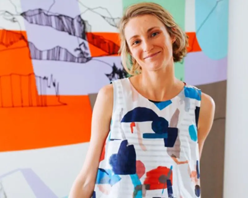
Pip Brett of Jumbled re-imagines the Escapade look with bold block colours and clashing patterns.
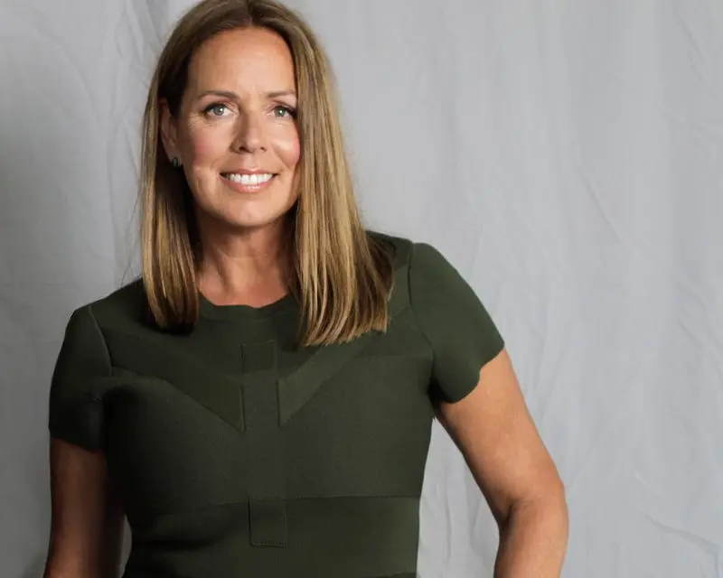
Heather Nette King shows us how to create a modern take on an elegant space taking cues from the Reflect trend.
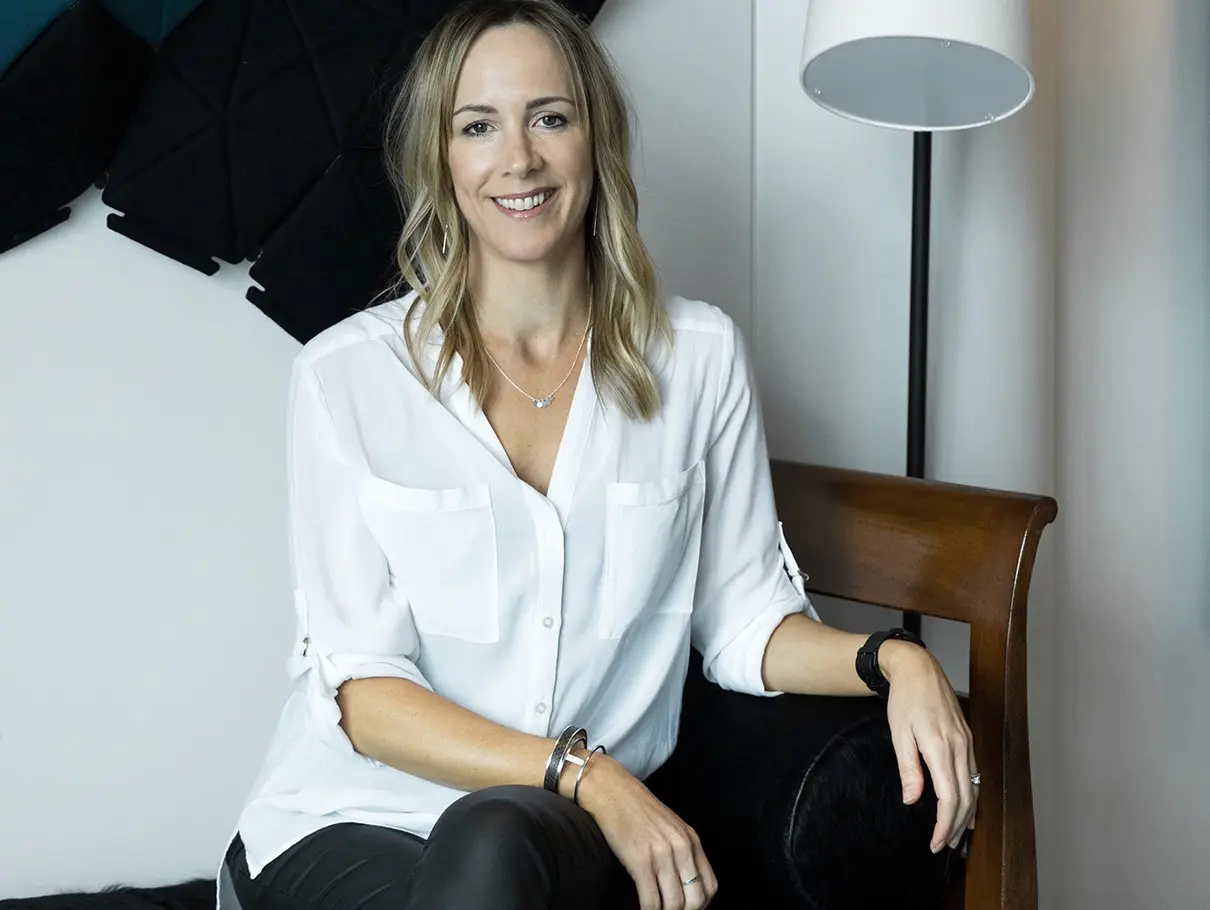
Interior stylist and writer of The Design Chaser, Michelle Halford, creates a warm, cosy space with the Kinship trend.
Disclaimer
Colours displayed should be used as a guide for your colour selection. To ensure best accuracy, test your colour choice at home by ordering Dulux sample pots, stickers and A4 colour swatches.