Dulux Colour Forecast 2011
Velocity
The Dulux Colour Forecast 2011 theme, Velocity, reflected our fast-paced and ever-changing environment where factors including tradition, religion, culture, environment and symbolism rapidly influenced our colour preferences. Colour choice is a personal decision because it is so highly emotive. Colour makes a huge impact in any environment and can vary the ambience like no other element.
Lost Memoirs
The Memoirs palette described turning old objects into new masterpieces and celebrating the past.


Lost Memoirs palette
The colours in this palette reflected nostalgia and a way of keeping old traditions alive from one generation to the next. It mixed the old with the new, with colours such as Orangeade, Pale Buttercup and Lemon Delicious. Think Gran power and lovingly made handcrafts, such as patchworks, knitted objects and even macrame. These are now becoming cherished heirlooms and these skills are now being taught in schools, with knitting classes over lunch breaks and cafes rekindling old traditions.
Mirage
This refreshing palette plays with deep blues and aquas, which are an important part of our daily lives.


Mirage palette
When you think of a distant mirage, often feelings of blues come into play with flitting sequences of water and dreamy skies. Blending the inside with the outside world was becoming a standard practice architecturally in 2011, adding dimension to space and design and also creating a harmonious essence in our fast-paced and cluttered lives. Sailing the seas with colours such as Porpoise Place, Sea Creature and Diplomatic was the soothing introduction to Mirage.
Forbidden
This palette explores the emerging prohibition culture that is being driven both openly and by stealth from a growing need amongst authorities to reduce the costly consequences of negative lifestyle choices.


Forbidden palette
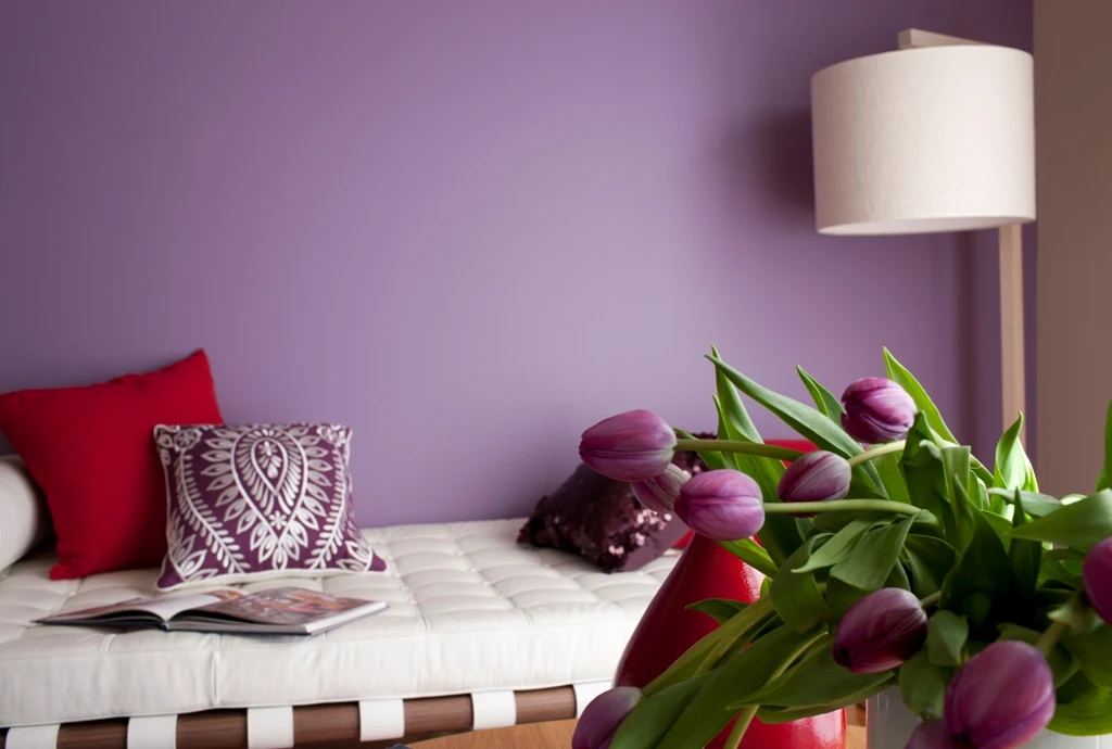
In 2011 everywhere we looked there seemed to be more rules and regulations; what we could and couldn't eat, whether we were drinking to excess; our freedom of expression was being curbed, controlled, nudged and monitored. Known as the “Big Brother” effect, our lives seemed to be monitored much more than we were aware. This behaviour was increasingly seen as anti-ethical against society. An example of this was the rapid increase in diabetes in western cultures. As a result, we urged people to cross the boundaries and explore strong reds and purples such as Carmen, Symphony Red and Enchantress.
Momentary
Following the Global Financial Crisis, there was a new sense of design: a more pared-down aesthetic rule, which led to vintage purchases and buying quality products that would endure the test of time.


Momentary palette
Our palette of combinations included the soothing colours of Warm Neutral, Tapestry Beige, and the soft Mocha Pearl from our Design Effects range. This palette was influenced by austerity and a new sense of sobriety. As the hangover from the Global Financial Crisis continued to bring uncertainty, it created a desire for reassurance and feeling of calm. This insecure period encouraged people to compose a sense of comfort and security with a strong sense of family. The refuge is “home” and eating with family and friends became the new reality. Not only saving money, it also gave us an opportunity to develop our culinary skills.
Revive
This colour palette reflected our fresh mindset and new ways to re-use materials once considered waste.


Revive palette
Our Revive palette drew on restoring energy and creating new life with colours such as Deduction, Spring Fever and Gentle Sands. This was influenced by how sustainability, environmental care, reuse and recycling had become part and parcel of our way of life. We saw the future as being about finding better ways to protect and care for our world and its resources. We believed in questioning our effect on the environment and how looking back to the ways of our parents and grandparents to inform the use of products and materials more wisely.
e-magine
The e-magine palette captured the essence of imaginative colours where the possibilities were endless.


e-magine palette
What was inconceivable only several years earlier was now not only accepted, but expected. Living in a digital age where technological advances were so rapid meant the future could only be imagined. Social networks, e-commerce, tablets, integrated wifi and 3D TV were just the beginning of what was to come. The e-magine palette reinforced the endless possibilities of cyberspace with imaginative colours such as Nolita, Metal Icon Metallic Effect and China White.
Dulux Colour Forecast: now and then
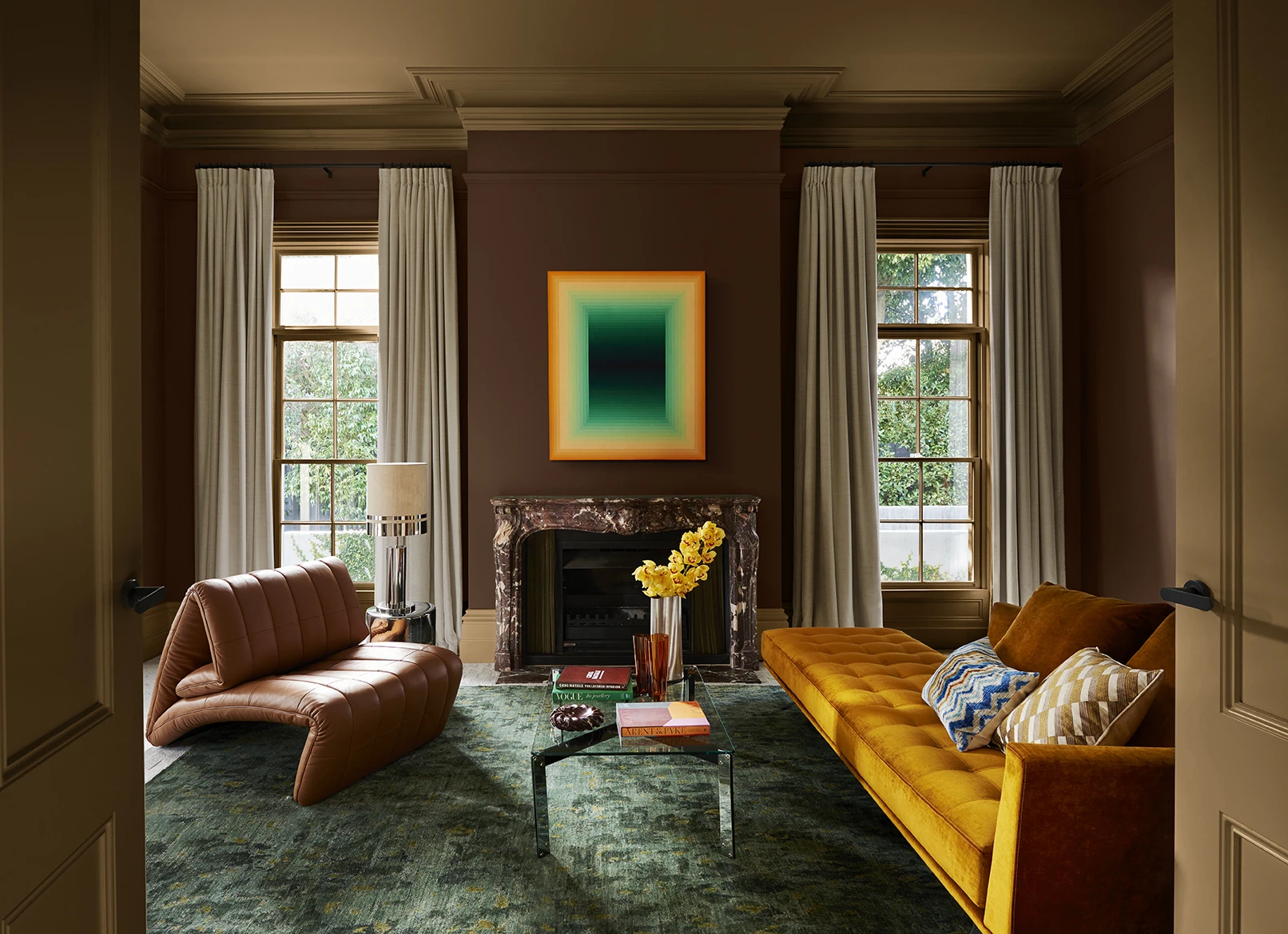
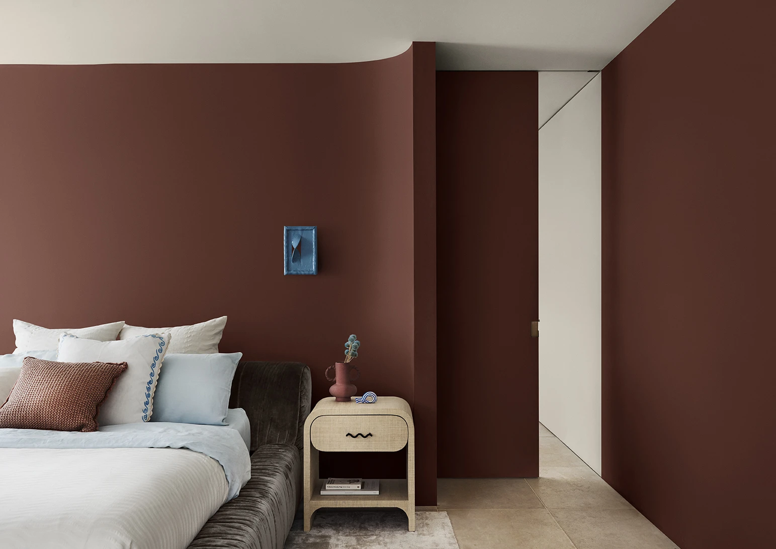
Dulux Colour Forecast 2024 reflects an inner desire for positivity and spaces that nurture within our homes with warm colours such as rich golds, olive greens and reddy browns.
We're proud to be at the forefront of colour trends in interior design as we celebrate the 25th anniversary of the Dulux Colour Forecast!
Download the Dulux Colour Forecast 2024 brochure to explore the three beautiful palettes and be inspired to transform your home with the latest trends.
Love your colour
Dulux Authentic Colour®
Only Dulux colour mixed with Dulux Wash&Wear® paint gives you exact colour accuracy to create Dulux Authentic Colour® palettes that look fresh in your home for years.
Disclaimer
Colours displayed should be used as a guide for your colour selection. To ensure best accuracy, test your colour choice at home by ordering Dulux sample pots, stickers and A4 colour swatches.


