Dulux Colour Forecast 2009
The future of colour
The Dulux Colour Forecast was as dynamic as it was insightful, drawing on the latest global colour trends to provide a source of ongoing inspiration.
Each palette displayed a very different personality and represents our extensive research of global fashion, design and architecture trends.
Our research behind the six key colour palettes for 2009 was supported by exclusive trend forecasting insight from internationally renowned experts, The Future Laboratory.
Culture Vulture
Through a rainbow of primary colours, many young designers were challenging the seriousness and commerciality of the design industry with playful everyday designs.
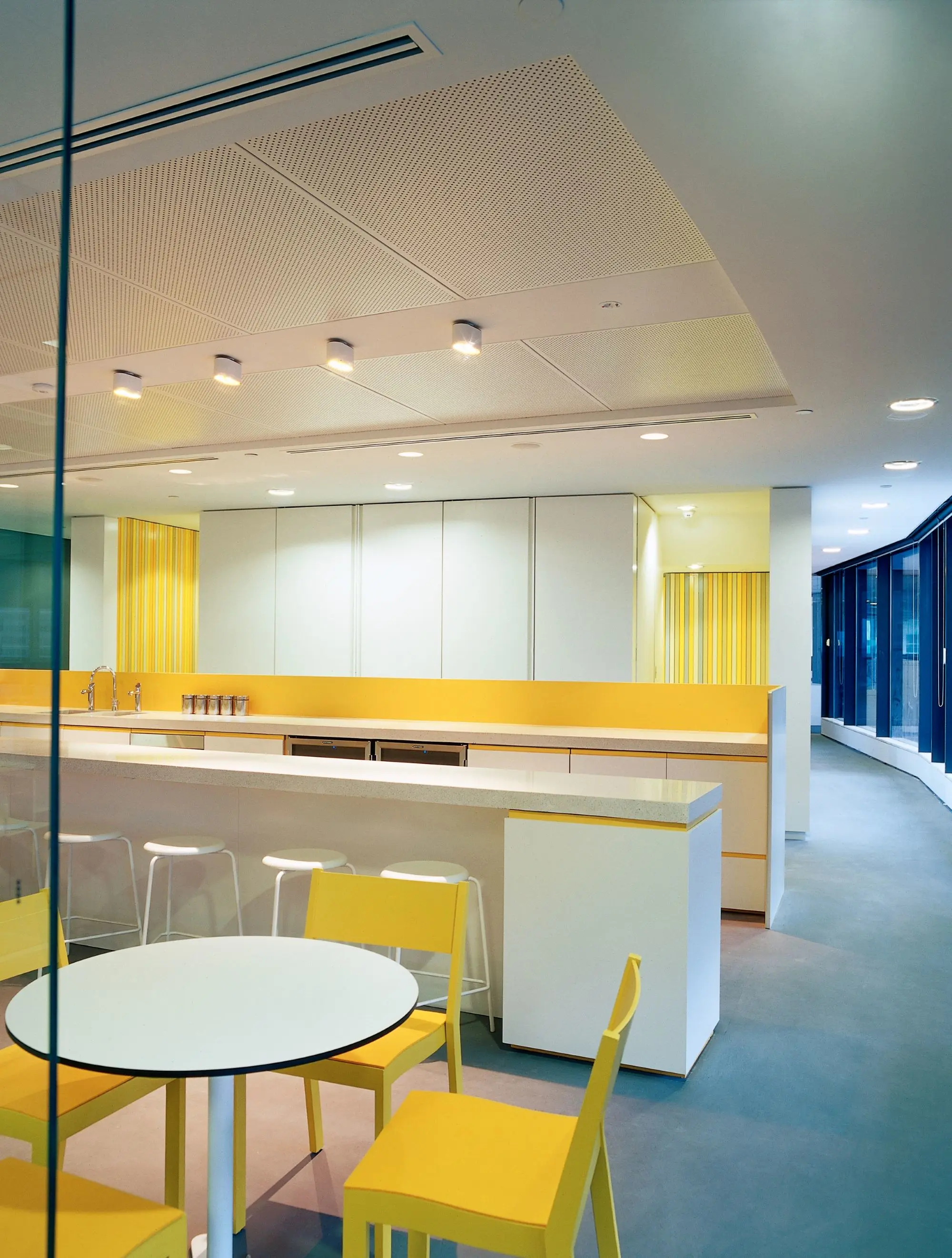
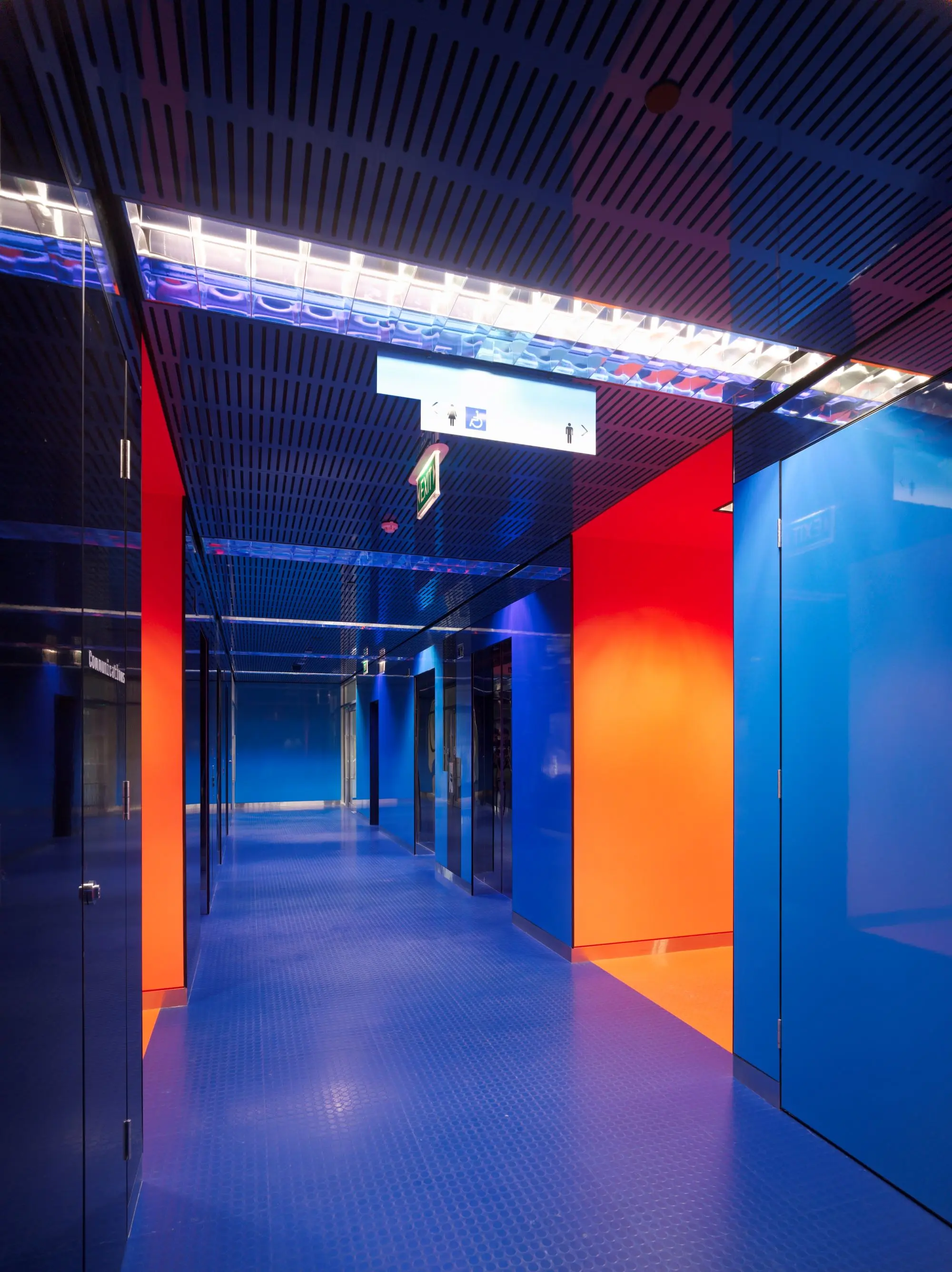
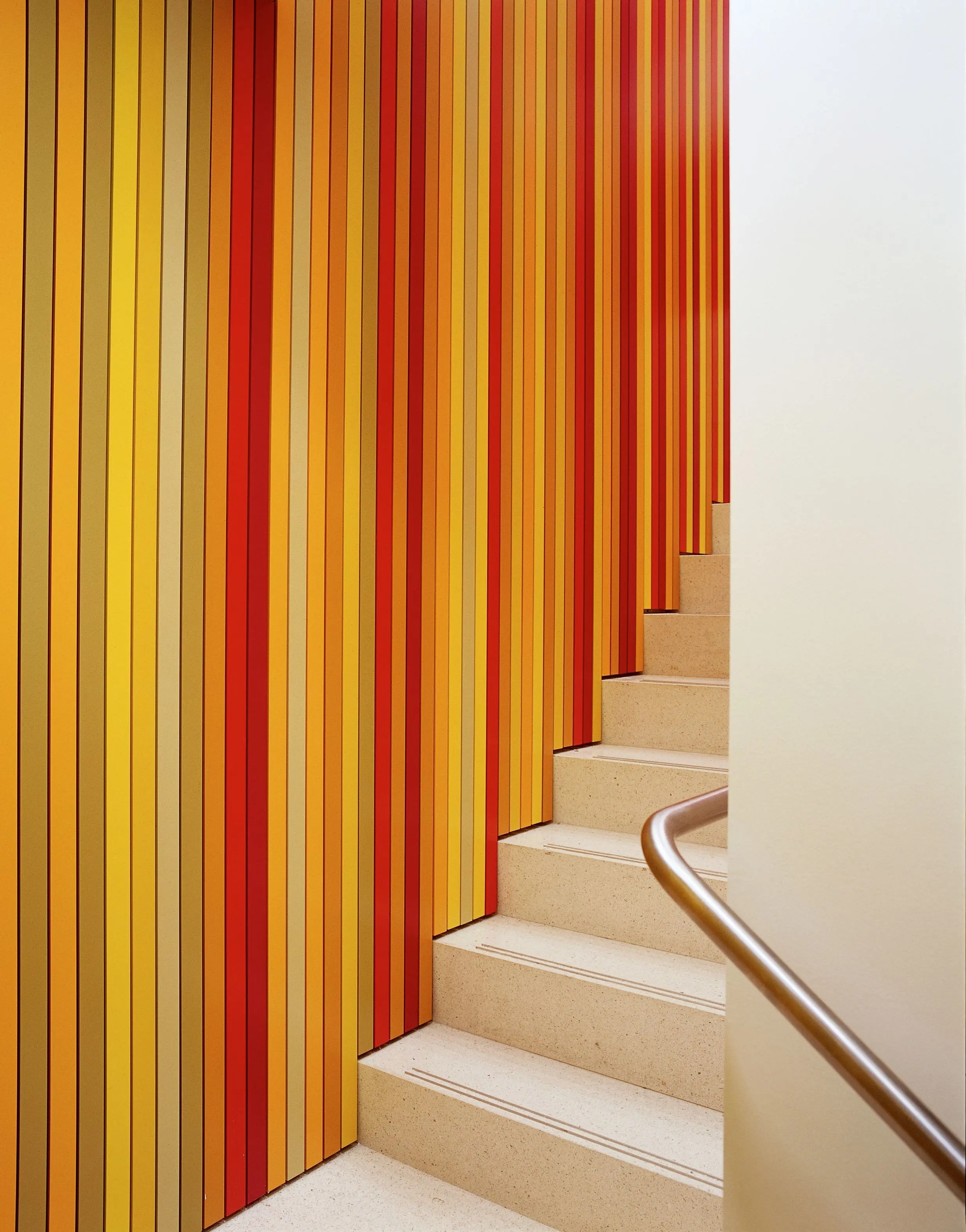
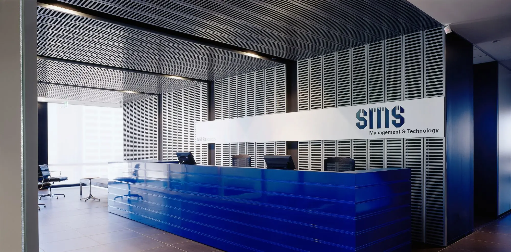
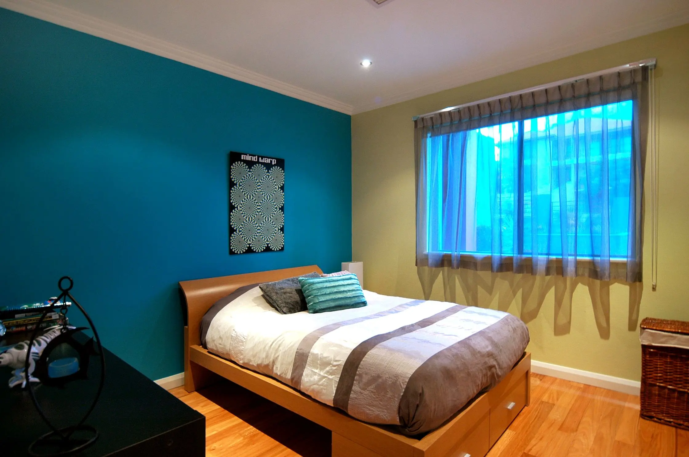
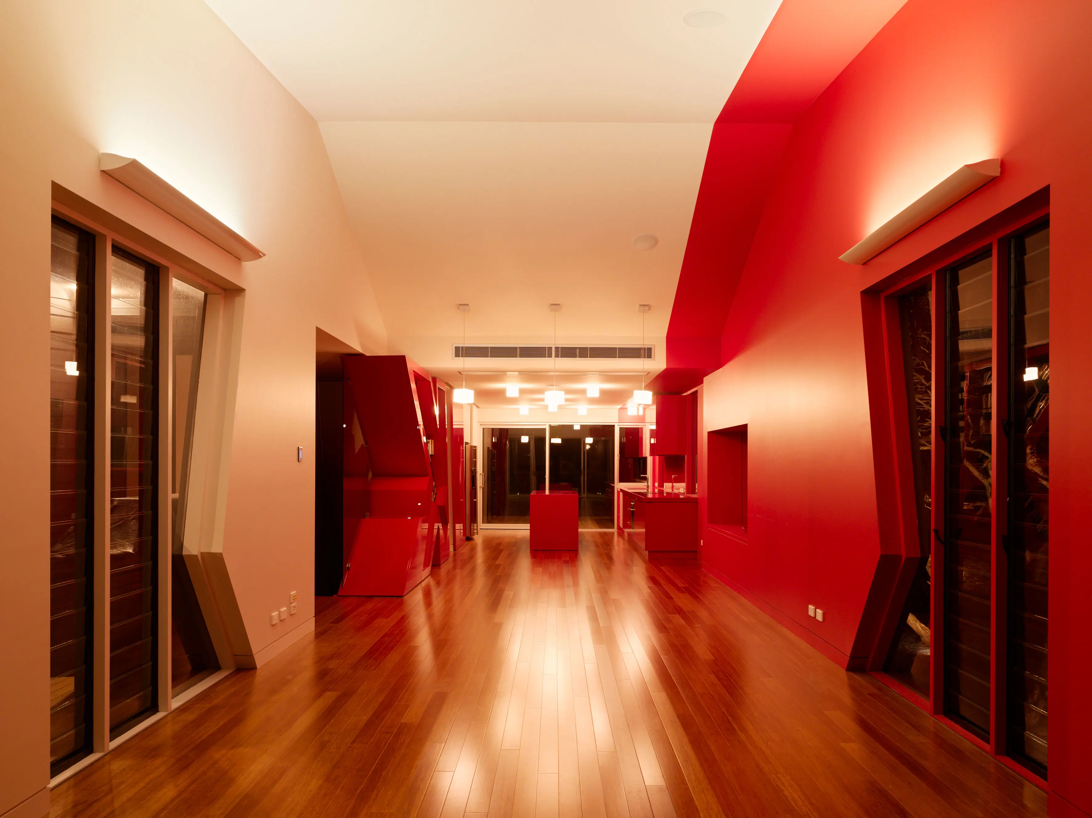
Culture Vulture palette
Fun and playfulness were the key characteristics of this palette. Dark at times, too, sometimes this childish exploration took on a more organic tone with animalistic influences such German designer, Ding300's "Muli", a sideboard that though it was a mule.
Bionic Nature
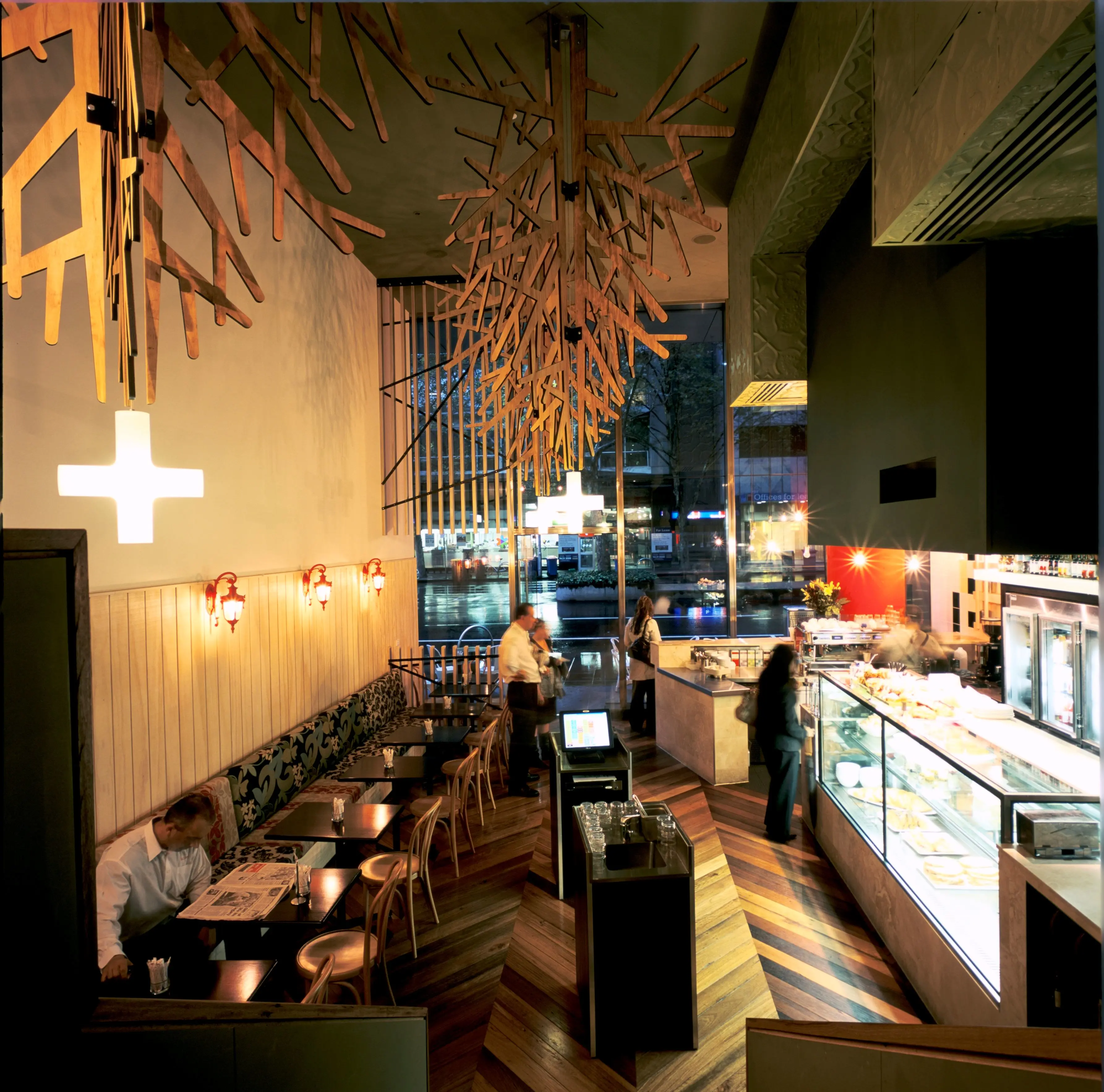
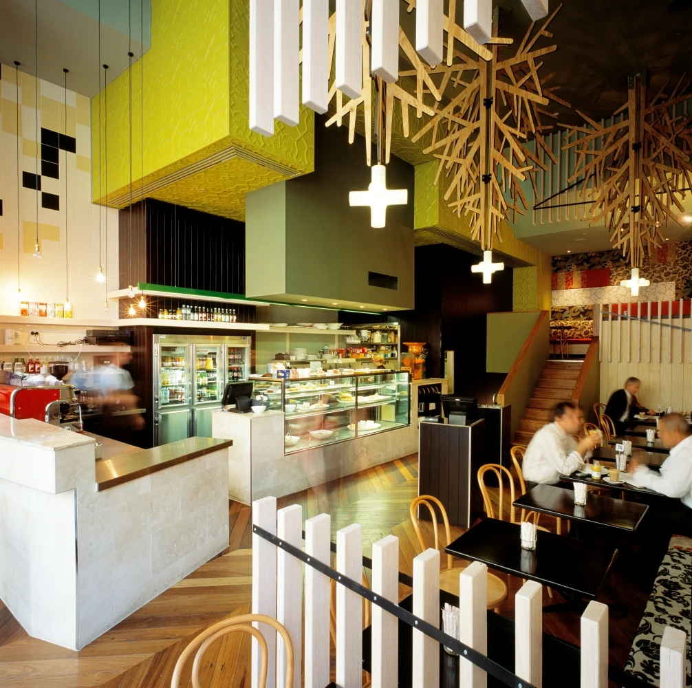
Blurring the lines between nature and technology, this earth-toned palette reflected the new "green" world that's here to stay.
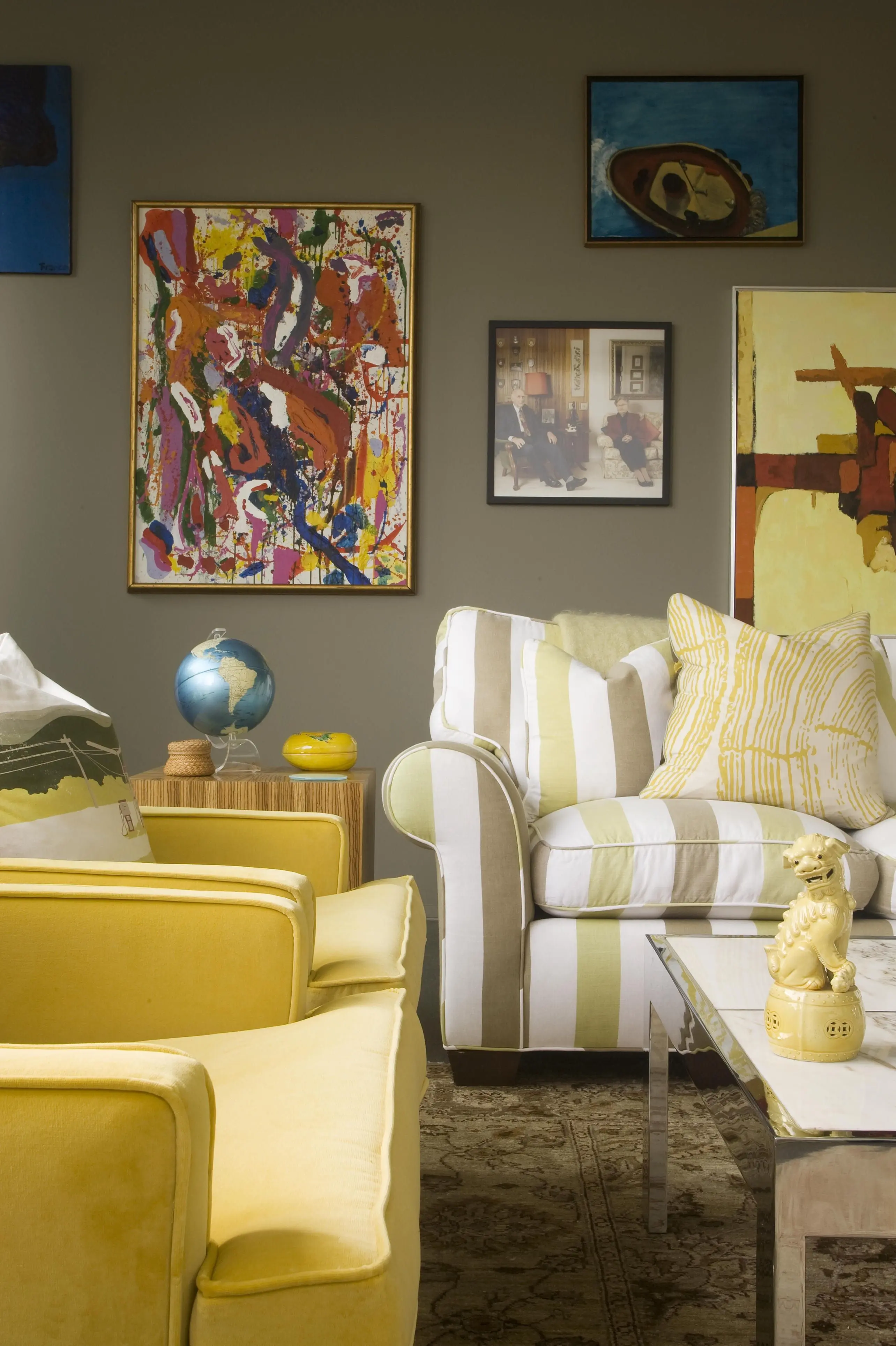
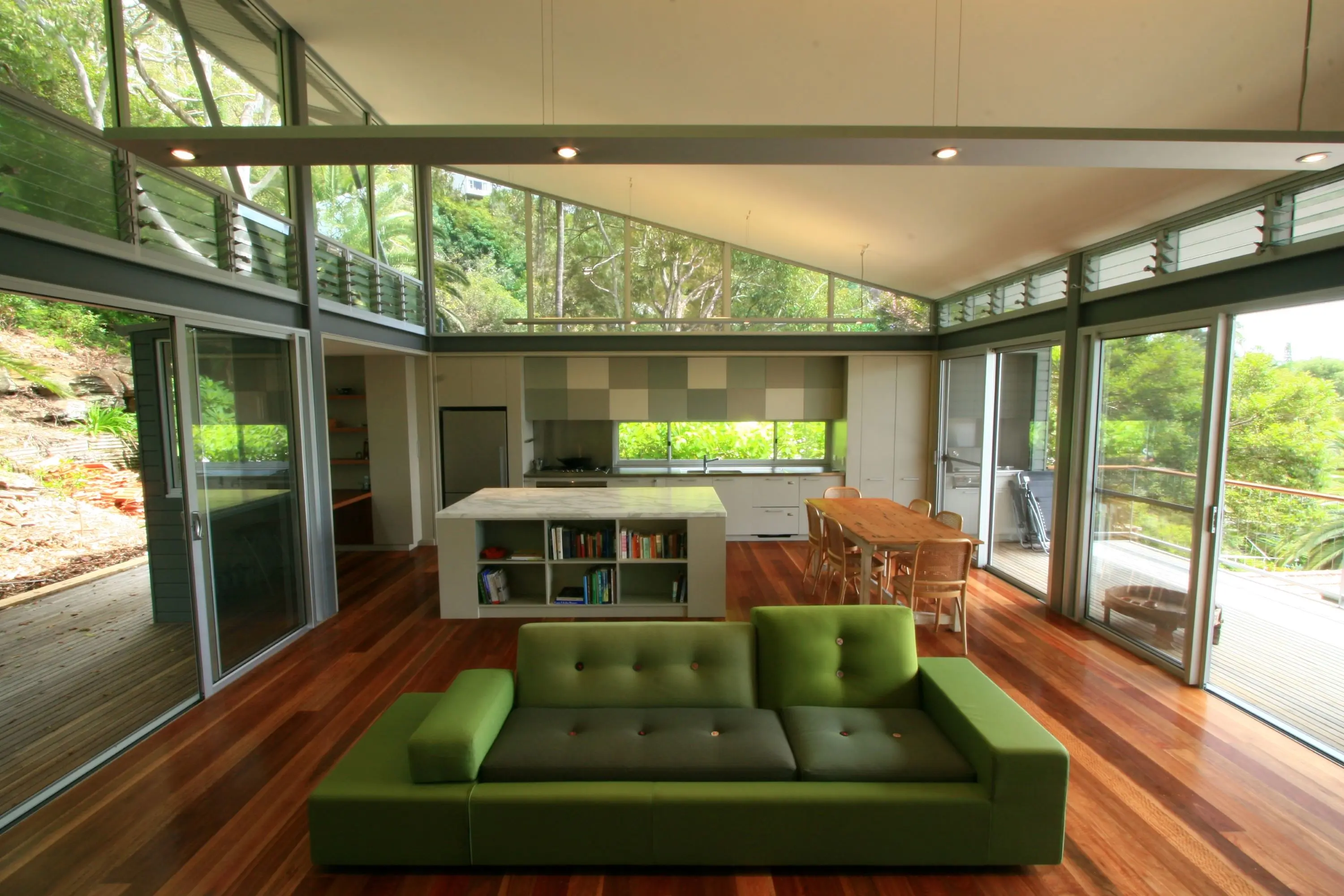
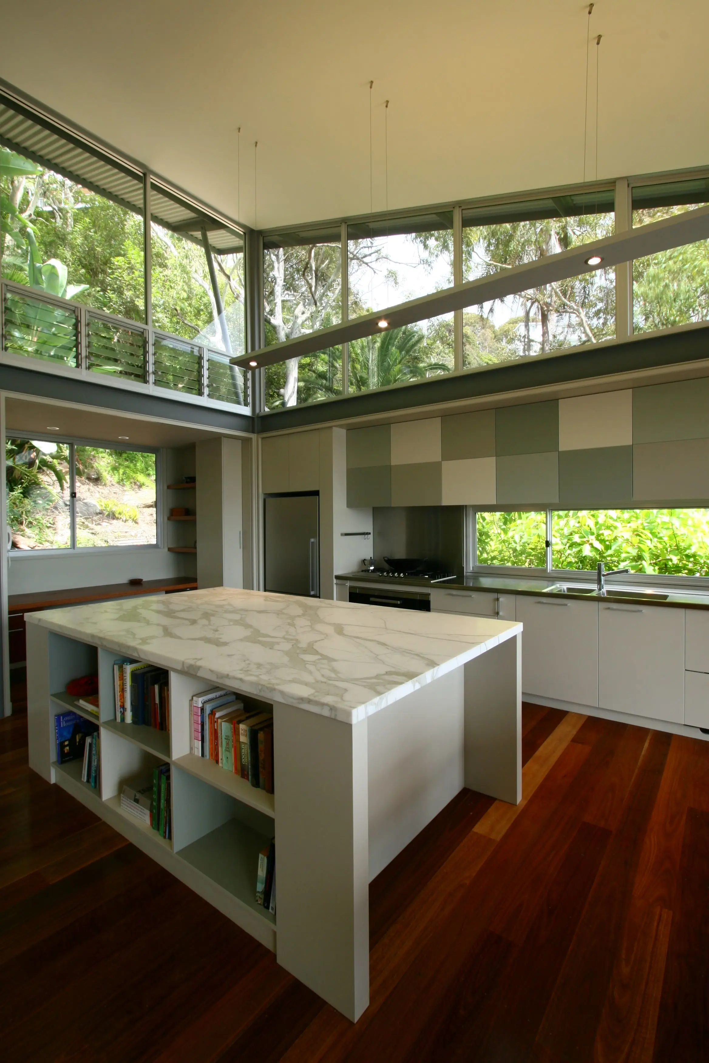
Bionic Nature palette
With beauty foods and drinks that promised to make you look younger, "smart foods" that vowed to stimulate brain function, "fill you up" foods that suppressed the appetite, and immunity-enhancing foods and drinks, it's better living through chemistry", indeed! Colour combinations such as Cape Lee and Cocoa Milk, were like a breath of fresh air.
Eve...olution
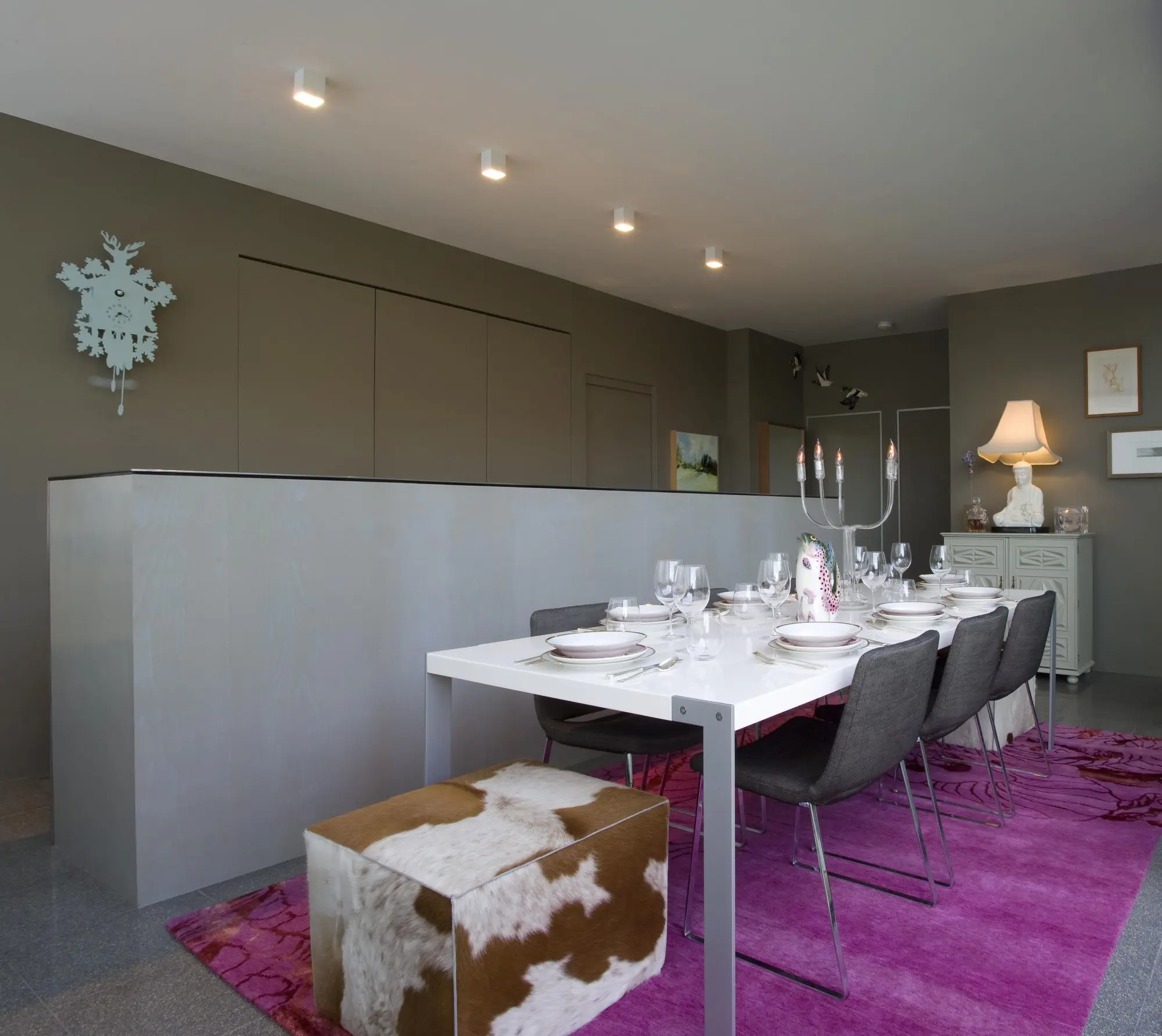
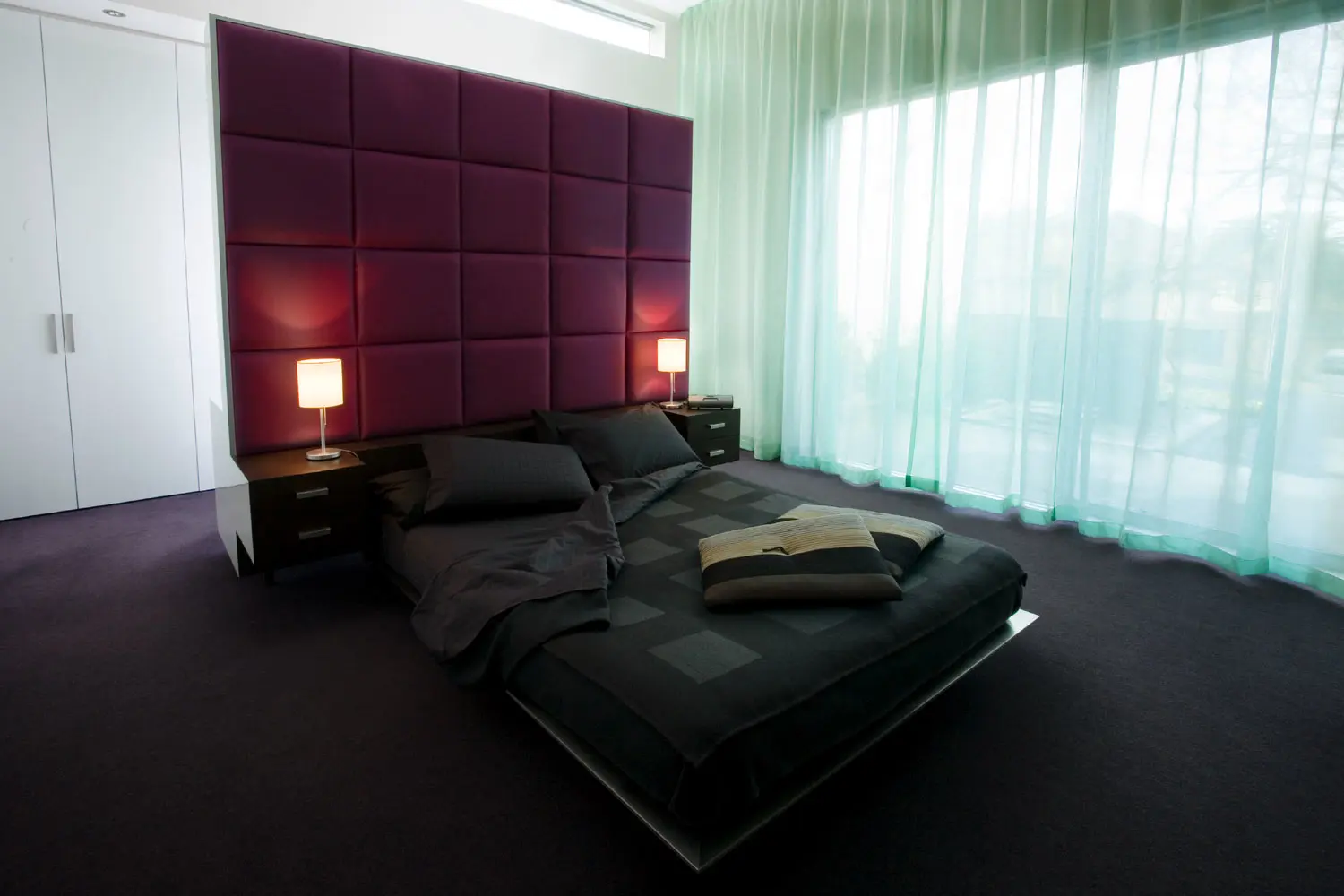
It was not the traditional female palette of florals and patterns. It was female, not feminine. This palette exhibited subtle strength; in colours such as Vibrant Vision and Kiss.
Eve...olution palette
Watch out, here she comes...awash in purples, pinks and browns! Powerful women in senior positions were influencing design in everything from computer hard drives to automobiles. Fashion mixed colours, shapes and materials to provide effortless grace, while form had to meet function when it came to technology and furniture. The result was a daring display of moods – from the hardness of H&Ms folded aluminium façade to the incredibly soft, emotive and curvaceous Zaha Hadid "Nekton" stool. It was not the traditional female palette of florals and patterns.
Refined Eloquence
A sense of humour and emotion replaced the previous brash show of wealth to create a palette of pale golds, gloss whites and neutral metallics like Pluto Pulse warmed up with burgundy such as Carmen.
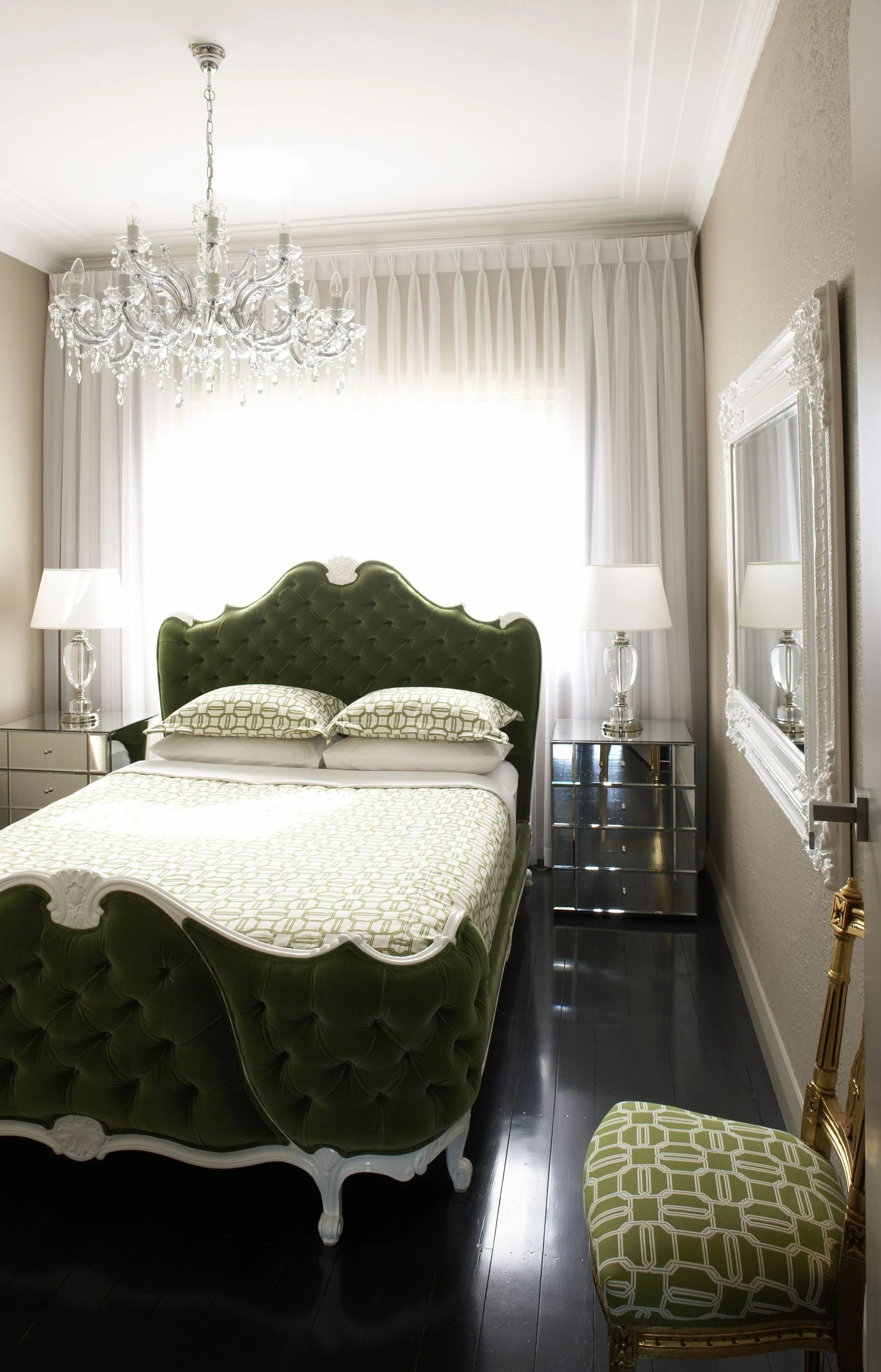
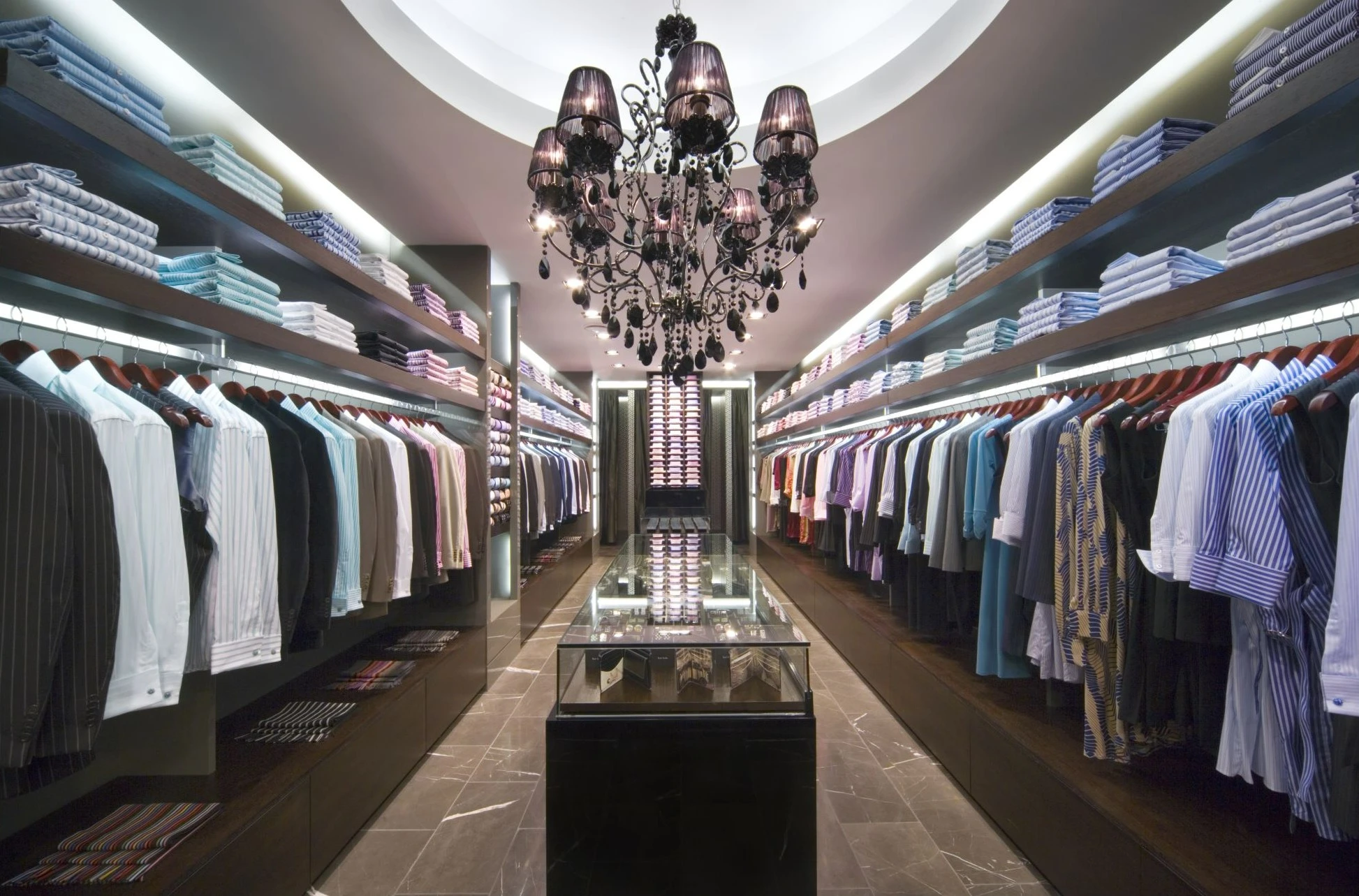
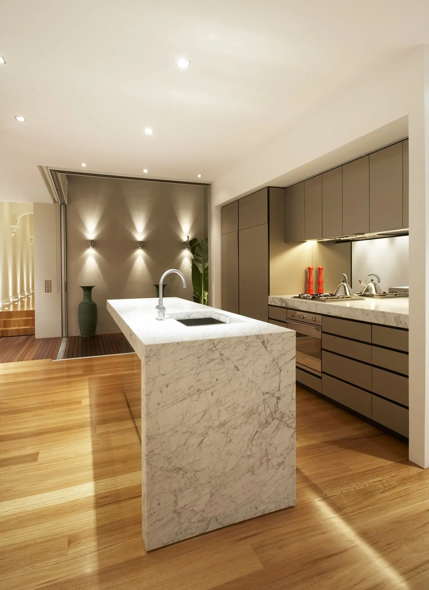
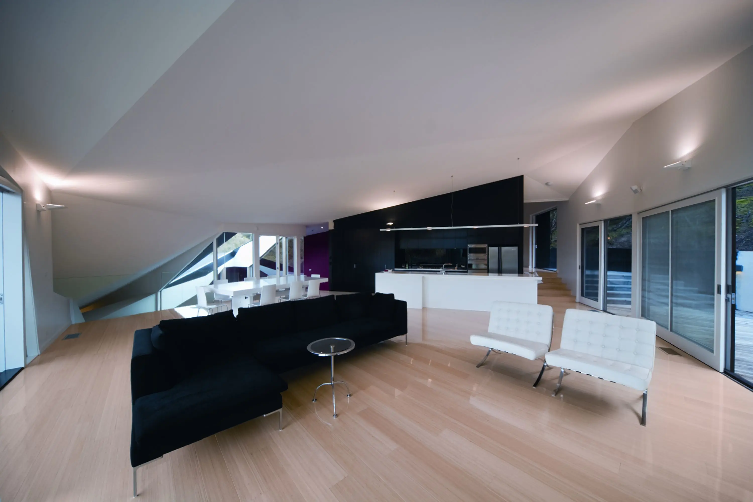
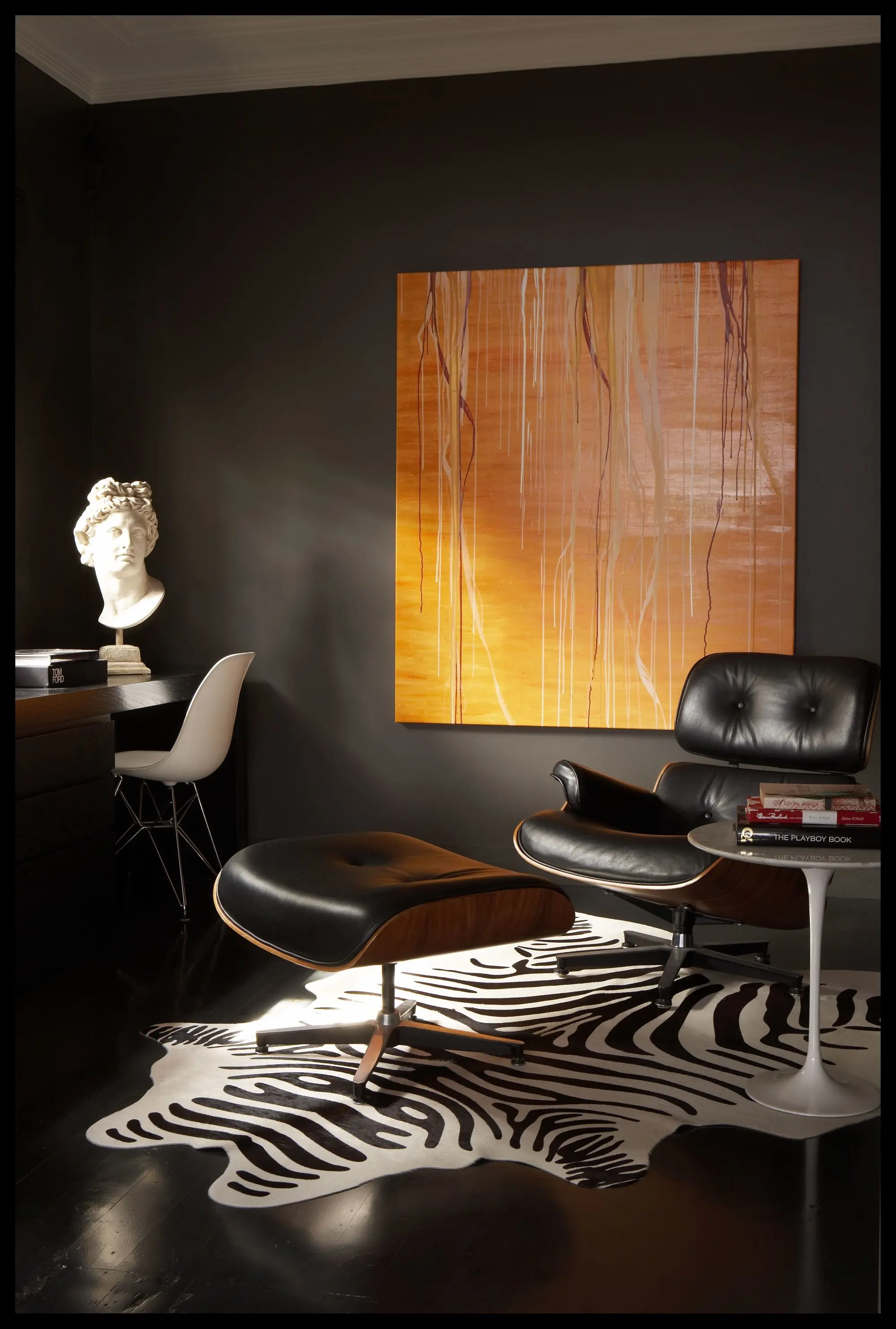
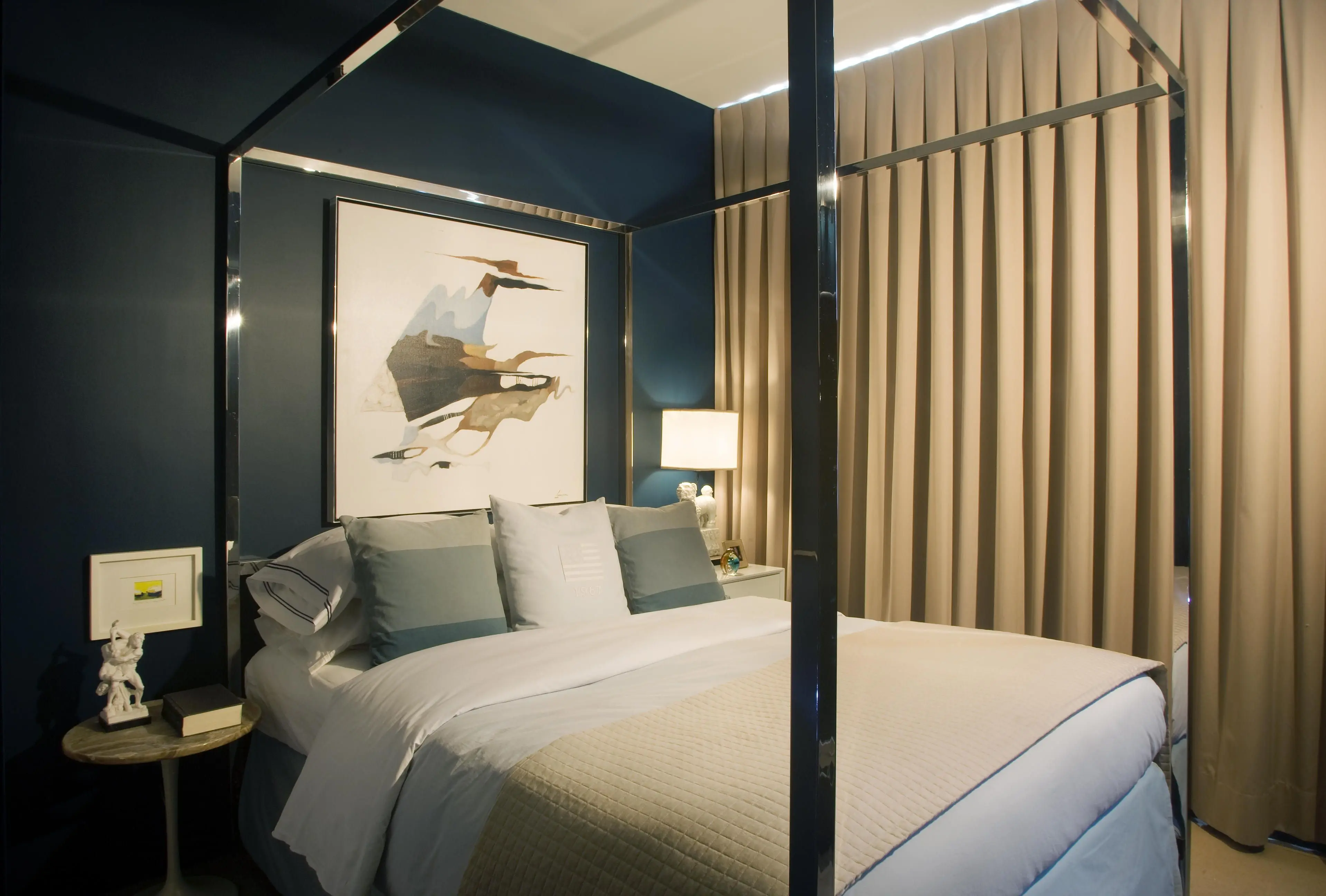
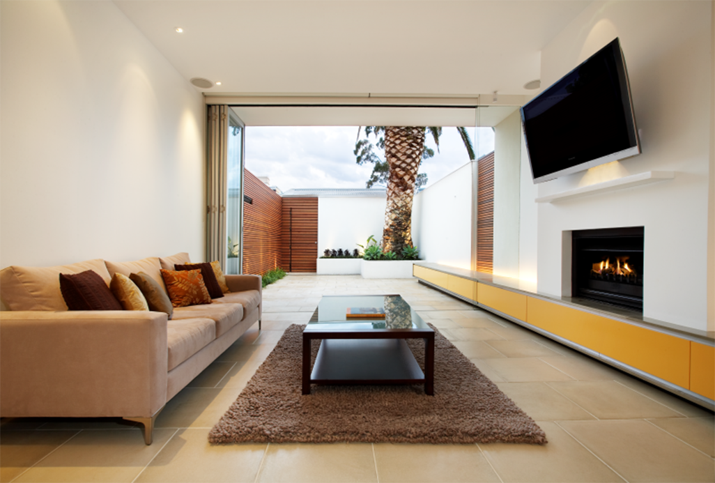
Refined Eloquence palette
Bye-bye bling! Luxury was re-imagined with stark blacks, whites and greys intensified by gloss and metallic finishes. The refrain in furniture? Stylish and sleek – clean lines and simple upholstery fabrics, such as commercial felt. While chandeliers boasted less crystal, the traditional essence is still dominant. However, it was not all buttoned up. Although embellishments in ornamental designs were tapered back, the strategic use of metallics and growing penchant for textures, such as crocodile skin, feathers and furs, balanced glitz and glamour.
Wabi Sabi
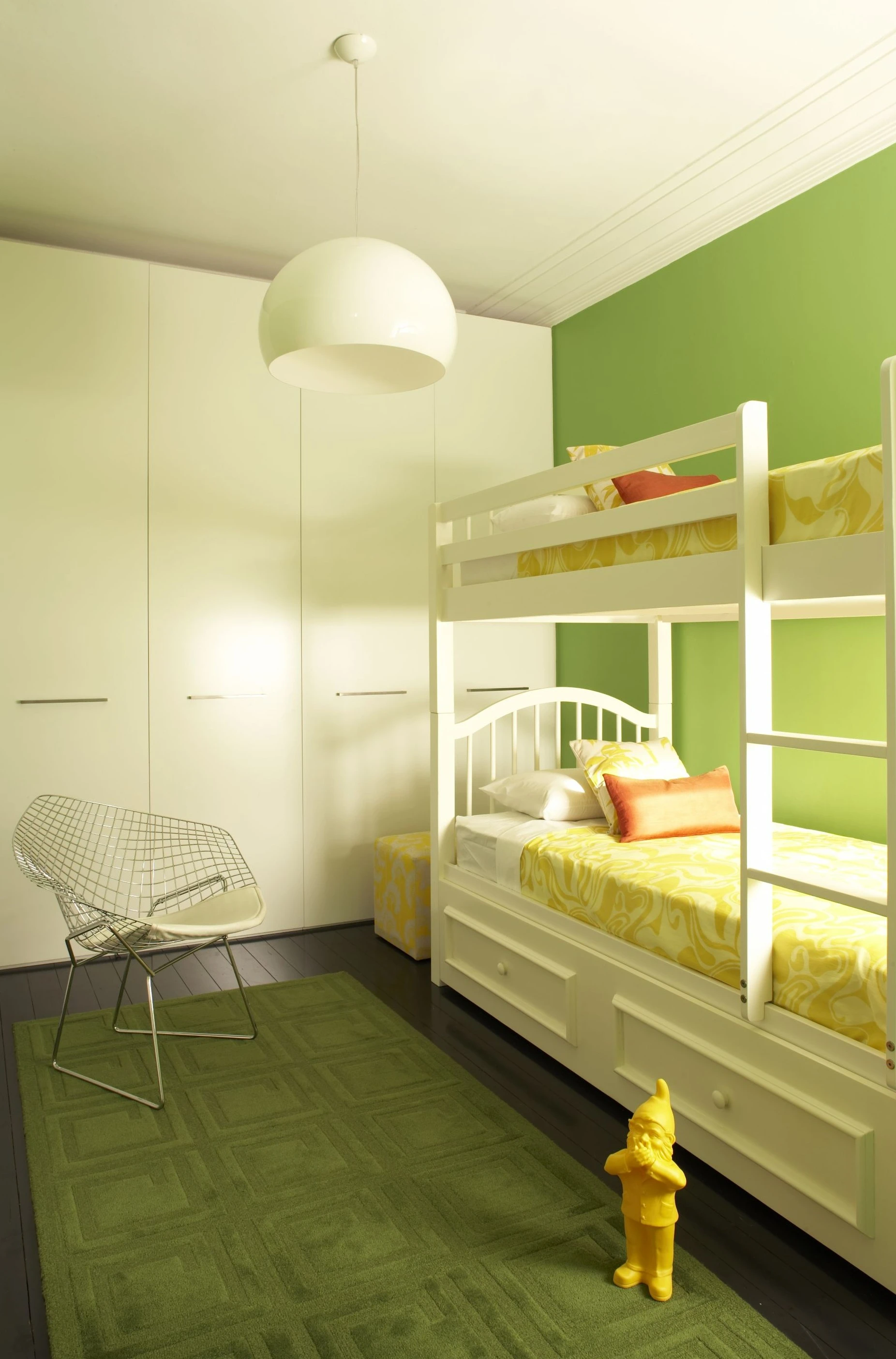
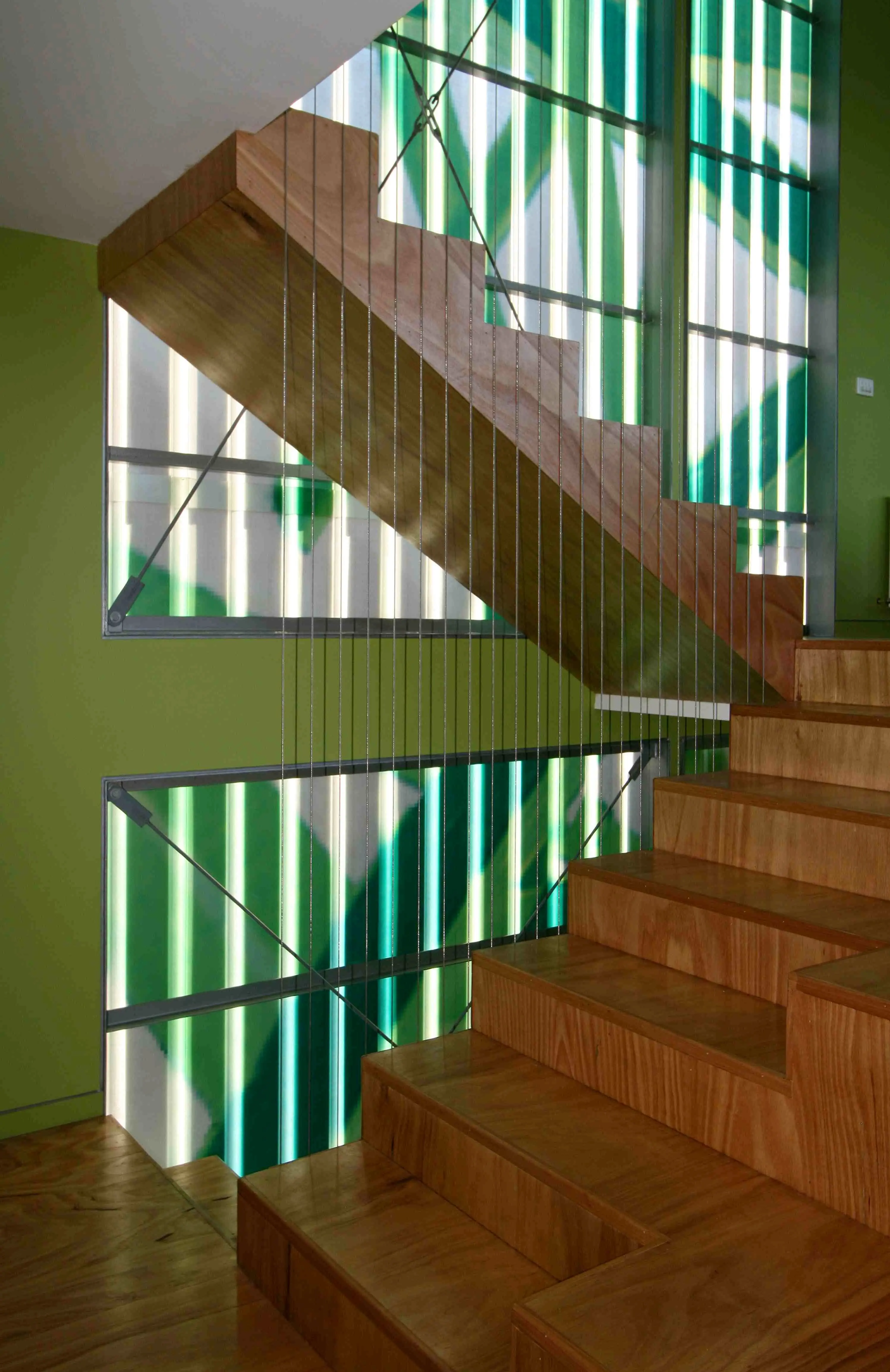
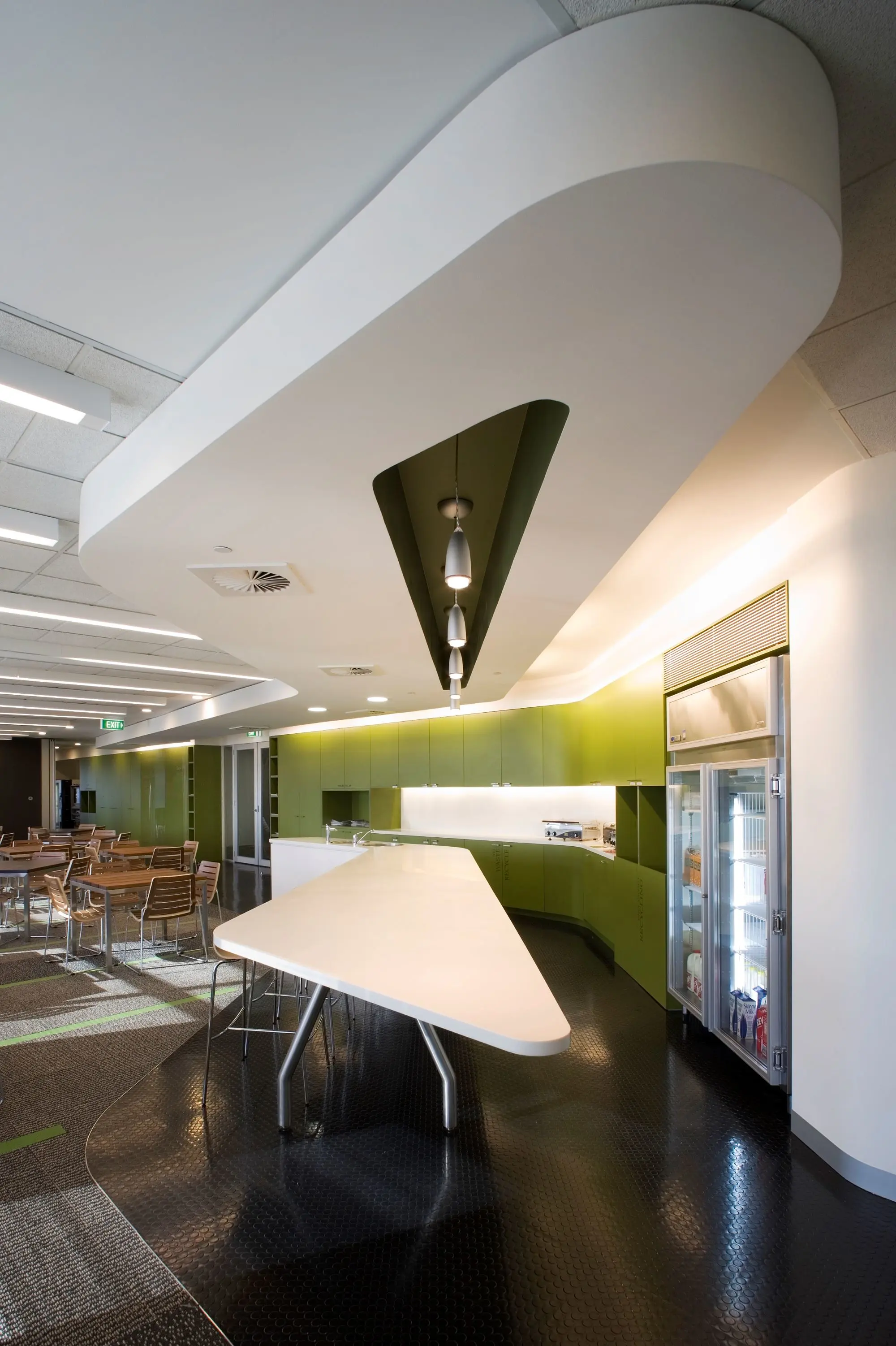
Intelligent colour, colour that reminded us of evocative places of culture and meditation was the stimulus behind this palette. "Wabi sabi" was not merely a Japanese decorating style; it was a mindset.
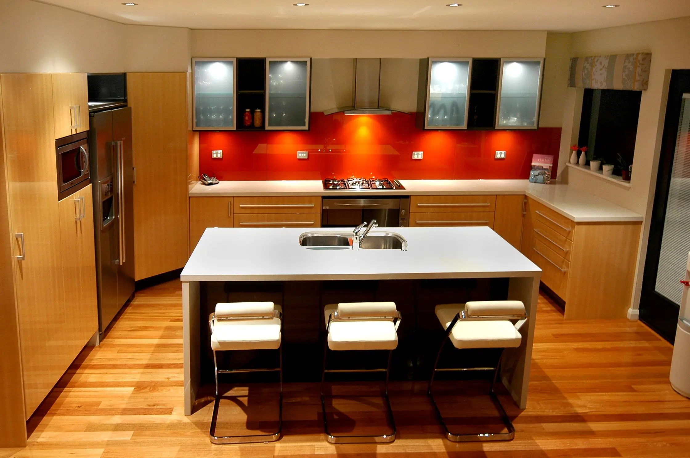
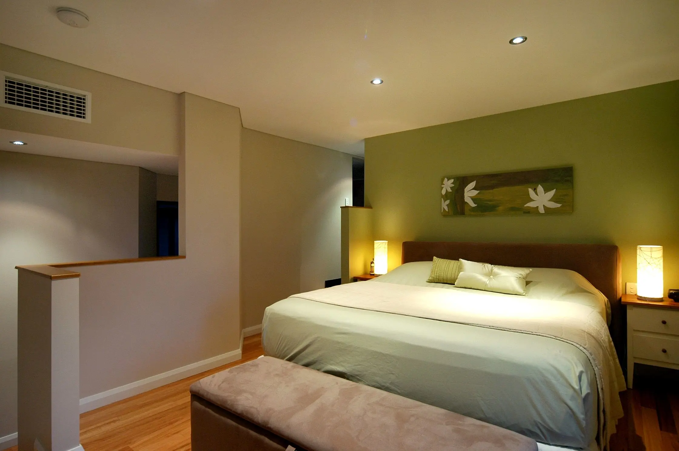
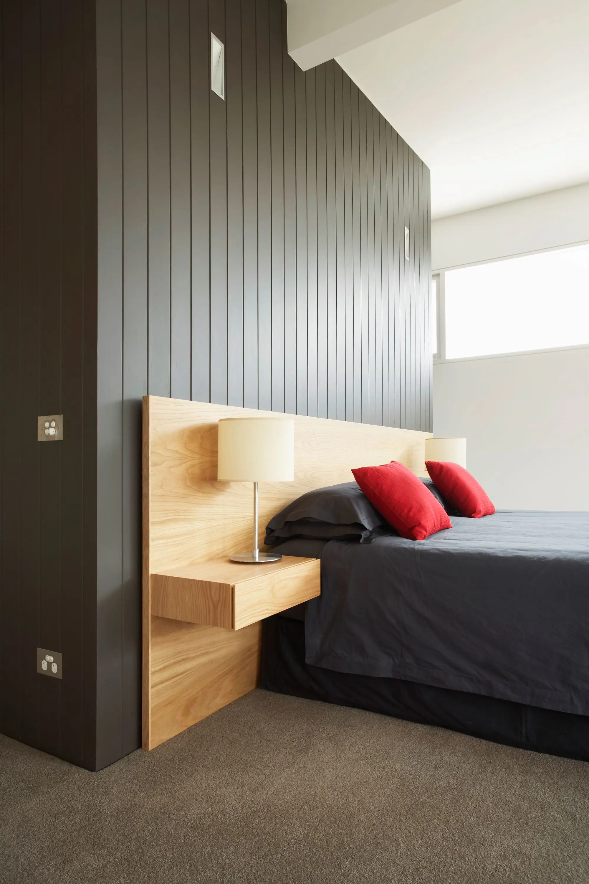
Wabi Sabi palette
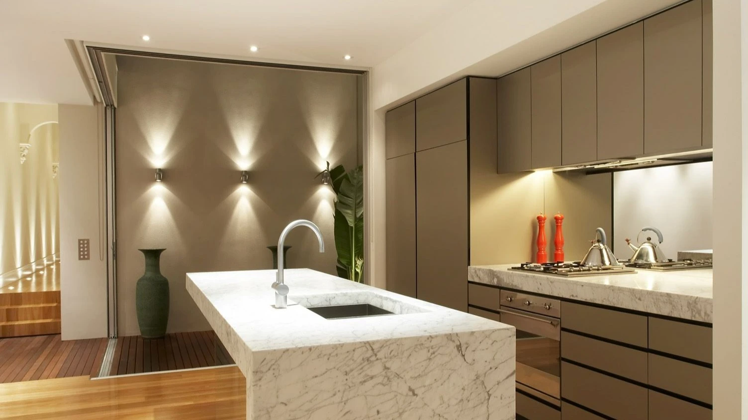
This palette captured the power and culture of Tokyo as a key driver in fashion trends. Long-time leaders in the electronic design market, there was an increasing dominance of Japanese designers. In particular, Japanese furniture designers, such as Muji, were gaining exposure in European and Western markets. Powder-coated metals added low-key detail to refined and simply constructed shapes. Reserved mushrooms, olives and near blacks captured the philosophy of living modestly and learning to be satisfied without unnecessary items.
Intrigue
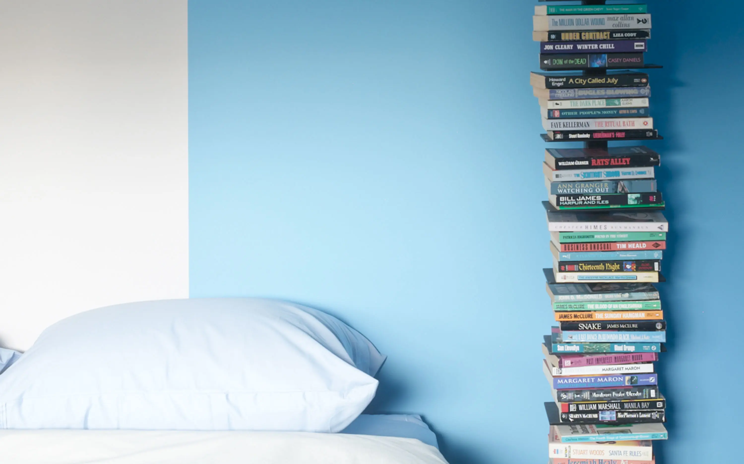
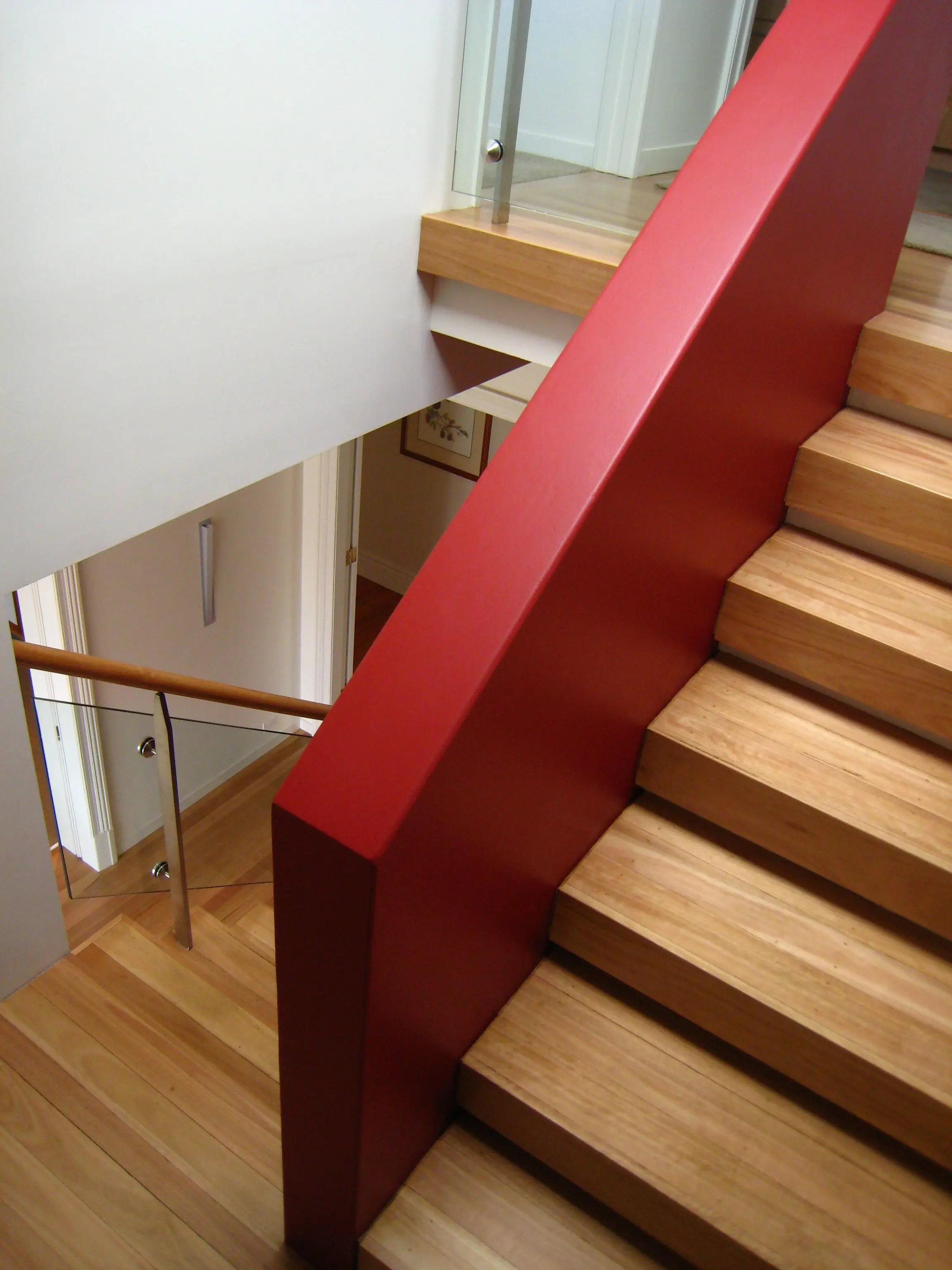
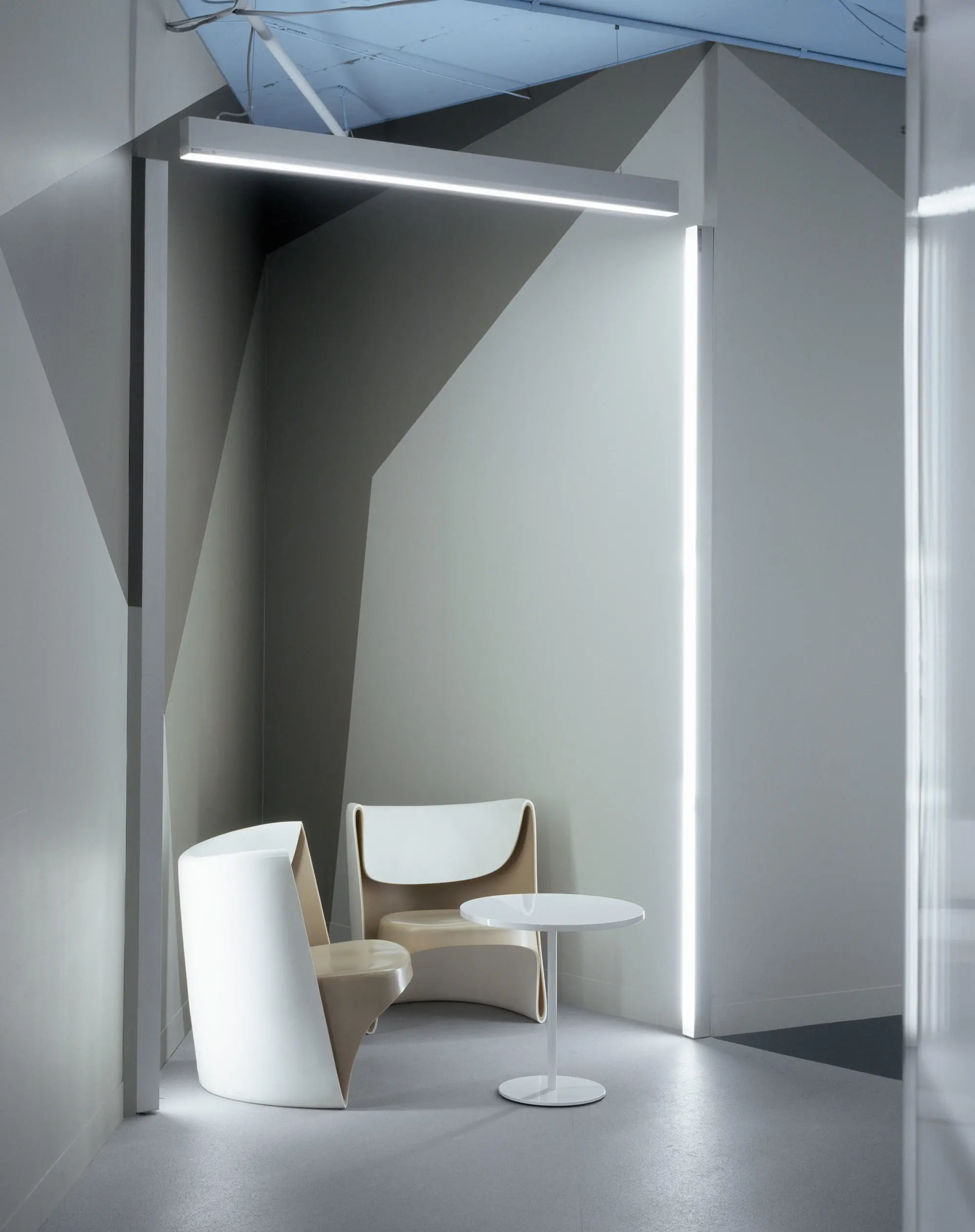
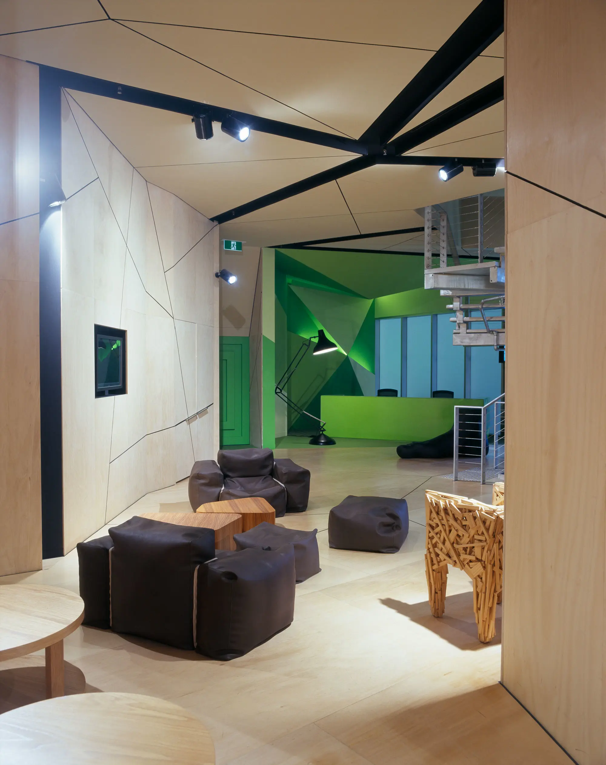
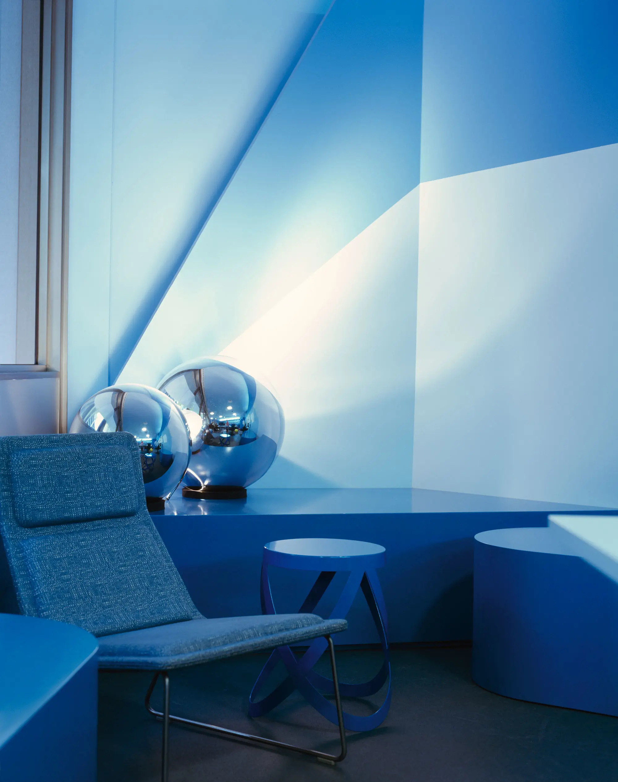
A big step away from the boring beige '90s, the Intrigue palette brings splashes of colour back into the home. Rich pinks such as Lickedy Lick and exciting aquas like Piccolo brought colour to life.
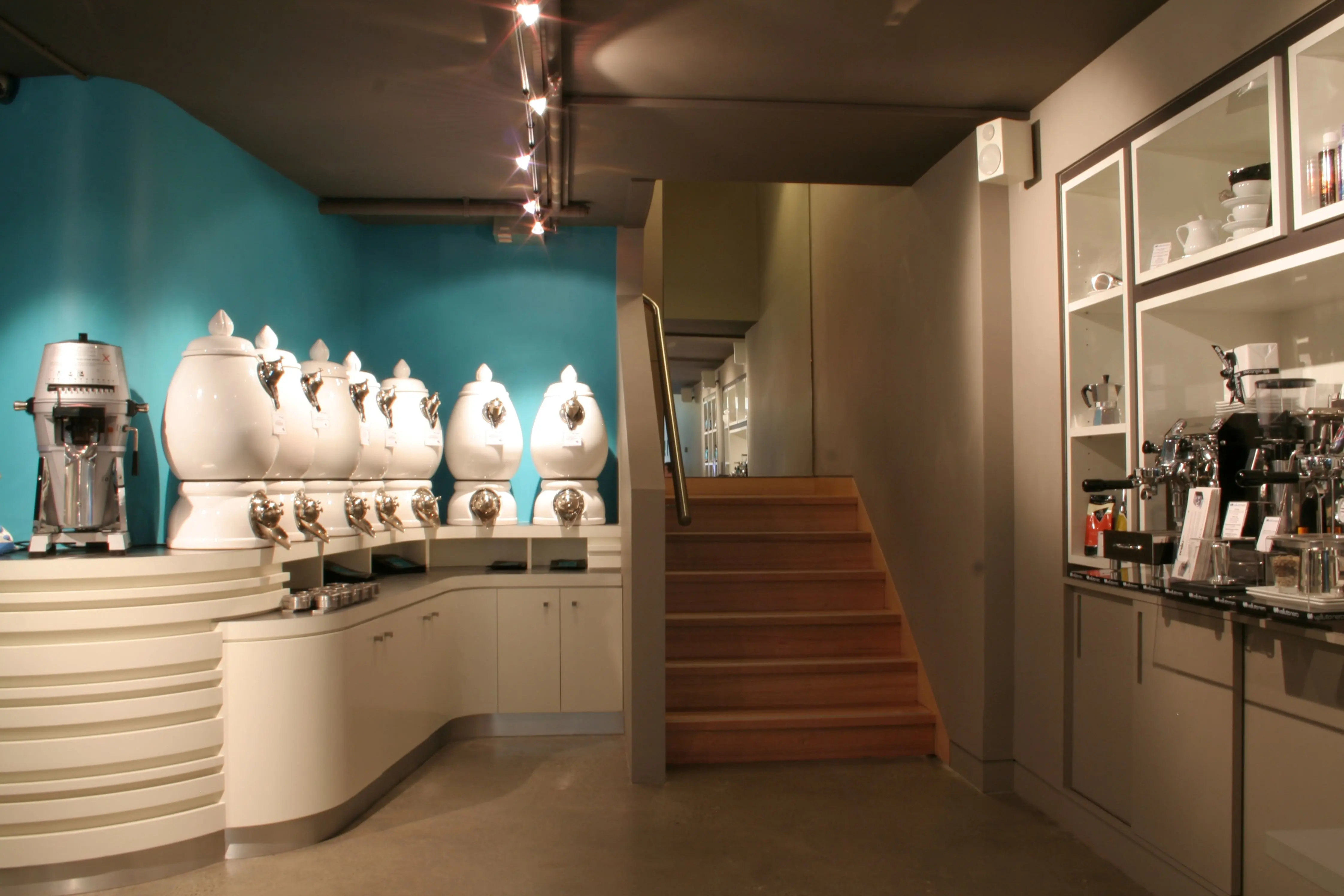
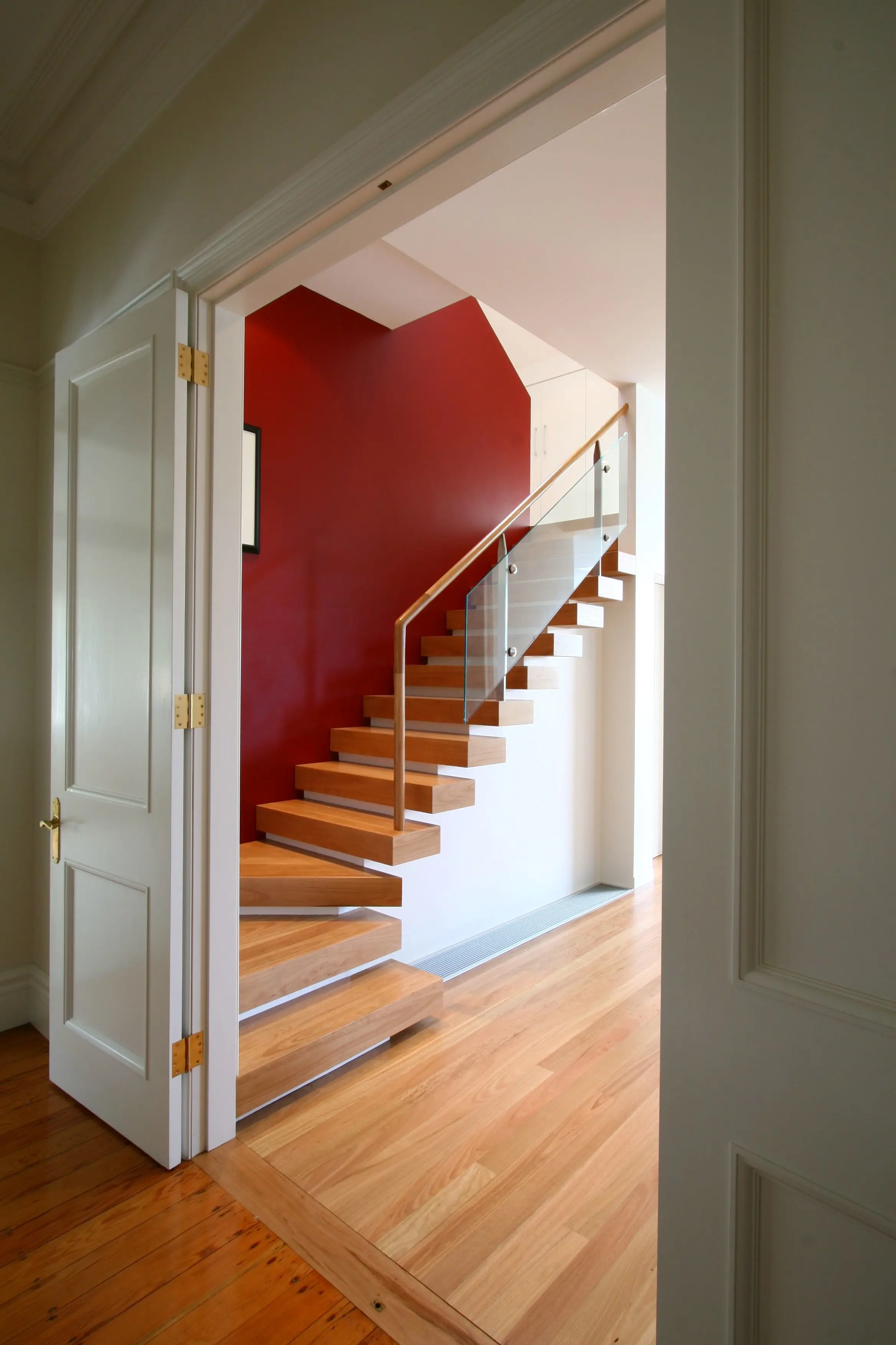
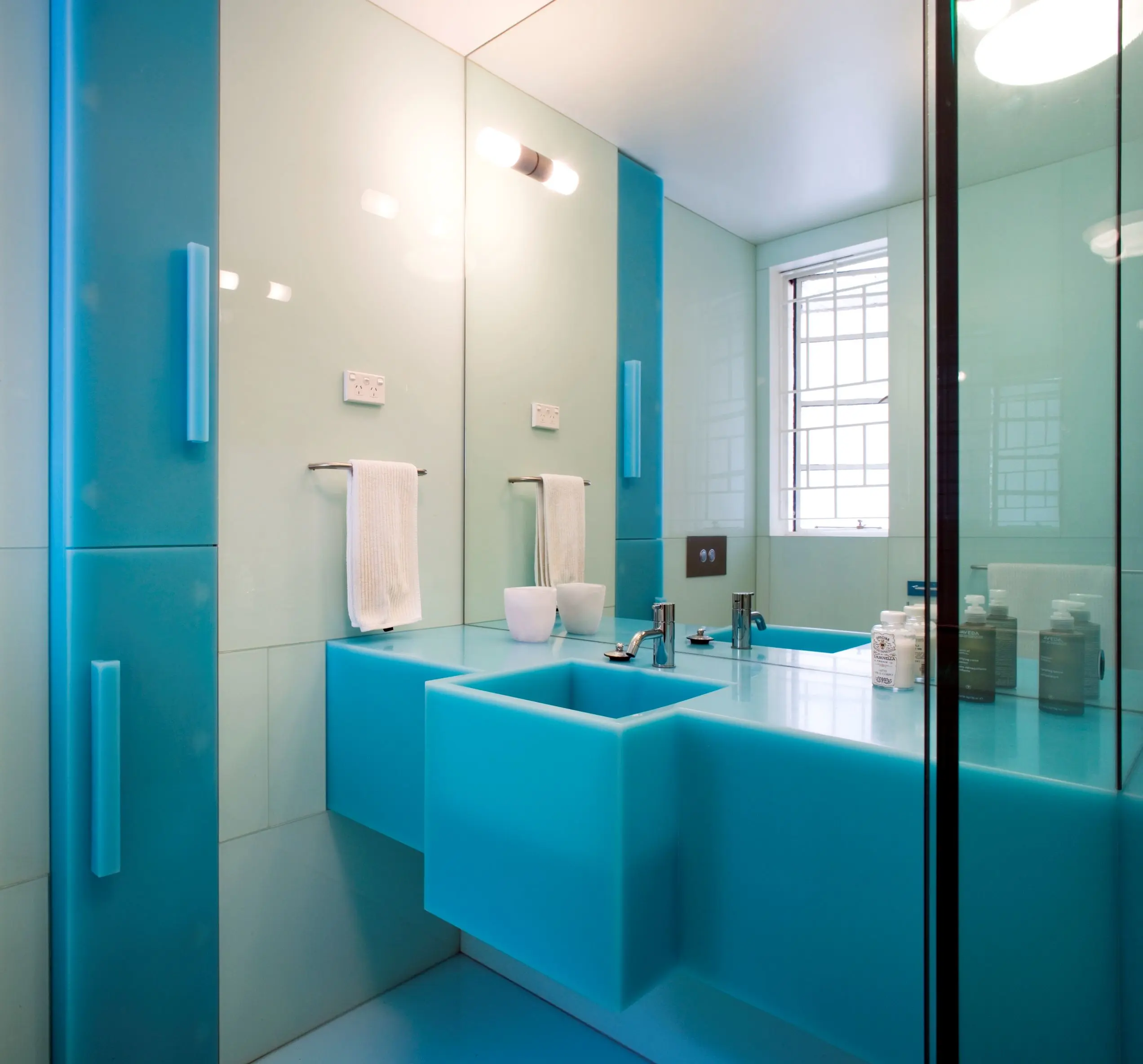
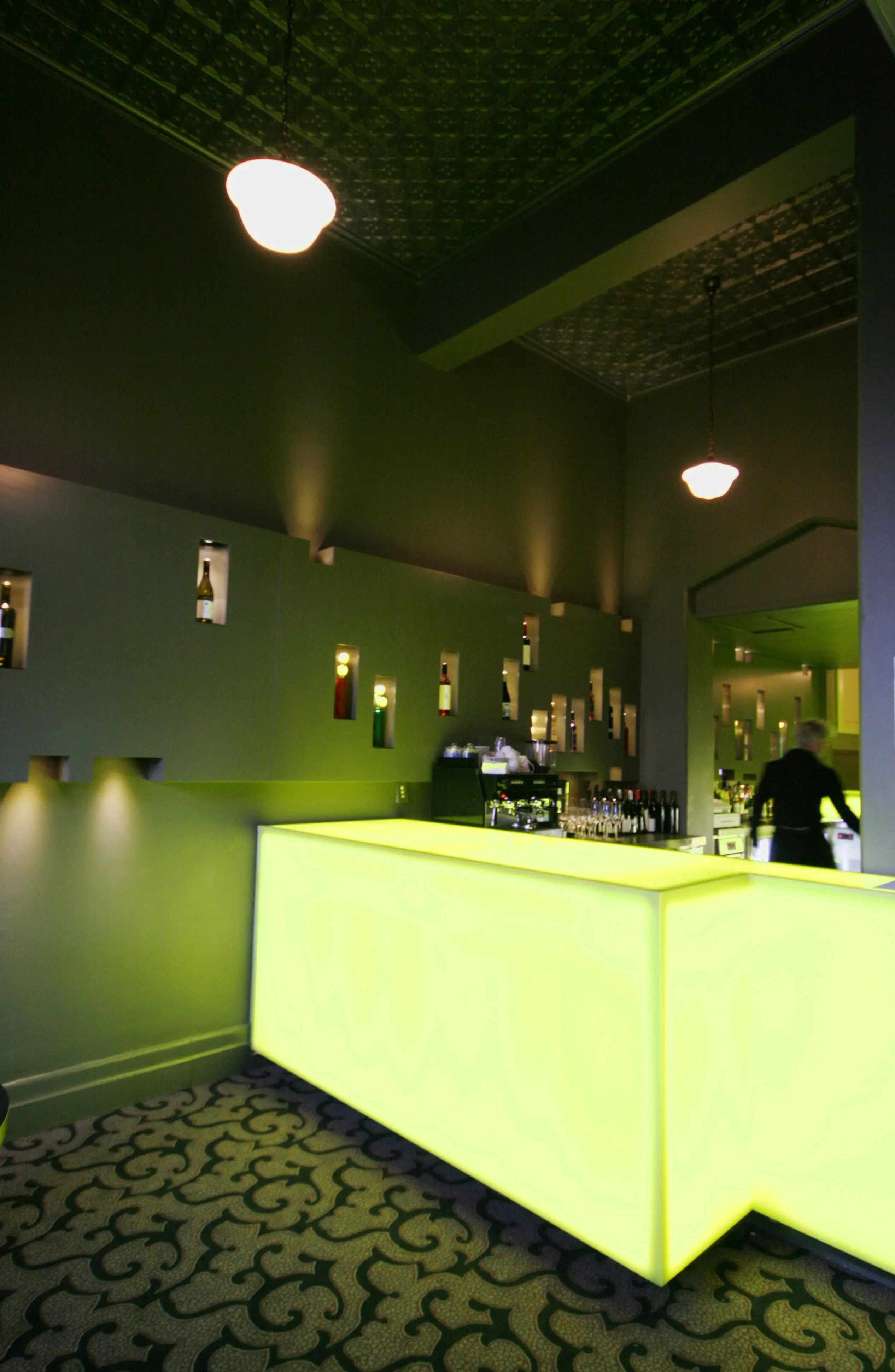
Intrigue palette
Sometimes secrets are good. Like the beautiful "hidden" personal colours that abound in fashion and interior design. From Louboutin shoes with that sexy lick of colour on the heel to the newly dubbed "Louboutin manicure", which deftly accentuates the underside of the fingernail, to secret internal lapels and cuffs – nothing was as it seemed. Conservative handbag? Have you seen the vibrant fabrics concealed within? Seemingly neutral vases and lamps, likewise, cloaked a secret wild side. The Intrigue palette was based on those secret colours behind the first impression we see when looking at an object. Looking at the power of the "hidden" personal colour in fashion and bringing that to life in the home.
Dulux Colour Forecast: now and then
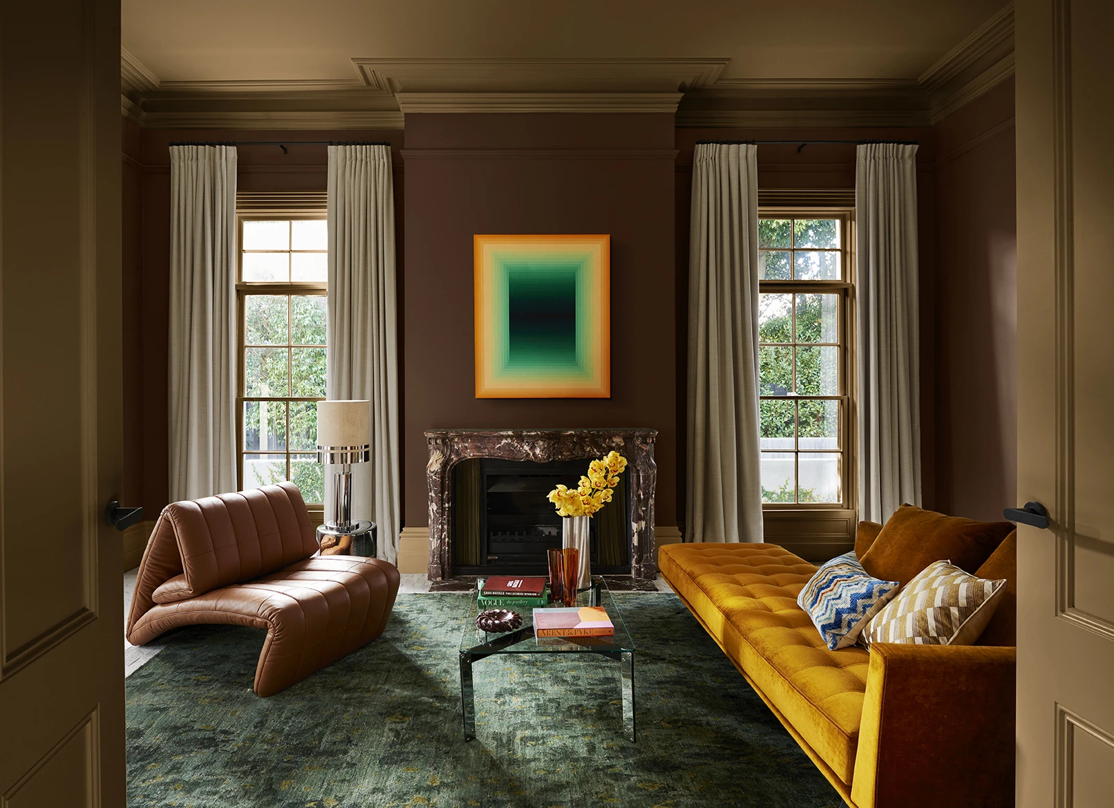
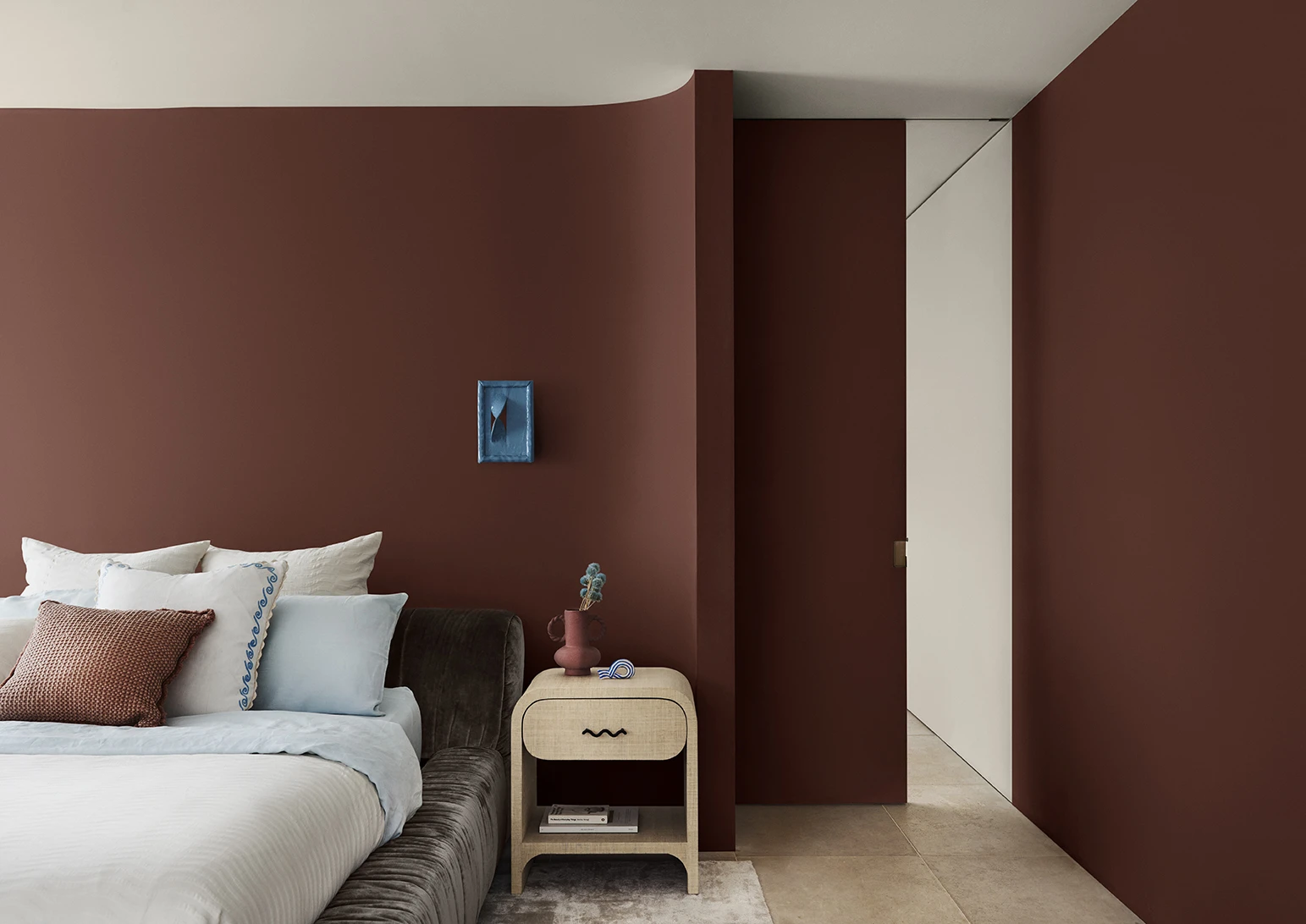
Dulux Colour Forecast 2024 reflects an inner desire for positivity and spaces that nurture within our homes with warm colours such as rich golds, olive greens and reddy browns.
We're proud to be at the forefront of colour trends in interior design as we celebrate the 25th anniversary of the Dulux Colour Forecast!
Download the Dulux Colour Forecast 2024 brochure to explore the three beautiful palettes and be inspired to transform your home with the latest trends.
Love your colour
Dulux Authentic Colour®
Only Dulux colour mixed with Dulux Wash&Wear® paint gives you exact colour accuracy to create Dulux Authentic Colour® palettes that look fresh in your home for years.
Disclaimer
Colours displayed should be used as a guide for your colour selection. To ensure best accuracy, test your colour choice at home by ordering Dulux sample pots, stickers and A4 colour swatches.
