Dulux Colour Forecast 2007
The Colour Generation
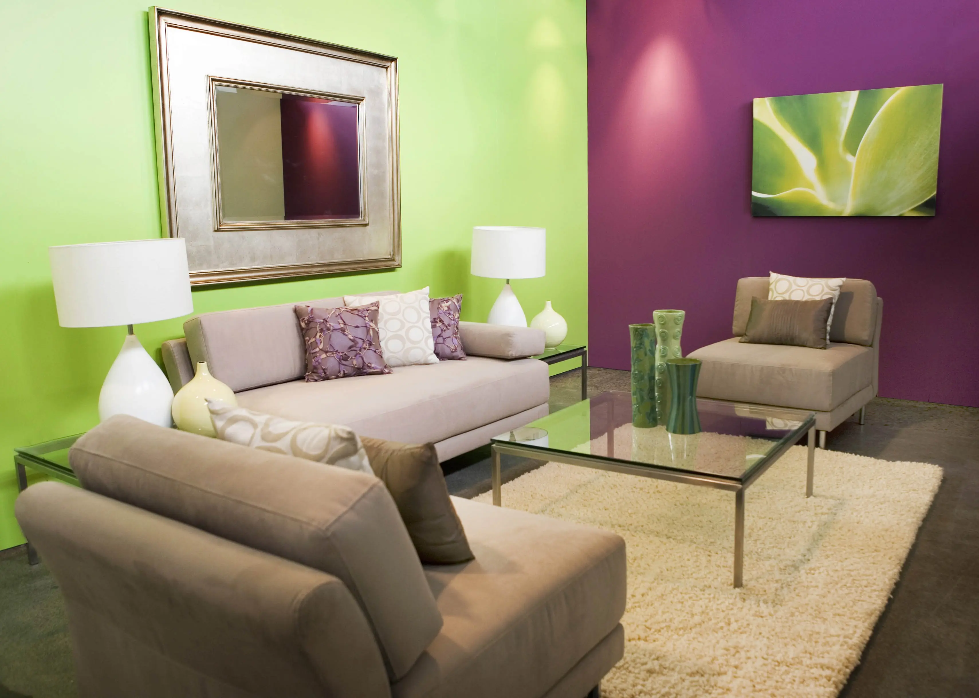
Mixing styles and textures to ensure an individual touch at home or work was the key to creating some of the hottest looks for 2007. Rich tones blended with soft hues or striking metallics with glossy whites, provided an eclectic mix. We included brighter greens, almost lime, to reflect the growing values of environmental sustainability and design trends. Vintage chic was thriving and provided a contrast of colours.
Vintage Paradox
With a modern approach to the Art Deco movement, blacks, whites and neutrals dominated in various styles. Whether it’s traditional or contemporary, impressive blacks with a hint of other undertones created amazing drama in any space.
Layering of all varieties of white (cool, warm, glossy, textured) was used to create a cluttered approach while still using one hue group, forming a simplified and elegant space.
Lace and feminine motifs were very prominent in fashion and homeware trends with lace designs interpreted in plaster, plastics, ceramics, glass, leather and even concrete.
Natural Essence
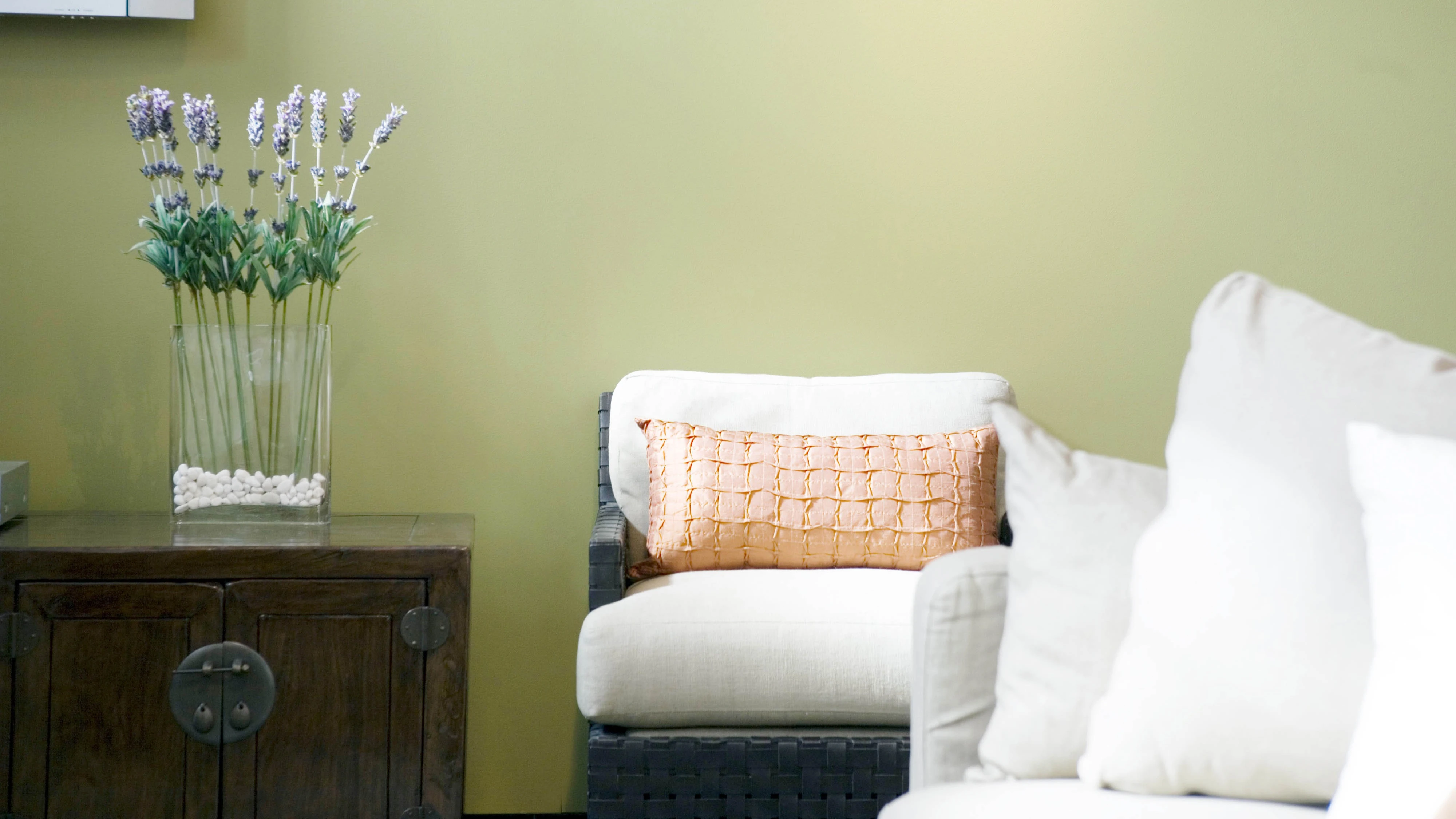
Using colour from our natural surroundings, this palette showcased the wonders of our environment. Earthy greens and browns, reddish chestnuts, and sandy hues whipped from the dunes. The beauty around us continued to create incredible inspiration for design and colour. An interesting colour in fashion, “chestnut” was one of the latest colours on the catwalks of Paris. Combined with earthy beiges, browns and greens, this latest in trends will work beautifully in home decorating. Bamboo products continued their momentum, and many recycled items were increasing in aesthetic. For the exterior, solar panels were increasingly designed as part of the building and were making interesting visual additions.

Moving Aura
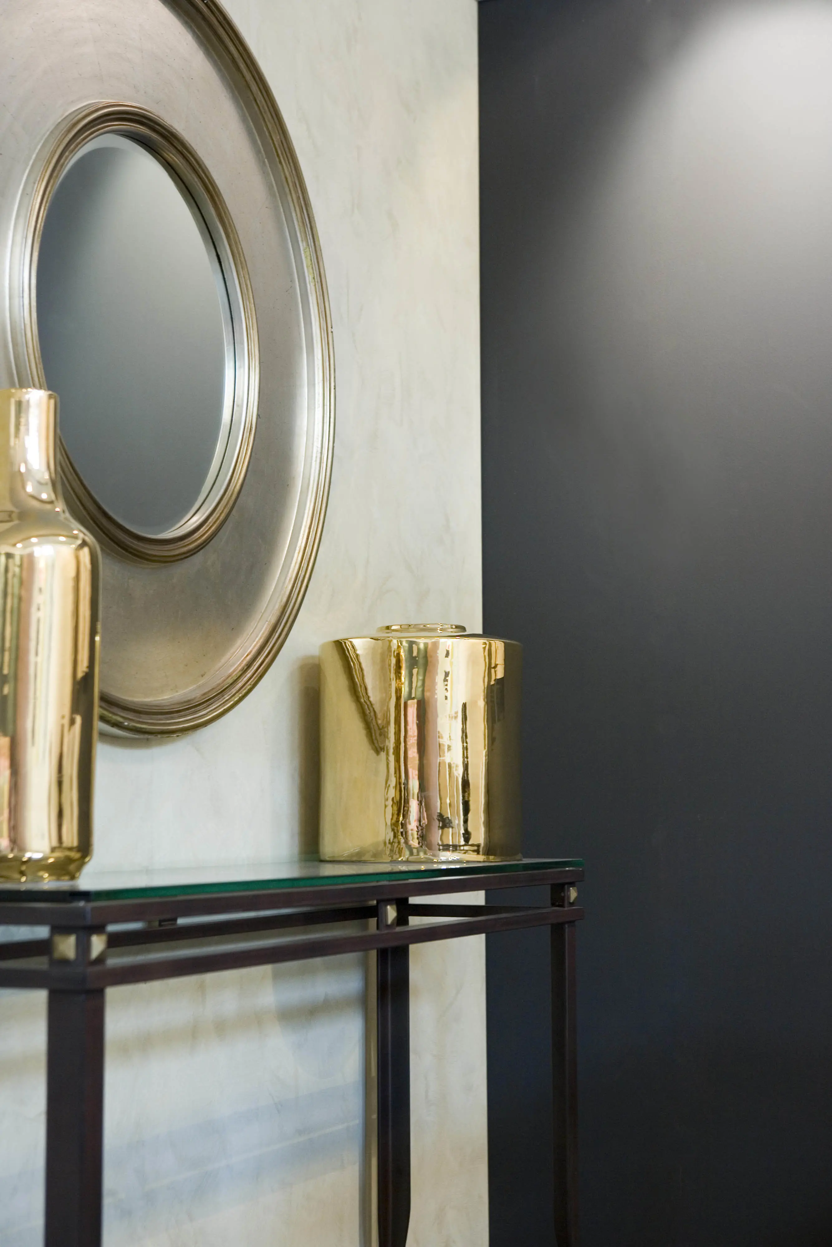
This gorgeous palette in intriguing and subtle tones created reflectance beyond belief! Metallics, looking forward, were increasingly used in homewares. Fabric designers were using metallic flecks or strips for texture and movement. Kitchen appliances were becoming a real standout feature for kitchens in these metallic shades.
Combined shades of gold, bronze, pewter and copper blended well with neutral and bold colours. Also, the benefit of metallics was the reflectance value and ability to create an illusion of colour, which changed depending on the light and viewing angle. There were so many choices now for materials made with metallic qualities. These included paints, plastics, paper, fabrics, ceramics, flooring and glass.
Intrinsic Edge
An enlightening kaleidoscope of colours in varying shades and tones helped form a revitalising union of non-traditional colour. This dynamic palette broke the conventional barriers on how colours should be schemed together. We were pushing the boundaries on blending clean and muted colours and as a result saw unique and balanced colour blends.
Self-reflection
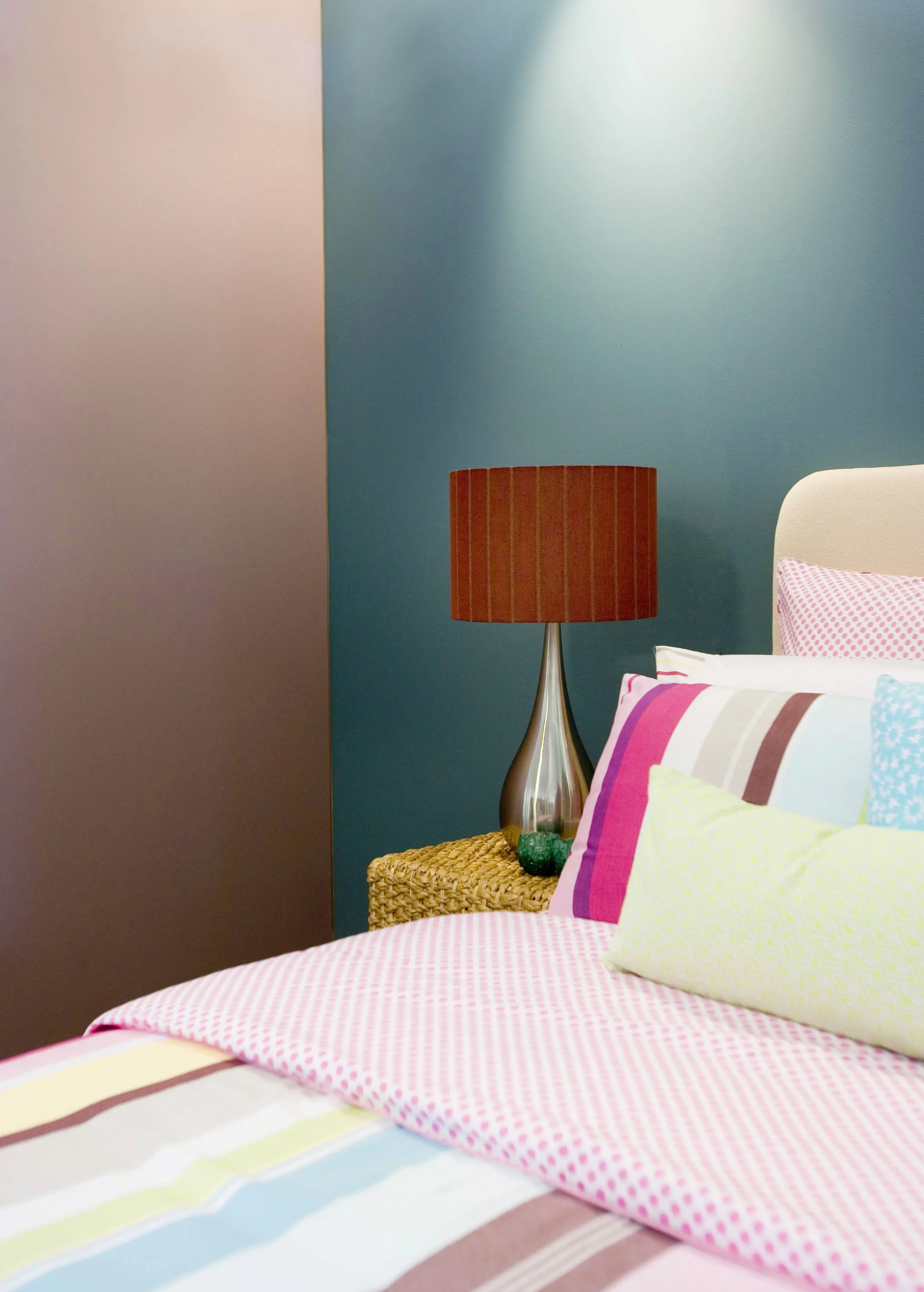
This lovely palette created an overwhelming feeling of calmness and serenity in colourful, yet subtle pastels. Calming blues, soft grey-greens, coloured greys, apple greens and mushroom pinks gave this palette an inviting and relaxing ambience. The increasing trend in “escapism” or “sea change” from the busy city lifestyle led to this very soft and peaceful palette. Holiday homes or quiet retreats were increasingly popular and these homes or “shacks” reflect simple and basic decoration needs. Home theatres and outdoor kitchens were also on-trend.
Techno Rush
A dazzling and exciting palette – finally we were seeing some bright and clean colours coming through the trends! Hot reds and pinks, cobalt blue; almost lime tangerine and bright white. The iPod culture had created a fascination for glossy whites. We were seeing extreme gloss in furniture and accessories in basic white. Technology created this gloss finish in a non-scratch material in some items. Kitchen trends were continuing with coloured small appliances.
With the emerging trend for personal tattoos, we were also seeing this with imagery in designs. Wall tattoos and images printed in everyday home items reflected this personal image. Customised designs were becoming more desirable with consumers demanding more unique items that reflected their own personality.
Dulux Colour Forecast: now and then
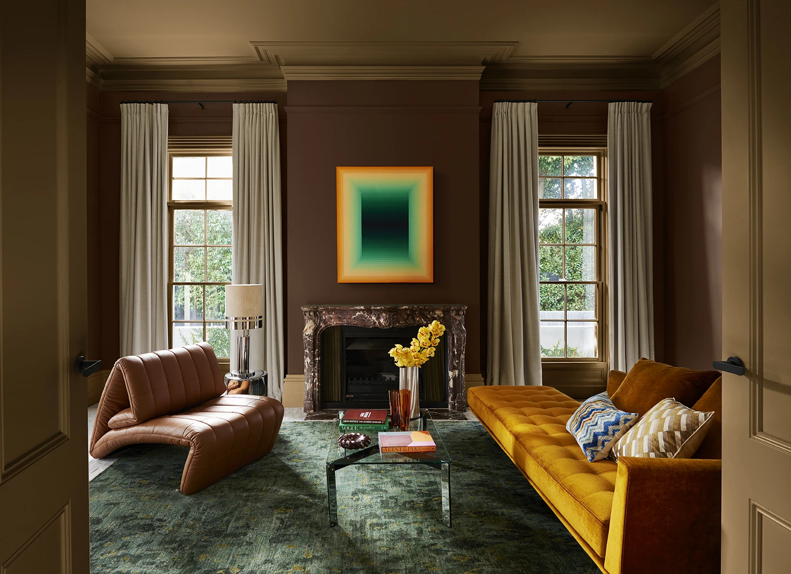
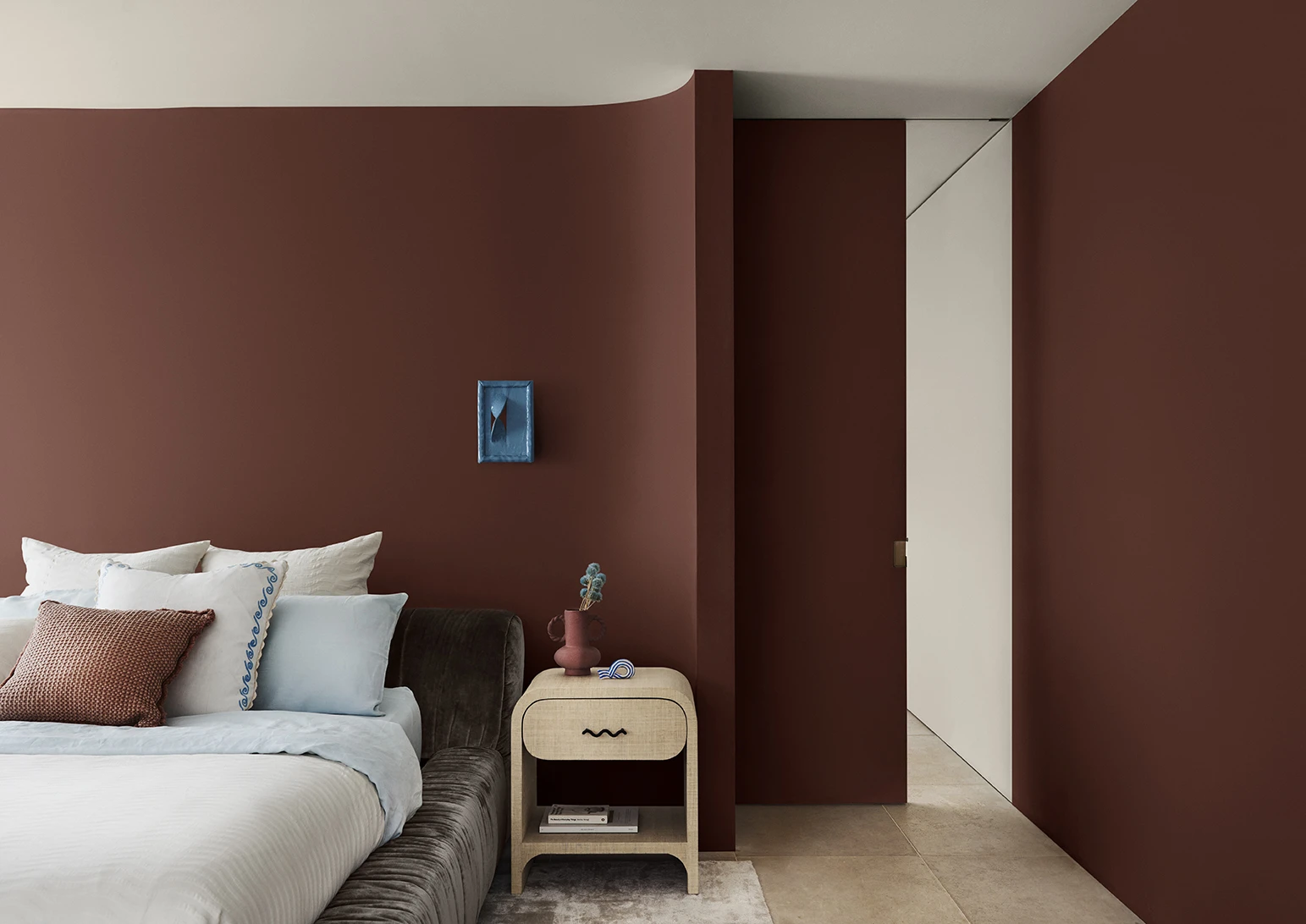
Dulux Colour Forecast 2024 reflects an inner desire for positivity and spaces that nurture within our homes with warm colours such as rich golds, olive greens and reddy browns.
We're proud to be at the forefront of colour trends in interior design as we celebrate the 25th anniversary of the Dulux Colour Forecast!
Download the Dulux Colour Forecast 2024 brochure to explore the three beautiful palettes and be inspired to transform your home with the latest trends.
Love your colour
Dulux Authentic Colour®
Only Dulux colour mixed with Dulux Wash&Wear® paint gives you exact colour accuracy to create Dulux Authentic Colour® palettes that look fresh in your home for years.
Disclaimer
Colours displayed should be used as a guide for your colour selection. To ensure best accuracy, test your colour choice at home by ordering Dulux sample pots, stickers and A4 colour swatches.


